



Did you know that even a small mistake in color selection can make your website look dull or unappealing? Color is more than just an aesthetic choice; it is a visual language that conveys emotions, messages, and brand identity. Understanding color scheme and applying standard color coordination principles will transform your website from ordinary to engaging, professional, and memorable. Let’s join Markdao in exploring smart color combinations to turn every website into a stunning visual experience!
What is a color scheme?
In web design, a color scheme is a collection of colors selected and combined harmoniously to create a cohesive aesthetic. It is not just about choosing colors that look good; it is a vital tool for conveying messages, evoking emotions, and shaping brand identity. A well-thought-out color scheme helps users focus on important content and enhances the overall experience on your website.

The role of a color scheme in web design
- Building brand identity: Primary colors help customers recognize your brand instantly.
- Creating a visual impression: A sophisticated color palette makes a website eye-catching, drawing users in from their very first visit.
- Guiding user experience: Colors can highlight call-to-action buttons, categorize content, and create a natural reading flow.
- Evoking emotion: Each color evokes a unique feeling – for example, blue inspires trust, red stimulates action, and yellow creates a sense of joy.
Common color schemes
To create effective color palettes, designers often use one of the following color schemes:
- Monochromatic: Uses a single base color with various shades and tints. Example: Light blue – medium blue – dark blue.
- Analogous: Combines colors that are adjacent to each other on the color wheel. Example: Green – light green – yellow-green.
- Complementary: Combines colors that are opposite each other on the color wheel to create high contrast. Example: Blue – orange.
- Triadic: Uses three colors evenly spaced around the color wheel, creating balance and vibrancy. Example: Red – yellow – blue.
- Tetradic: Combine four colors, typically two pairs of complementary colors, to create richness, but be sure to balance the proportions carefully.
Benefits of applying the right color scheme
- The website becomes professional and aesthetically consistent.
- Enhances user experience, making it easier for them to read, understand, and interact with content.
- Improves brand recall, thanks to colors used consistently across the entire website and related channels.
Color coordination principles in website design
Colors are more than just an aesthetic element; they are powerful tools for conveying messages, guiding user experience, and expressing brand identity. A website with a well-thought-out color scheme is both visually appealing and helps users interact with content more easily.
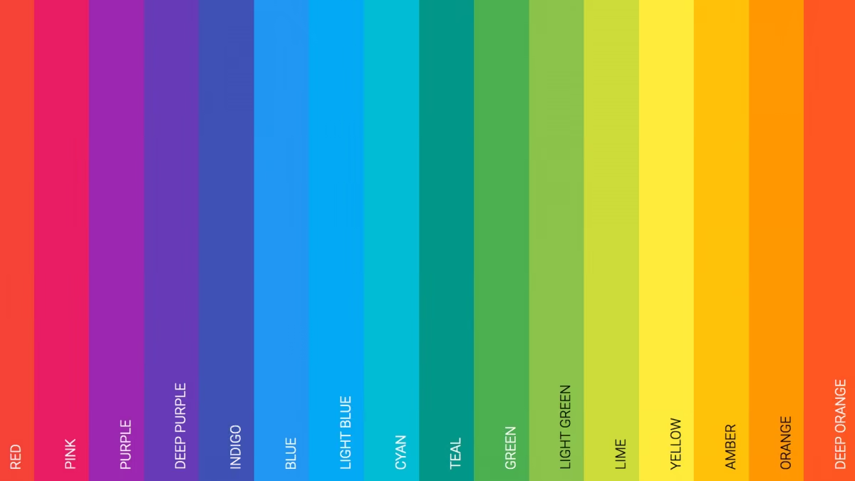
Below are the 5 most fundamental and important principles for color coordination in website design.
1. The 60-30-10 Rule
This rule is a guiding principle in color design, helping to create visual balance and prevent the design from becoming overwhelming for users.
- 60% Primary color: This is usually the main background color or the brand's signature color. It defines the overall feel of the website and must maintain consistency across all pages. For example, a financial website might use blue as the primary color to evoke a sense of trust and professionalism.
- 30% Secondary color: Used for secondary elements such as menu bars, sidebars, information cards, or content hierarchy components. The goal is to create a subtle contrast that remains harmonious with the primary color. For instance, light green or gray can serve as a secondary color to highlight content sections without being distracting.
- 10% Accent color: This color is used to highlight important details such as call-to-action (CTA) buttons, key links, or elements that need to grab attention. For example, an orange "Buy Now" button against a blue background will immediately draw the eye.
Applying the 60-30-10 rule correctly will help your website feel balanced, harmonious, and professional, while guiding the user's gaze toward important content without causing eye strain.
2. Color Contrast
Contrast is a crucial factor that helps elements on a website stand out and become easily recognizable. When designing, you need to pay attention to:
- Text and background: Text must be easy to read; avoid light text on light backgrounds or dark text on dark backgrounds. For example, white text on a dark blue background is easy on the eyes, while light yellow text on a white background is difficult to read.
- CTA and buttons: Call-to-action buttons should use colors that contrast with the background to grab attention. For instance, a red button on a gray background creates a strong focal point.
- Use contrast wisely: Avoid creating too many areas of harsh contrast on a single page, as this can cause eye strain. Consider the level of contrast to ensure it is both striking and harmonious.
Good contrast not only helps users process information easily but also enhances the aesthetics and professionalism of the website.
3. Choose colors that align with your brand and emotions
Color is a powerful tool for conveying emotion. Choosing colors that align with your brand and desired message will create a deep emotional experience for users.
- Blue: Evokes feelings of trust, stability, and professionalism – commonly used in the finance and technology industries.
- Red: Stimulates action, attention, and a sense of urgency – suitable for CTA buttons and promotional campaigns.
- Yellow: Playful, creative, and inspiring – suitable for youthful or dynamic brand websites.
- Green: Approachable, balanced, and associated with nature and health – ideal for health and environmental websites.
A website with the right colors will create an emotional connection with users, helping them remember the brand and increasing the likelihood of future visits.
4. Balancing warm and cool colors
Combining warm and cool colors creates an energetic balance on your website, ensuring the user experience is neither overstimulating nor dull.
- Warm colors (red, orange, yellow): Easily grab attention, creating a sense of energy, excitement, and a call to action.
- Cool colors (blue, green, purple): Provide a sense of calm, trust, and comfort.
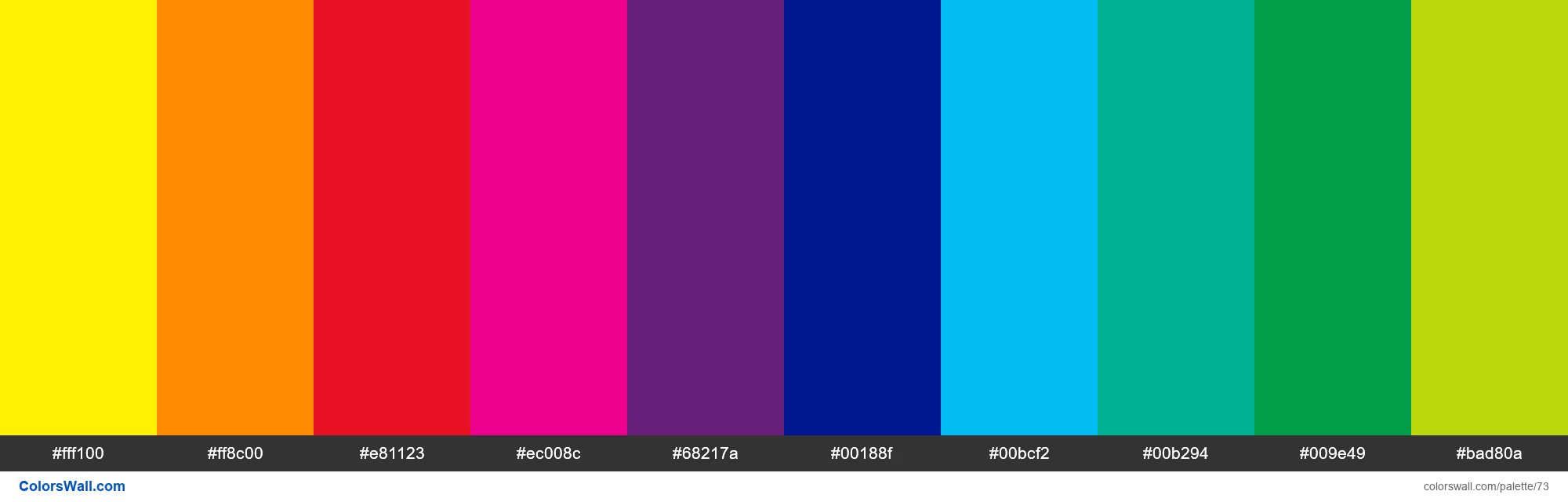
For example, an e-commerce website might use a blue background (cool color) to establish stability, paired with a red "Buy Now" button (warm color) to drive user action. Balancing warm and cool tones makes the website experience vibrant yet comfortable and professional.
5. UX/UI and Accessibility Considerations
A beautiful color scheme is ineffective if it doesn't prioritize the user experience:
- Ensure sufficient contrast for users with visual impairments or color blindness.
- Avoid using too many colors, which can be distracting and cause users to lose focus on key information.
- Maintain color consistency across the entire website so users don't feel "lost" when navigating between pages.
- Test across various devices and resolutions to ensure colors display consistently.
When you correctly combine UX/UI and accessibility, your website becomes both visually appealing and user-friendly, ensuring a comfortable and effective experience for all users.
Understanding and applying color theory not only makes a website look better but also strengthens brand identity, enhances user experience, and effectively guides user behavior. A well-thought-out color scheme transforms every webpage into a harmonious, memorable, and professional visual experience that keeps users coming back.
Common color mistakes
When designing a website, even experienced designers can fall into common color traps. Recognizing and avoiding these mistakes will help your website look more professional and feel more comfortable for your users:
- Using too many colors at once: A website with too many colors can be overwhelming and difficult to focus on. Instead, prioritize 2-3 primary colors, along with appropriate accent colors to create clear focal points.
- Colors that don't align with your brand: Choosing colors based on personal preference rather than brand identity can dilute your website's recognition. For instance, a financial brand should avoid using excessive neon or overly vibrant colors.
- Insufficient contrast: Text that is too close in tone to the background makes it difficult to read and degrades the user experience. Users are likely to overlook important content if it isn't clearly visible.
- Lack of consistency across pages: When every page uses a different color scheme, users feel disoriented and the site loses its professional appeal.
- Failing to test across multiple devices: Colors can appear differently on desktop monitors, smartphones, and tablets. Skipping testing before launch can result in a website that looks unappealing or is hard to read.
- Ignoring emotional impact: Every color conveys a specific feeling. Using colors that don't align with your message or desired mood will prevent users from forming an emotional connection with your website.
Recognizing these common mistakes is a crucial step toward optimizing your color scheme. By avoiding these pitfalls, your website will become more harmonious and visually appealing, creating a positive user experience while boosting brand recall and conversion rates.
Tips and tools for color coordination
Effective color coordination relies on more than just intuition; it requires strategy, technique, and the right tools. Below are some tips and resources to help designers create harmonious, professional color schemes suitable for any type of website.
Tips for effective color coordination
- Use a color wheel: This is a fundamental tool for selecting colors based on complementary, contrasting, or analogous principles. A color wheel helps you visualize the relationships between colors and avoid cluttered palettes.
- Start with your brand's primary color: Choose one color that represents your brand or core message, then build your secondary and accent colors around it to maintain consistency.
- Apply the 60-30-10 rule: Using a balanced color ratio helps ensure the overall website design remains harmonious and easy on the eyes.
- Evaluate color mood and emotion: Before choosing a color, consider the emotions it conveys and whether it aligns with your website's goals. For example, a health-related website should prioritize green or blue to create a sense of safety and comfort.
- Test across various backgrounds and devices: A color may appear differently on desktop, mobile, or tablet screens. Testing on multiple devices helps ensure that colors remain consistent and legible.
Popular color palette tools
- Adobe Color: A powerful tool for creating, saving, and testing color palettes based on standard color theory. It allows for direct export to other Adobe software like Photoshop or Illustrator.
- Coolors: A fast, user-friendly color palette generator that offers random generation or precise manual adjustments for each color. It is perfect for designers looking to experiment with creative color schemes.
- Canva Color Palette Generator: Ideal for beginners, this tool helps create palettes from images or logos, ensuring colors are compatible with your brand.
- Paletton: Allows you to visually test how colors coordinate and appear on a simulated website background, helping designers preview the final result.
- Contrast Checker: A tool to check the contrast ratio between text and background, ensuring accessibility and readability for all users.
Combining tips and tools
- First, choose a primary color based on your brand identity.
- Use a color wheel or tools like Adobe Color and Coolors to select secondary and accent colors.
- Apply the 60-30-10 rule to distribute color proportions on your website.
- Check contrast and display across multiple devices to ensure the best possible user experience.
By combining these tips with the right tools, designers can easily create harmonious, visually appealing, and professional color schemes that enhance user experience, helping the website stand out and remain memorable to visitors.
Conclusion
Color is more than just decoration; it is a powerful visual language that dictates how users perceive and interact with a website. Understanding color schemes, mastering color theory principles, and avoiding common mistakes will help your website become harmonious, professional, and memorable. When combined with practical tips and supporting tools, creating a beautiful, brand-aligned color palette that delivers an optimal user experience becomes easier than ever.
Start applying these insights today to ensure your websites are not only eye-catching and vibrant but also leave a lasting impression, helping customers easily connect with and remember your brand. A beautiful website does more than just attract attention—it is a powerful tool that elevates your user experience and business performance.