


When a visitor lands on your website, what makes them stay instead of leaving after just a few seconds? The answer is Hero Banner, the "hero" that kicks off the entire online experience. More than just a large image at the top of the page, a Hero Banner is the element that seals your brand message, captures attention, and guides users toward your desired action. In the competitive world of web design, having an impressive Hero Banner is the fastest way to make a lasting impression on your customers.
What is a Hero Banner?
In web design, Hero Banner is the large image or video area located in the most prominent position at the very top of a homepage or landing page. It is the first "greeting" that visitors see when they enter your website.

The name "Hero" is no coincidence. It stems from the idea that this area acts as the "main character" or "hero" of the page, grabbing attention, conveying the most important message, and leading users to take a desired action. A Hero Banner typically includes:
- High-quality background image or video that showcases your product, service, or brand value.
- A striking headline that is impactful and memorable.
- A concise subheadline that clarifies the message.
- A Call-to-Action (CTA) button such as "Learn More," "Buy Now," or "Sign Up."
The special thing about a Hero Banner is its ability to convey information quickly within the first few seconds. Users can immediately recognize what the website is about, whether it meets their needs, and what they should do next.
Today, a Hero Banner is more than just an aesthetic design element; it is a strategic tool for attracting customers, building brand identity, and driving conversions. Investing in a high-quality Hero Banner is a direct investment in your website's user experience and overall performance.
Structure and characteristics of a Hero Banner
An effective Hero Banner is not just about placing a large image at the top of a webpage; it must be strategically designed to ensure every element supports the goal of conveying your message and guiding the user. Typically, a Hero Banner includes the following components:

1. Background image or video
- This serves as the visual "canvas" that first catches the visitor's eye.
- It can be a product photo, brand illustration, or a short video showcasing your services.
- It must be high-quality, with colors that are harmonious and aligned with your message.
- Prioritize visual content that is easy to understand, avoiding overly complex images that cause visual clutter.
2. Headline
- This is the text that immediately grabs the user's attention when they see the Hero Banner.
- It should be short and concise, yet powerful enough to spark curiosity or address a need.
- It should be placed in a prominent position with high contrast against the background for readability.
3. Subheadline
- This helps elaborate on the headline, providing context or core value.
- Usually longer than the headline, but still needs to be neat and easy to understand.
- It helps users quickly grasp the benefits or the main message.
4. Call-to-Action (CTA) button
- Acting as a bridge that guides users from "viewing" to "taking action."
- Examples: "Buy Now," "Learn More," "Sign Up for Free."
- Use bold colors, make them easy to click, and place them in highly visible areas.
5. Layout and Proportions
- Ensure a balance between images, text, and white space to make the content easy to read.
- Sizes should be suitable for all devices, from desktop screens to mobile phones.
- Ensure responsive design for a seamless experience across all platforms.
A successful Hero Banner is a harmonious blend of visual imagery, concise copy, and a clear call to action, all aimed at attracting and converting visitors.
The importance of Hero Banners in website design
In a competitive online environment where users may leave a site within 3–5 seconds if they don't find what they are looking for, the Hero Banner acts as a "gatekeeper" that determines whether a visitor stays or leaves.

1. Creating a strong first impression
First impressions carry significant weight. A Hero Banner, featuring eye-catching images or videos combined with a clear message, helps a website immediately grab attention and project professionalism. A well-crafted Hero Banner not only sparks interest but also builds trust in the brand.
2. Guiding the user experience (UX)
Upon arrival, users typically look for answers to three questions:
- What is this website about?
- Is this relevant to my needs?
- What should I do next?
An effective Hero Banner answers all three of those questions in an instant, thanks to a clear headline, a concise description, and a CTA button.
3. Boost conversion rates
A Hero Banner is more than just an aesthetic element; it is a business tool. With a well-placed CTA, users are easily guided toward the desired action: signing up, making a purchase, downloading resources, or exploring new products. An optimized Hero Banner design can significantly improve your website's conversion rate.
4. Build a consistent brand image
The Hero Banner is where you convey the "spirit" of your brand through colors, typography, visual style, and tone of voice. When designed in alignment with your brand identity, the Hero Banner makes it easier for customers to remember and recognize your brand, even if they are just scrolling past.
In web design, the Hero Banner is not just "decoration" but a foundation for user experience—creating a visual impression, guiding behavior, and reinforcing brand identity all at once. Neglecting or poorly designing your Hero Banner means missing the chance to win over customers at first sight.
Common types of Hero Banners
Hero banners come in many forms, each suited to different goals, industries, and user experiences. Below are 5 common types, analyzed in detail to help you choose the right one for your website.
1. Static Hero Banner
The static hero is the most common type: a large background image (or illustration) accompanied by a headline, subheadline, and CTA. It is simple yet highly effective when your message is clear and needs to be communicated quickly.
Pros:
- Fast loading, easy to optimize for SEO and performance.
- Easiest to design and maintain.
- Ideal when you have high-quality product images or brand visuals.
.avif)
Cons:
- Low interactivity; can be less impressive if the content is not truly outstanding.
- Difficult for storytelling if you need to present a lot of information.
Design & Tips:
- Choose images with enough "white space" for text placement; avoid overly cluttered visuals.
- Keep headlines short and punchy; use subheadlines to clearly state benefits.
- Optimize images (size, WebP format if possible) to maintain fast loading speeds.
- Always check readability (contrast) on mobile devices.
2. Dynamic Hero Banner / Video Hero
Dynamic heroes use short videos or animations as a background to create a powerful visual experience from the very first visit.
Pros:
- Evokes emotion and conveys richer messages in just a few seconds.
- Ideal for products involving motion (e.g., app demos, lifestyle products, fashion).
Cons:
- Heavier load times; if not optimized, it will negatively impact UX.
- Can reduce performance on mobile devices or weak networks if not handled properly.
- Pay attention to autoplay (many browsers block autoplay with sound).
Design & Tips:
- Use short, looping videos muted by default; provide a poster image in case the video fails to load.
- Keep the video minimalist, focusing on action or context, and avoid including too many details.
- Provide a static image fallback for mobile or slow network connections.
- Compress videos and serve them via a CDN.
3. Full-screen / Immersive Hero
A full-screen hero section occupies the entire initial viewport, often used to create a powerful and immersive impression (such as on a landing page for a product launch).
.avif)
Pros:
- Striking and helps viewers become "immersed" in the message.
- Suitable for launch campaigns, portfolios, or premium brands.
Cons:
- Easy to lose context (users may not know to scroll further if the CTA is unclear).
- Content below the fold must be considered; without good design, users might get "stuck" on the first screen.
Design & Tips:
- Place a clear CTA and use indicators (e.g., an arrow or "Scroll down" text) to guide users.
- Ensure there is important content below the fold; do not rely entirely on the hero section.
- Test across various screen heights (desktop, laptop, tablet, mobile).
4. Carousel / Slider Hero
A carousel displays multiple slides in sequence, each with its own image, headline, and CTA, which is useful when you want to showcase multiple topics or products.
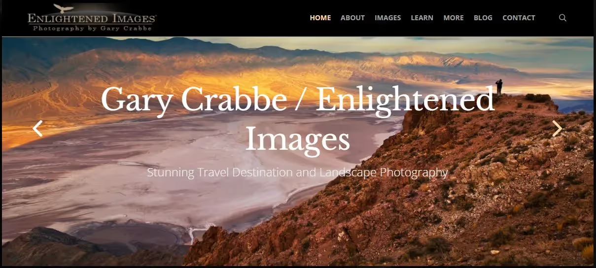
Pros:
- Can convey multiple messages or offers in a single space.
- Flexible for marketing campaigns with a lot of content.
Cons:
- Users often do not wait for the slider to rotate; the second slide becomes invisible if the first CTA is compelling enough.
- Adding scripts can impact speed; usability suffers if controls are unclear.
Design & Tips:
- Don't use too many slides (2–4 is ideal).
- Provide clear controls (dots/arrows) and pause auto-play when the user interacts.
- Ensure each slide has its own CTA and avoid overly long text.
- Optimize accessibility (ARIA labels) for keyboard navigation.
5. Split-screen & Interactive Hero
Split-screen divides the layout into two sections (e.g., image on one side, content on the other), or the Hero includes small interactive elements (micro-interactions, short sign-up forms).
Pros:
- Creates a balance between visuals and content; excellent for messages that need quick explanation.
- Interactive elements (e.g., forms, selectors) help boost conversions right on the spot.
Cons:
- Requires responsive consideration; split-screen layouts can be difficult to display properly on mobile.
- More complex design, requires thorough UX testing.
Design & Tips:
- On mobile, switch to a stacked layout (image on top, content below) to maintain clarity.
- If using a form, keep it minimal (2–3 fields).
- Use light micro-interactions (hover effects, subtle animations) to add a lively feel without being distracting.
There is no "one-size-fits-all" Hero banner. The choice depends on your goals (brand awareness, lead gen, sales), your audience (mobile vs. desktop users), and your resources (images/video, performance optimization capabilities).
Principles of Effective Hero Banner Design
A beautiful Hero Banner isn't necessarily an effective one. What gives it "power" is its ability to convey a clear message, evoke emotion, and guide users to take action, all within a few short seconds. To achieve that, there are a few principles you cannot ignore:

1. Tell a story at first glance
The imagery and headline in a Hero Banner need to blend together to convey a unified message. Don't just choose a "pretty" photo; choose one that has a story and aligns with your brand message. When users look at it, they should immediately feel "who you are" and "what you offer."
2. Position your CTA as an invitation, not a command
A Call to Action (CTA) button shouldn't be rigid like "Click here." Instead, turn it into an enticing invitation: "Explore now," "Start your journey," or "Get today's offer." The CTA is the bridge from emotion to action, so make it feel natural and compelling.
3. Keep everything clear and concise
A Hero Banner is not the place to "tell everything." Too much text or complex imagery will drive users away. The golden rule: one main message, one prominent CTA. White space is your best friend, helping content breathe and stand out.
4. Play with visuals, but don't sacrifice speed
High-resolution images, impressive videos, or smooth animations can catch the eye, but if they make the page load too slowly, all your effort will go to waste. Always optimize file sizes, use modern formats (WebP, compressed MP4), and test loading speeds on both desktop and mobile.
5. Ensure a seamless experience across all devices
Users don't just come from large computer screens; they also arrive via phones, tablets, and smart TVs. A responsive Hero Banner doesn't just "resize" images; it rearranges content logically for each screen size to preserve the message and CTA.
6. Test, experiment, and optimize continuously
There is no fixed formula for every brand. Conduct A/B testing on different versions of images, headlines, and CTAs, then measure the results. Real data will tell you which Hero Banner truly "speaks" to your customers.
An effective Hero Banner is a combination of art, strategy, and user psychology. Don't just think of it as a "pretty picture at the top of the page"; treat it as the most valuable greeting you offer your visitors.
Conclusion
A Hero Banner is more than just a "big photo" at the top of a website; it is the gateway that leads customers into your brand's world. In just a few short seconds, it can create a powerful impression, evoke emotion, and drive users to take the action you desire.
A successful Hero Banner is a blend of refined aesthetics, clear messaging, and user experience strategy. When invested in properly, it becomes a "silent hero" that helps your website stand out in a sea of information, while boosting conversion rates and strengthening your brand image.
And remember: a great website starts with the first impression. If your Hero Banner can capture the user's heart, the rest of their journey will be smoother and more effective than ever.