


A Call to Action (CTA) plays a crucial role in guiding users toward a desired action, whether it's making a purchase, signing up, downloading a document, or contacting support. An effectively designed CTA not only boosts conversion rates but also enhances the user experience and optimizes website performance. So, what is a CTA, why is it important, and how can you optimize it for maximum effectiveness? This article will help you better understand CTAs and how to apply optimization strategies to increase conversions on your website.
What is a Call to Action (CTA)?
A Call to Action (CTA) is a vital element in digital marketing that serves as a prompt, encouraging users to take a specific action. CTAs can appear as buttons, links, forms, or concise text designed to guide customers to the next step in their buying journey.
Examples of effective CTAs on major websites
1. Amazon – Uses CTAs like "Add to Cart" and "Buy Now" to encourage quick purchases.
2. Netflix – The CTA "Try it free now" makes it easy for users to sign up and experience the service.
3. Shopify – "Start your free trial" helps businesses easily access e-commerce platforms.
The Role of Call to Action in Digital Marketing
In Digital Marketing, Call to Action plays a decisive role in driving conversions, helping businesses guide users toward predefined goals. A compelling CTA not only increases traffic but also improves conversion rates and boosts revenue.
Below are some key roles of CTAs in marketing:
1. Increase conversion rates – An effective CTA helps visitors take the desired action, from signing up for newsletters to placing an order.
2. Guide user behavior – Users often won't take the next step automatically without clear guidance. A CTA lets them know exactly what to do.
3. Improve user experience (UX) – A well-designed CTA makes it easy for users to navigate without feeling confused or lost.
4. Support multi-channel marketing strategies – CTAs can be implemented across websites, email marketing, Facebook ads, and Google Ads to optimize campaign performance.
%20l%C3%A0%20m%E1%BB%99t%20y%E1%BA%BFu%20t%E1%BB%91%20quan%20tr%E1%BB%8Dng%20trong%20Digital%20Marketing.avif)
Why is a Call to Action important for increasing conversion rates?
The impact of CTAs on user behavior: A strong CTA can influence customer psychology, prompting them to make quick decisions. Key factors that help CTAs influence user behavior include:
- Urgency: CTAs such as "Only 3 discount spots left!" or "Offer expires in 24 hours!" creates a sense of urgency, encouraging immediate action.
- Clear benefits: CTAs should communicate the specific value the customer receives, such as "Download free SEO guide Ebook" will attract more downloads compared to "Click here".
- Simple and easy to understand: CTAs need to be concise and clear, avoiding confusion for the user.
Call to Action is an indispensable element in Digital Marketing, helping to guide customers to take action and increase conversion rates. A good CTA not only needs an eye-catching design but also compelling content that provides value to the user.
Common types of Call to Action (CTA) on websites
On a website, Call to Action (CTA) comes in many different forms, depending on business goals and user behavior. Below are the most common types of CTAs that help optimize conversion rates.
1. Primary CTA
Primary CTA is the most important call to action on the page, guiding users toward a decisive step such as making a purchase, signing up for an account, or booking an appointment.
Primary CTA examples:
- On e-commerce sites: "Buy now", "Add to cart".
- On SaaS sites: "Start free trial".
- On service websites: "Contact us for a consultation".
2. Secondary CTA
Secondary CTA acts as a supporting element, providing additional information for users to explore before taking the primary action.
Secondary CTA examples:
- "Learn more", "View details", "Compare service plans".
- "Read customer reviews", "Explore similar products".
3. Button CTA
Button CTA is the most common type, designed as a button with eye-catching colors, shapes, and sizes.
Examples of Button CTAs:
- "Sign up now", "Download for free".
- "Get the offer now", "Try it today".
%20ph%E1%BB%95%20bi%E1%BA%BFn%20tr%C3%AAn%20website.avif)
4. Text CTA
Text CTA are typically embedded within blog posts, emails, or articles to guide readers toward a specific action.
Examples of Text CTAs:
- "View the detailed guide here".
- "Discover more tips on optimizing Call to Action on our blog".
5. Form CTA
This type of CTA helps collect customer information by prompting them to fill out a form.
Examples of Form CTAs:
- "Subscribe to our newsletter" (Email Signup).
- "Get a quote now" (Lead Form).
- "Book a free consultation" (Booking Form).
6. Pop-up CTA
Pop-up CTAs appear when a user visits or is about to leave the website, helping to capture attention immediately.
Pop-up CTA examples:
- "Don't miss out – Get 20% off when you sign up today!".
- "Before you go... Claim your special offer!".
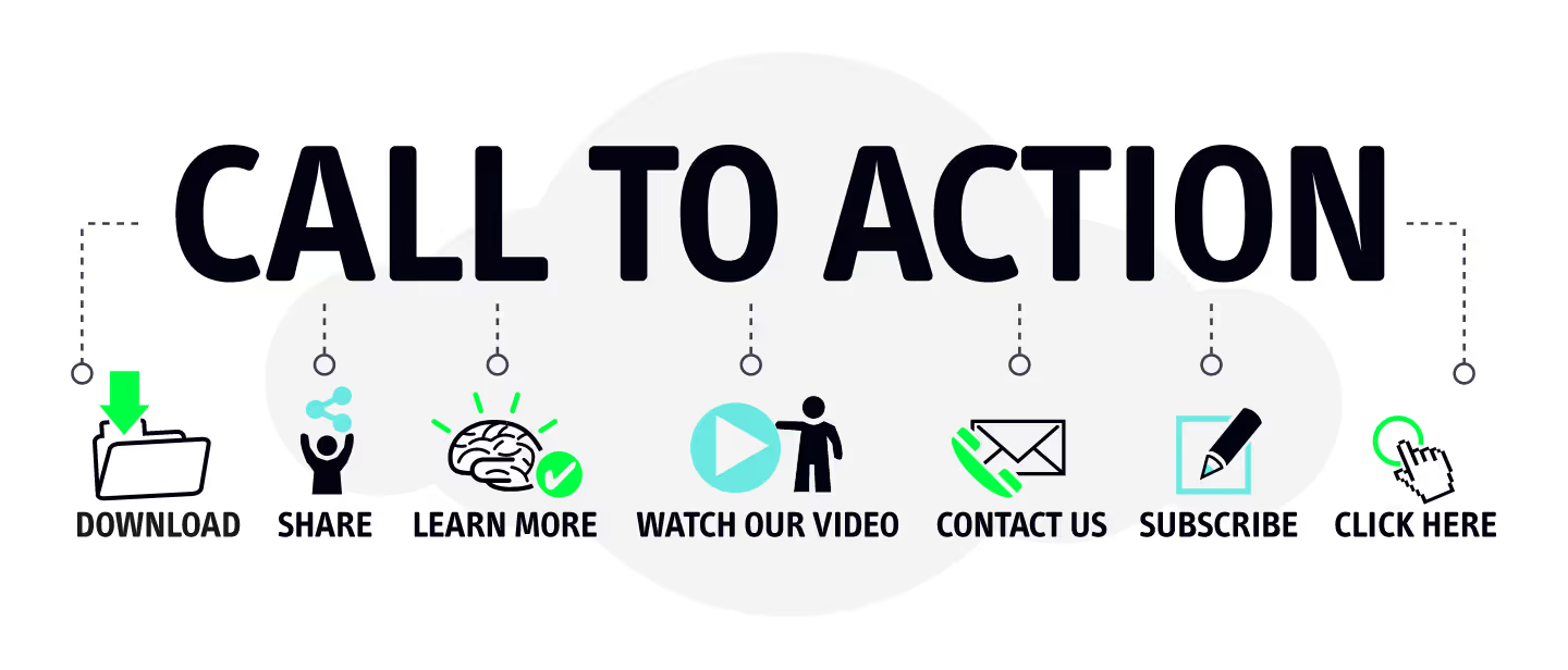
There are many different types of Call to Action (CTA)
On a website, there are many different types of Call to Action (CTA) , each serving a specific purpose to encourage user action. To optimize conversion rates, you need to combine various types of CTAs tailored to each stage of the customer journey.
Guide to optimizing CTAs to increase website conversion rates
A Call to Action (CTA) is a crucial element in Digital Marketing, serving to guide users toward a specific action such as making a purchase, creating an account, or downloading resources. Optimizing your CTAs not only boosts click-through rates but also significantly improves your website's overall conversion rate. Below are effective strategies for optimizing your CTAs.
Design compelling CTAs
Standout colors that align with your brand
CTA colors must balance two factors: being eye-catching enough to grab attention while remaining consistent with your brand identity to avoid visual clutter. Here are some key principles for choosing CTA colors:
- Use high-contrast colors against the website background to ensure they are easily visible.
- Ensure colors are consistent with your brand identity while still standing out clearly from the rest of the content.
- Some popular colors and their meanings in CTA design:
- Red and orange convey urgency and are often used for "buy now" buttons.
- Green and blue create a sense of security, making them suitable for CTAs related to sign-ups or service commitments.
- Yellow and purple can spark curiosity and entice users to take action.
Optimal CTA size and placement
The size of a CTA should be large enough to be easily recognizable, yet not so large that it becomes aesthetically unpleasing or distracts from the main content. Consider these criteria when determining CTA dimensions:
- CTA button height typically ranges from 40-50 pixels on mobile devices, and 50-70 pixels on desktop.
- CTA text size should be between 16-20 pixels to ensure readability.
- CTA placement should be strategically planned to ensure users can easily see and click it exactly when needed.
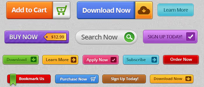
A guide to optimizing CTAs to increase website conversion rates
Crafting compelling CTA content
Use clear, action-oriented language
An effective CTA is more than just a button; it must convey a clear message that compels the user to act immediately. CTA content should be concise, punchy, and directly highlight the benefit of taking action.
Tips for writing engaging CTAs:
- Use direct calls to action, such as: "Buy now," "Sign up today," or "Start your free trial."
- Use benefit-driven language, such as: "Get 50% off," or "Download your free guide."
- Avoid generic or vague phrasing like "Click here" or "Read more."
Create a sense of urgency to drive immediate action
A key factor in high-performing CTAs is creating a sense of urgency, making users feel they might miss out if they don't act now. Here are some ways to achieve this:
- Use time-based elements, such as "Only today" or "Offer expires in 24 hours."
- Highlight limited availability, for example: "Only 3 spots left at this price."
- Combine with promotional elements like "Flash Sale" or "Buy now to get a free gift."
Effective CTA placement
Place it above the fold
"Above the fold" is the portion of a webpage visible to users without scrolling. It is a critical location for CTAs, as it increases the likelihood of immediate engagement. Major websites like Amazon and Netflix often place key CTA buttons in this area to optimize conversions.
Appearing at the end of an article or within the content
If a CTA is relevant to the article or product, placing it at the end allows users to make a decision after fully absorbing the information. Additionally, placing a CTA in the middle of the content is an effective way to capture attention while the user is engaged with the topic.
Use sticky CTAs to keep them visible on the screen
A sticky CTA is a call-to-action button that remains visible on the screen as the user scrolls, commonly used on e-commerce sites. For example, on product pages, "Add to Cart" or "Buy Now" buttons often remain visible so users can easily click them at any time.
Optimize user experience (UX) when clicking a CTA
Ensure the CTA leads to the appropriate page without disrupting the user experience
A common mistake on many websites is having a CTA that does not lead to the page the user expects. For example, if a "Buy Now" CTA takes the user to the homepage instead of the checkout page, it can lower conversion rates. To optimize the user experience, ensure that:
- The CTA leads directly to a page with content corresponding to the call to action.
- Avoid requiring too many intermediate steps that might cause users to drop off.
Minimize the steps required after clicking a CTA
The simpler the process after clicking a CTA, the higher the conversion rate. Some methods to optimize this process include:
- Reduce the number of fields in registration forms, requesting only essential information.
- Integrate quick registration methods such as logging in with Google or Facebook.
- Avoid using too many pop-ups that may annoy users.
A/B Testing to improve CTAs
Test colors, text, and sizes to find the most effective CTA
A/B testing is a vital method for evaluating and optimizing CTAs. By testing different versions of a CTA, businesses can determine which elements perform best.
Some elements to test include:
- The color of the CTA to see which one yields a higher click-through rate.
- Content copy to test which phrasing generates the most engagement.
- Size and placement of the CTA on the website.
Evaluate results using Google Analytics and Heatmaps.
After conducting A/B testing, you need to monitor and analyze the results to make informed optimization decisions. Some useful tools for measuring CTA effectiveness include:
- Google Analytics helps track CTA clicks and conversion rates.
- Heatmaps (tools like Hotjar or Crazy Egg) provide visual data on where users interact most on your website.
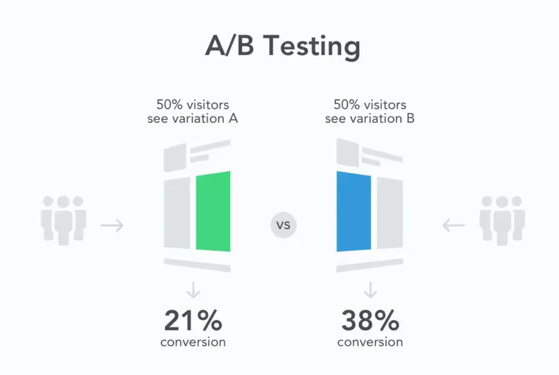
To optimize your Call to Action (CTA) and increase website conversion rates, you must focus on factors such as design, content, placement, and user experience. Continuous testing and measurement help identify the most effective CTA strategy, thereby boosting marketing performance and revenue.
Common CTA mistakes and how to fix them
A Call to Action (CTA) is a crucial element for driving user action on a website. However, if not designed and optimized correctly, a CTA may not deliver the expected results and could even lower your conversion rate. Below are common mistakes when using CTAs and how to fix them to maximize effectiveness.
Unclear or confusing CTAs
A common design error is using unclear or overly wordy content, which leaves users unsure of what to do next. For example, a CTA button with text like “Discover more information” is not specific enough to guide user action.
→ How to fix it
- Use direct, simple, and action-oriented language, such as: “Buy now”, “Sign up for free”, Get your offer now.
- CTA content should inspire specific action and offer clear benefits, for example: Get your free eBook now instead of Learn more.
- Avoid generic, unappealing phrases like Click here or View details.
Unattractive color and design
Some websites use CTA colors that are too muted or lack sufficient contrast with the page background, making them difficult for users to notice. Additionally, designs that are too monotonous or inconsistent with the overall website interface also reduce the effectiveness of the CTA.
→ How to fix it
- Choose high-contrast colors so the CTA stands out from the rest of the content. For example, on a white background, colors like red, orange, or green are more eye-catching.
- Avoid using colors that are too similar to the background or surrounding elements, as this causes the CTA to blend in.
- Use a font size that is large and clear enough to ensure users can easily read and click the CTA.
- Check the design consistency of your CTAs with the overall style of the website to ensure professionalism and brand recognition.
Poor CTA placement, making it hard for users to find
Placing CTAs in illogical positions can cause users to miss or overlook them. Some common mistakes include:
- Placing the CTA at the bottom of the page without clear visual cues to encourage users to scroll down.
- Only placing the CTA in a single location, making it difficult for users to find as they scroll.
- Allowing the CTA to be obscured by other elements on the page, especially on mobile devices.
→ How to fix it
- Place the CTA in the most visible area, especially above the fold (the content visible immediately without scrolling).
- Use multiple strategic locations for CTAs, such as at the top of the page, within the content, and at the end of the article.
- Use a sticky CTA (a fixed call-to-action button) so it remains visible as the user scrolls.
- Test CTA visibility on both desktop and mobile versions to ensure optimal accessibility.
CTAs that are too generic and lack urgency
A CTA that fails to create a sense of urgency or lacks a compelling reason to act immediately can cause users to delay their decision. For example, “Sign up for updates” sounds uninspired and lacks persuasion.
→ How to fix it
- Add time-sensitive elements to encourage quick action, such as: “Only 2 days left – Sign up now to claim your offer”.
- Use strong, action-oriented language to trigger immediate engagement, for example: "Buy now – 50% off today", "Grab the deal – Limited quantity".
- Use scarcity strategies like limited quantities or exclusive offers to make your CTA more compelling.
Optimizing a Call to Action (CTA) goes beyond just good design; it requires clear copy, eye-catching colors, strategic placement, and a sense of urgency to drive action. Avoiding common mistakes and applying these fixes will help improve your conversion rates and boost the effectiveness of your digital marketing strategy.
Conclusion
A Call to Action (CTA) is an essential element in digital marketing, playing a decisive role in guiding users toward a desired action. To optimize CTAs effectively, businesses should focus on eye-catching design, compelling copy, strategic placement, and continuous A/B testing to improve performance.
A powerful CTA not only increases conversion rates but also enhances the customer experience and optimizes marketing campaigns. Start applying these CTA optimization strategies today to turn traffic into action and drive better business results.