

Images play a vital role in attracting users and enhancing the website experience. However, failing to optimize image dimensions can lead to issues such as slow page load speeds, poor display across different devices, and negative impacts on SEO. Updating to standard image dimensions ensures images appear sharp and professional while keeping your website running smoothly.
In 2025, web design trends continue to prioritize image optimization to meet increasingly high user expectations. Let's join Markdao in exploring the latest standard image dimensions to help your website perform more effectively!
Why are image dimensions important in web design?
Images are essential in web design, helping to attract users and create a strong visual impact. However, without optimizing for standard image dimensions, a website can face many issues such as slow loading, layout imbalances, or pixelated images. Below are the reasons why you should adhere to standard image dimensions on your website.

1. Standard images help optimize display and create a beautiful interface
A professional website needs to ensure all design elements are properly sized, especially images. If images are too large, the page layout can become unbalanced. Conversely, if images are too small or do not meet standard dimensions, they may appear pixelated when scaled up, reducing display quality.
2. Improve page load speed
Page load speed is one of the most critical factors affecting user experience and SEO. Large, unoptimized images will cause your website to load slowly, reducing user retention. By using standard image dimensions for your website, images will remain sharp while ensuring fast loading speeds and optimal website performance.
3. Support SEO optimization for images
Google favors websites with SEO-friendly images. Using standard image dimensions helps improve search rankings due to factors such as:
- Smaller image file sizes help the website load faster, reducing bounce rates.
- Sharp, high-quality images that look great on any device, enhancing the user experience.
- Easily optimize ALT tags, file names, and image descriptions to help Google understand your visual content.
4. Improving User Experience (UX/UI)
Users tend to stay longer on a website when images are displayed correctly, beautifully, and clearly. Using standard image sizes for your website keeps the layout clean and the content readable, which in turn boosts conversion rates and customer retention.
Using the correct standard image sizes on your website not only ensures sharp visuals but also improves page load speeds and supports effective SEO. To keep your website running optimally, always adhere to standard image dimensions and use appropriate editing tools to maintain image quality without compromising site performance.
Standard sizes for common website images
Images play a vital role in building a professional website interface. To ensure a beautiful display, optimized load speeds, and an improved user experience, it is essential to use standard image sizes for your website. Below are the common types of images and the standard dimensions you should apply.
Standard image sizes for the website homepage
Images on your homepage are the first key element that captures a user's attention upon arrival. To ensure a professional interface and optimal display, you need to use standard image sizes accordingly.
Homepage slide/banner images: 1260×540 pixels
This size ensures images appear sharp on both desktop and mobile devices, creating a strong impression on customers.
Additionally, other elements on the website homepage should also be adjusted to standard image sizes, especially the logo.
Standard logo sizes for websites:
- Horizontal logo: 250×150 px, 350×75 px, 400×100 px
- Square/vertical logo: 160×160 px
- The logo should be designed to fit the overall interface to ensure brand consistency.
Favicon size (browser icon):
- 16×16 px or 48×48 px – this is the small icon displayed on the browser tab, helping users easily identify the website.
- A favicon helps improve page load speed and assists Google in crawling data more quickly.

Using standard image sizes for your website not only optimizes the user experience but also improves site performance, boosts SEO effectiveness, and enhances brand recognition.
Standard image sizes for articles/blogs
Besides optimizing standard image sizes for your website, images within articles also play a crucial role in conveying content and enhancing the user experience. To ensure they look great and are SEO-friendly, you should follow these standard image dimensions:
- Article illustration images: 300×188 pixels – helps images display clearly without affecting page load speed.
- Product images on the website: 800×500 pixels – ensures images are sharp, allowing customers to easily observe product details.
Product description images:
- Illustration: 300×400 pixels – commonly used in product catalogs or general descriptions.
- Product detail image: 600×800 pixels – allows viewers to easily observe the material, style, and product features.

Using standard image sizes for your website ensures professional content display, boosts SEO performance, and improves user experience across all devices.
Standard sizes for website thumbnails
A thumbnail is a smaller version of an original image, allowing users to preview content without loading the full-sized file. This is a crucial element in web design, especially for e-commerce sites, blogs, and content-sharing platforms like YouTube.
Standard thumbnail sizes for websites
Depending on the platform, the standard thumbnail size will vary:
- Website thumbnail image sizes
When sharing articles on social media (Open Graph Image – OG Image): 1200×630 pixels
2. Thumbnail sizes for YouTube
- Video thumbnail: 1280×720 pixels
- YouTube channel banner: 2560×1440 pixels
- Channel profile picture: 800×800 pixels
- Thumbnail image for suggested videos on the right: 168×94 pixels

To create engaging thumbnails, keep the following in mind:
- Choose appropriate colors: Use a color palette that matches your content and avoid overly harsh or glaring colors.
- Clear, expressive main imagery: If using people, choose photos with strong expressions and focus on the face to grab attention.
- Make text stand out: Text should be clear and easy to read, allowing users to understand the message at a single glance.
- Design consistency: Using a consistent design style makes your brand look more professional and easier to recognize.
Standard product image dimensions for e-commerce websites
In e-commerce web design, product images play a crucial role in attracting customers and increasing conversion rates. To ensure beautiful display, fast loading speeds, and the best user experience, you need to use standard image dimensions for each type of product image on your website.
1. Product thumbnail – 800×500 px
- This is the main image displayed on product category pages or product detail pages.
- It should have high resolution with a white or transparent background to make the product stand out.
- Common formats: JPEG, PNG, or WebP to optimize quality and page loading speed.
2. Detailed product image – 600×800 px
- This is the image displayed when customers click on a product to view details.
- It needs to be high-resolution so customers can zoom in without the image becoming pixelated.
- Capture from multiple angles to give customers a comprehensive view of the product.
3. Small product description image – 300×400 px
- Typically used as a secondary image on product detail pages or within product image galleries.
- The smaller size helps the website load faster, improving the user experience.
- Used to display secondary details, different color versions, or additional product features.

Notes on optimizing product images for e-commerce websites
- Reduce image file size: Use tools like TinyPNG or Squoosh to compress images without sacrificing quality.
- Use SEO-friendly image naming: Image filenames should include relevant keywords, for example: white-tshirt-800x500.jpg.
- Use optimized formats: WebP helps reduce file size while maintaining high image quality.
- Consider the background: A white background helps the product stand out and avoids distracting the viewer.
By using standard image dimensions for e-commerce websites, you can enhance the customer shopping experience while optimizing your site's SEO performance.
Important considerations for using images on your website
Below are key points to keep in mind when using images on your website to ensure they look great and are optimized for SEO.
1. Optimize image file size to improve page loading speed
Large image files slow down page loading speeds, which negatively impacts user experience and SEO rankings. You should use image compression tools like TinyPNG, Squoosh, or ImageOptim to reduce file size without compromising image quality.
The WebP format is an optimal choice for reducing file size while maintaining high quality.
2. Use the appropriate image format (JPEG, PNG, WebP)
- JPEG: Suitable for colorful images, product photos, and illustrations.
- PNG: Best for images requiring transparency, such as logos and icons.
- WebP: A modern format that helps optimize standard image dimensions while maintaining the best possible quality.
3. Name your image files with keywords to support SEO
- Image filenames should not be in the default format like IMG1234.jpg.
- You should use filenames that contain relevant keywords and describe the image content, for example: standard-image-sizes-for-websites.jpg.
This helps search engines understand the image content and improves your website's SEO.
4. Use ALT tags and image descriptions to help Google understand image content
The ALT (Alternative Text) tag helps describe image content when a browser cannot display the image. Google uses ALT text to understand image content and display them in Google Image Search.
You should write ALT text that includes keywords, such as: "Standard image sizes on websites help optimize page load speed and SEO."
5. Ensure images display well on mobile devices
- Websites currently receive more traffic from mobile than desktop, so images need to be optimized to display well on all screens.
- Use responsivedesign to automatically adjust image sizes based on the device.
- Preview on different devices to ensure images are not pixelated or incorrectly cropped.
Some tools for image resizing
Design software
- Photoshop – Professional photo editing software that supports a wide range of design tasks.
- Illustrator – Suitable for vector graphics, logos, and banner design.
- Canva – An intuitive design tool with many beautiful, easy-to-use templates.
Online photo editing tools
- TinyPNG & ImageOptim – Reduce image file size without compromising quality.
- Squoosh – A fast online image compression tool that supports multiple formats.
- Fotor – Edit photos online with a variety of beautiful filters and effects.
- Pixlr – An online photo editing tool with an interface similar to Photoshop.
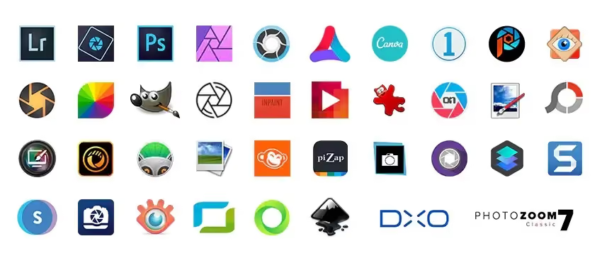
There are many effective tools available for resizing images. Canva is a simple choice with many pre-made templates, while Photoshop allows for in-depth editing. If you want to reduce file size without sacrificing quality, you can use TinyPNG or ImageOptim. Additionally, Squoosh is a fast online compression tool that makes image optimization easy.
Conclusion
Optimization standard image dimensions not only help your website look visually appealing and load faster, but they also contribute to a better user experience and support effective SEO. Choosing the right standard image sizes ensures that your website visuals remain sharp, professional, and compatible across all devices. Don't forget to regularly update and adjust your image dimensions to keep up with new trends, ensuring your website runs smoothly and attracts customers as effectively as possible.