
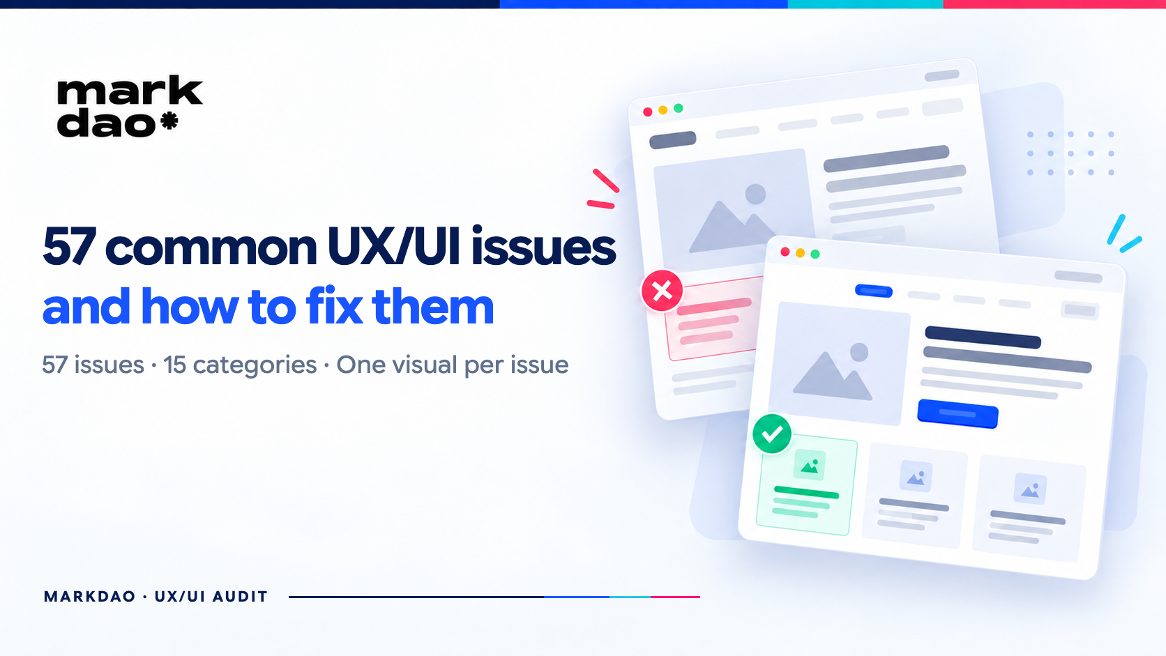

A survey by the Baymard Institute of hundreds of major e-commerce websites shows that most reasons users abandon a site aren't about "good" or "bad" design, but rather small, seemingly insignificant details: a field with the wrong format, a button with an unclear state, or an unnecessary confirmation step. This article compiles the 57 most common website UX/UI errors, categorized into 15 groups based on widely recognized industry research: Nielsen Norman Group (NN/g), the Baymard Institute, Jon Yablonski’s Laws of UX, and WCAG. Each error includes an explanation of why it is harmful and specific instructions on how to fix it.
1. Navigation & Information Architecture Errors
Navigation is where users form their first impression of whether a website "understands" them. Most errors in this category stem from businesses designing menus based on internal logic rather than how users actually search for information. Good navigation helps users know where they are, where they can go, and how to get back. This group should be checked first if the website has many services, categories, or content layers.
1.1 Too many items in the top-level menu
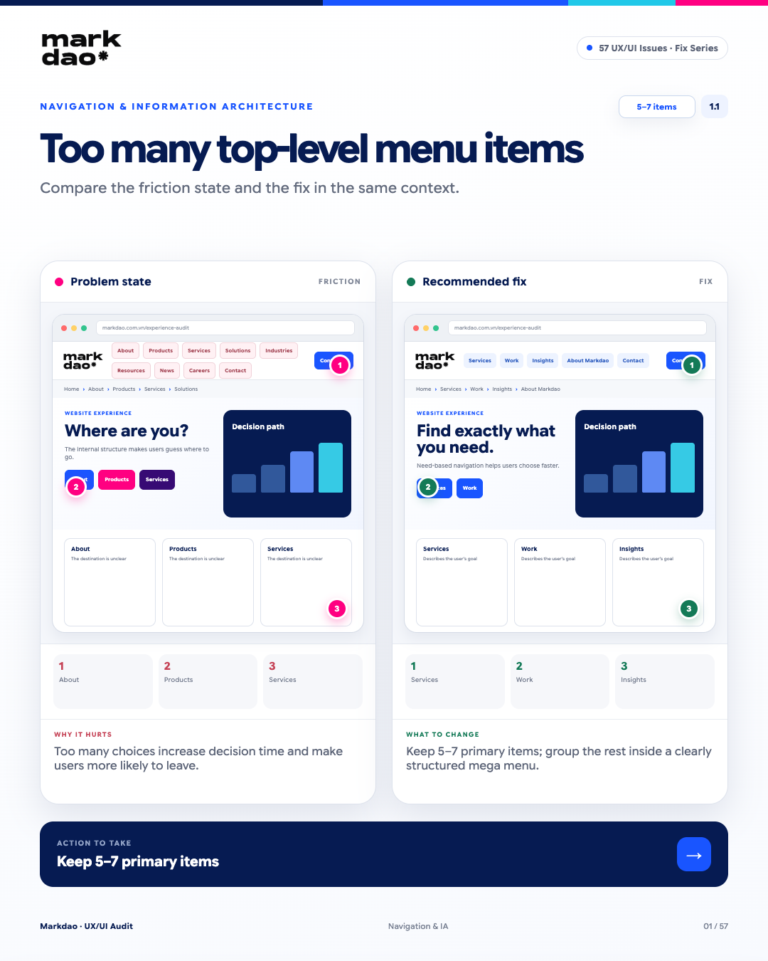
According to Hick’s Law, the time it takes to make a decision increases with the number and complexity of choices. The more items a menu has, the longer it takes for users to decide what to choose, especially when the items have similar content or names.
Signs to look for:
- The top-level menu has too many items, making it difficult to scan quickly on screen.
- Many items have overlapping content or meanings, making them hard to distinguish.
- Important content is pushed down or hidden deep within multiple menu layers.
- Users have to open multiple dropdowns or mega menus to find the content they need.
- There is no clear priority among navigation groups.
Impact: Too many choices in the main navigation increase cognitive load, making it difficult for users to determine their next step and find important content.
How to fix: Keep about 5–7 main navigation groups at the top level where appropriate. Remaining content should be organized into a mega menu or dropdown, grouped according to user needs and journeys.
Post-fix check: Can users quickly answer: “What am I looking for and where should I click?”
Benchmark: About 5–7 top-level navigation items, with clear, distinct labels that do not overlap in meaning.
1.2 Information Architecture (IA) does not match how users categorize information
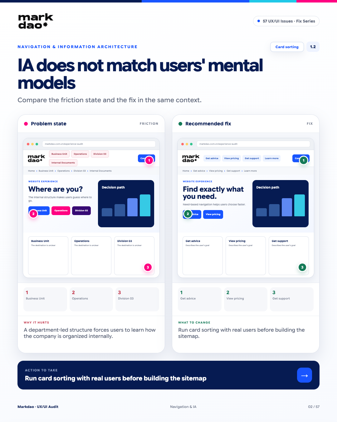
This violates the Match Between System and the Real World principle from the Nielsen Norman Group: the interface should use language, categorization, and mental models familiar to the user, rather than reflecting the company's internal organizational structure.
Signs to look for:
- The menu is organized by department or internal structure rather than user needs.
- Menu items use internal jargon, abbreviations, or department names that are confusing to users.
- Users must understand how the business is organized to guess where content is located.
- A single user need is scattered across multiple departments or different sections.
- Users often have to ask or search to determine where they need to go.
Impact: Organizing by internal structure increases cognitive load, forcing users to understand "how the business is organized" instead of just knowing "what they want to do".
Solution: Build the sitemap based on user needs, tasks, and mental models. Conduct card sorting with target users to validate content grouping and naming before finalizing the navigation structure.
Post-fix verification: Users can find the right content based on their needs without needing to know which department is responsible..
Checkpoints: Results card sorting and the user's ability to correctly identify content/tasks from the menu.
1.3 Multi-level website lacking breadcrumbs
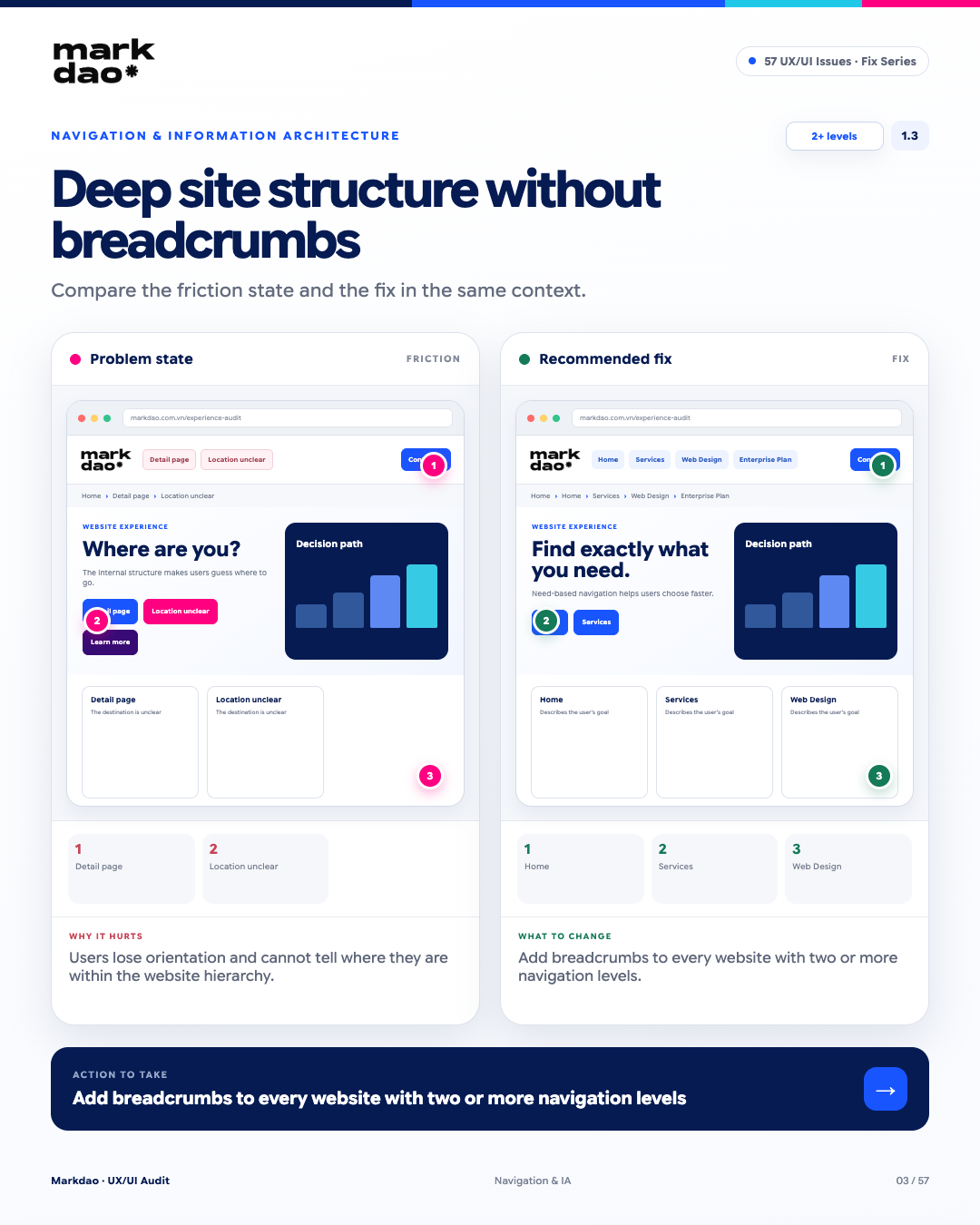
When a website has a multi-level structure but lacks breadcrumbs, users struggle to determine their current location and navigate back to previous levels. This diminishes the user's navigation and journey control .
Signs to look for:
- The website has a structure of two or more content levels, but subpages do not display their position within the hierarchy.
- Users are unaware of which category or content level they are currently in.
- To return to a previous category, users must use the Back button or reopen the main menu.
- Subpages have multiple levels but lack a way to navigate directly back to the parent level.
Impact: Users easily lose their way, struggle to understand the relationship between the current page and higher-level pages, and are forced to perform extra actions to return to previous content.
How to fix: Add breadcrumbs to pages with multi-level structures, clearly showing the path from Home → Category → Subcategory → Current Page. Breadcrumbs should have a consistent order and labeling.
Post-fix verification: Users can immediately determine “Where am I?” and return to any parent level without needing to use the Back button.
Checkpoint: Apply when the website has two or more levels of content/navigation.
1.4 Back button clears input state
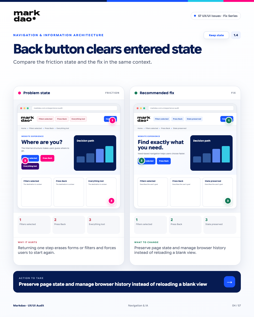
When users click Back to return to the previous page, the system should restore the previous state instead of reloading the page to its default state. Losing entered data or selected filters disrupts the user journey and forces them to repeat actions.
Signs to look for:
- Users have entered data into a form but lose it when returning to the page.
- Filters, selections, or scroll positions are reset after clicking Back.
- The page returns to its default state instead of the state the user was just interacting with.
- Users must re-enter form data or reset filters from scratch.
Impact: Users lose their progress, which disrupts their journey and may lead them to abandon the task due to the need for rework.
Fix: Maintain page state and user-entered data when navigating Back/Forward. Properly manage browser history and page state, avoiding reloads or resetting the page to its default state.
Verification: Select a filter → navigate to another page → click Back → the previous filter and state remain unchanged.
Benchmark: Maintain the correct state when the user uses Back/Forward.
1.5 Menu labels use internal terminology
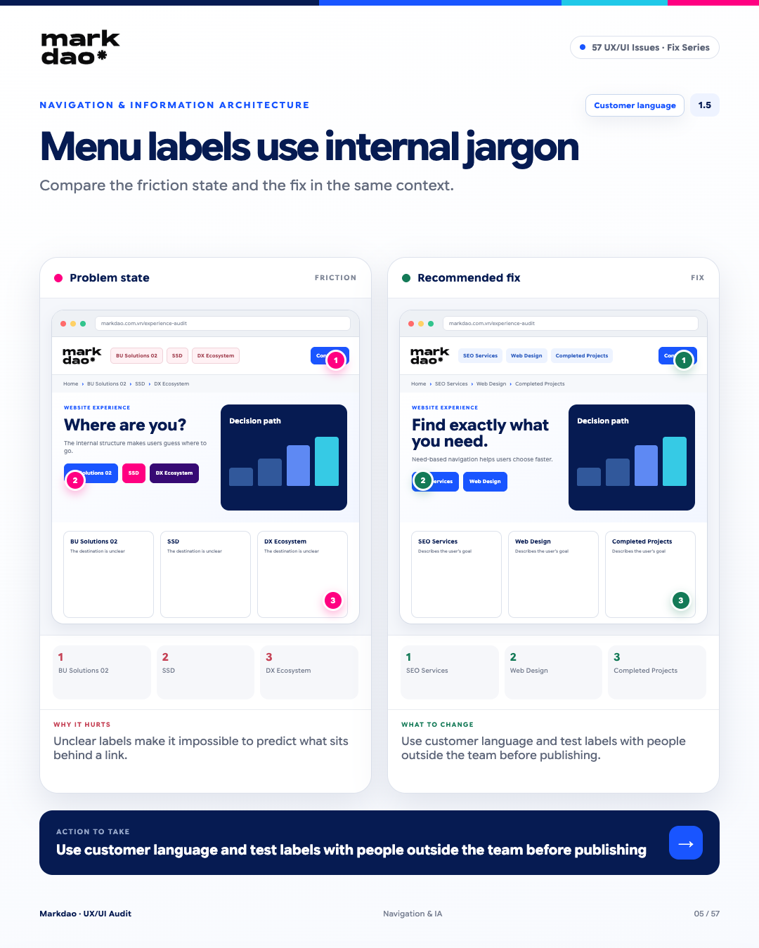
Navigation labels should use language familiar to the user, rather than internal jargon or terms used only within the company. A good label should help the user guess the content before you click.
Warning signs:
- The menu uses abbreviations, project codes, or internal jargon that users aren't familiar with.
- Labels don't reflect how users typically refer to or search for content.
- Users have to click through multiple items to figure out what they need.
- Labels are conceptual but don't clearly indicate what lies behind them.
- Users interpret the same label in different ways.
Impact: Confusing labels increase cognitive load, prevent users from predicting what's behind a link, and slow down the information-seeking process.
How to fix: Use the customer's language and prioritize common, easy-to-understand terms. Test labels with target users or people outside your team before publishing to verify clarity and predictability.
Post-fix check: Show users the label and ask: “What do you expect to find when you click this?” If most users guess correctly, the label is clear.
Checkpoints: Customer language + ability to infer content correctly.
2. Forms & Input Fields Errors
Forms are where intent is converted into data, registrations, or transactions. They represent the highest drop-off point in the entire website journey, especially during registration, checkout, or identity verification. A single ambiguous label, an unfamiliar format, or a delayed error message is enough to make users abandon the process.
2.1 E-commerce site uses an expiration date format that doesn't match physical cards
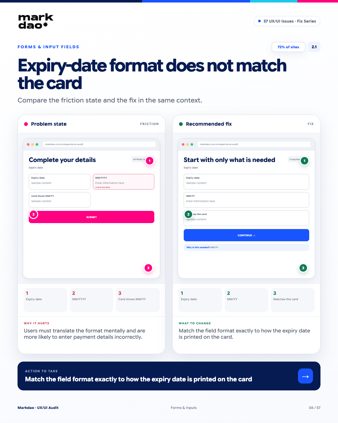
The expiration date field should use the exact format that users see on their payment cards. If a card displays MM/YY but the form requires MM/YYYY, users have to manually convert the format, which increases the likelihood of input errors.
Signs to look for:
- The form requires an expiration date format that differs from the one printed on the card.
- The placeholder or instructions request MM/YYYY while the card displays MM/YY.
- Users have to think or convert YY to YYYY themselves before entering the data.
- The form rejects a valid value simply because it differs from the format displayed on the card.
Impact: Users must perform an extra step to convert information, increasing friction and the risk of entering incorrect payment data.
How to fix: Match the field format, placeholder, and validation with the common expiration date format printed on cards. If multiple formats need to be supported, allow the system to normalize the data automatically instead of forcing users to convert it.
Post-fix verification: Check the expiration date on the card → enter it directly into the field → no formatting conversion needed and no error messages.
Checkmark: The field format must match the format displayed on the card.
2.2 Multi-column form layouts for unrelated fields
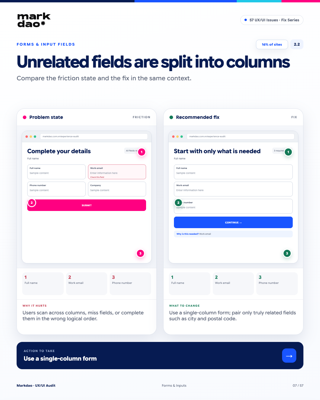
According to the Baymard Institute, multicolumn layout in forms can make it difficult for users to determine the input order, especially when the fields have no clear relationship. For most forms, a single-column layout helps create a more natural flow for reading and data entry.
Signs to look for:
- Independent fields are placed side-by-side despite having no direct relationship.
- Users have to scan back and forth between multiple columns to identify the next field.
- The visual reading order is unclear, especially on desktop screens.
- Important fields are easily overlooked or filled out in the wrong order.
Impact: Multi-column layouts increase cognitive load, making it harder for users to determine the sequence of actions and increasing the risk of missing or incorrectly entering information.
How to fix: Prioritize single-column layout for independent fields. Only place multiple fields on the same row when they have a direct and logical relationship, such as City + Zip Code.
Post-edit check: Users can fill out the form from top to bottom in a clear flow, without needing to think about which field to fill in first.
Checklist: Single-column for independent fields; multi-column only when fields have a clear logical relationship.
2.3 Placeholders replacing labels, disappearing as soon as the user starts typing.
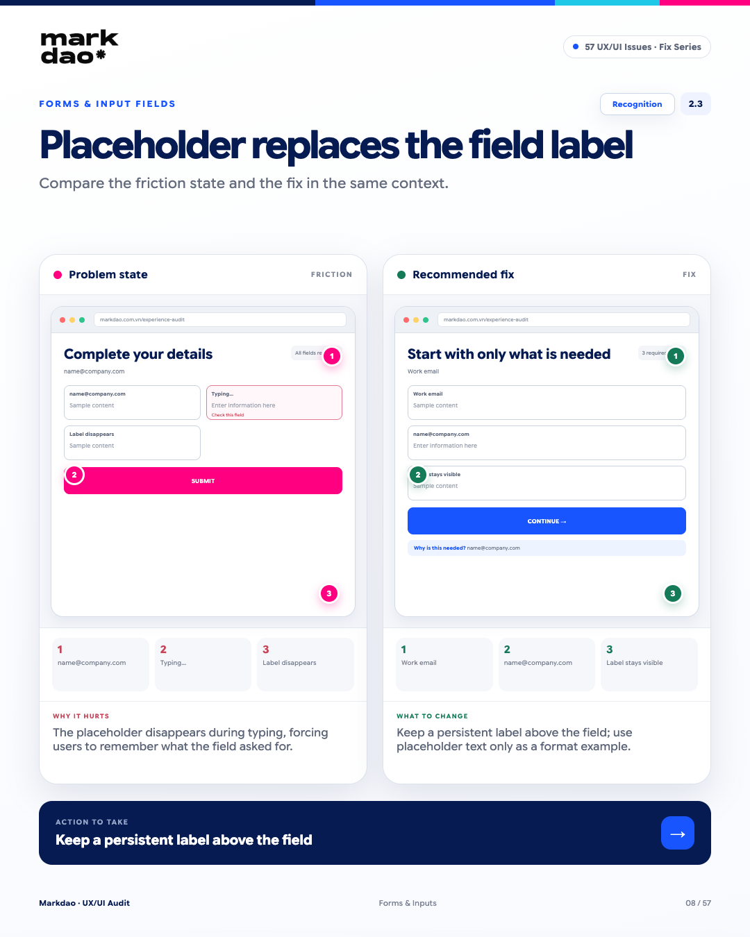
Using placeholders instead of labels causes the field description to disappear as soon as the user starts typing. This goes against the Recognition Rather Than Recall principle from the Nielsen Norman Group, as users have to remember what information the field is requesting instead of having that information always visible for reference.
Signs to look for:
- Fields that only have placeholders without a permanent label.
- Placeholders that disappear as soon as the user starts typing.
- When a form has many fields, it is difficult for users to re-verify the purpose of a field they have already filled out.
- After switching tabs, navigating back, or being interrupted, users no longer have information to identify what the field requires.
Impact: The information identifying the field disappears during input, increasing cognitive load and forcing users to recall instead of recognize.
Fix: Place a persistent label above or beside the field. Only use placeholders to illustrate formats or provide examples; do not use them as the sole label.
Verification: Enter data → switch to another field → the field label remains visible and the user can still identify the required input.
Benchmark: Recognition over recall.
2.4 Error indication only after full form submission
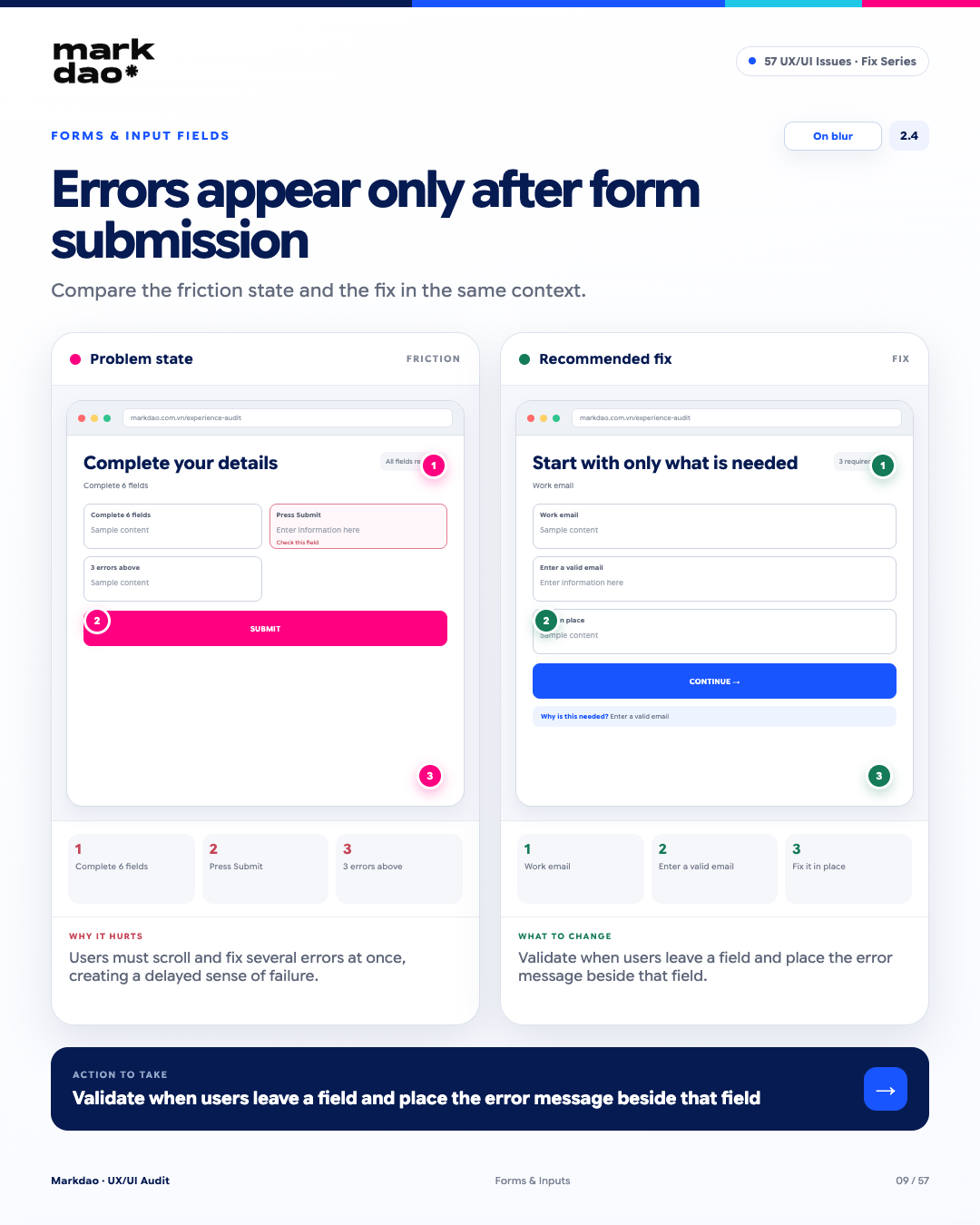
Displaying errors only after the user submits the entire form forces them to go back and locate each incorrect field, which is especially difficult with long forms. Validation should provide feedback at the right time and in the right place, but avoid showing errors too early before the user has finished their input.
Signs to look for:
- Users fill out multiple fields only to discover errors after clicking Submit.
- Error messages are located far away from the field that needs fixing.
- Multiple errors appear simultaneously in different locations.
- Users have to scroll up and down to find each field with an error.
- The erroneous field is not focused or clearly highlighted.
Impact: Users receive feedback too late, forcing them to backtrack and perform multiple corrections, which increases frustration and the risk of form abandonment.
How to fix: Validate at the appropriate time, prioritizing when the user leaves the field (on blur) for fields that can be checked immediately. Display error messages right next to the field, clearly stating what the error is and how to fix it.
Verification: Enter email → leave the field → immediately recognize that the email format is incorrect and be able to fix it directly in the field.
Checkpoints: On blur + error displayed right at the field that needs fixing.
2.5 CAPTCHA is too difficult or has too many steps
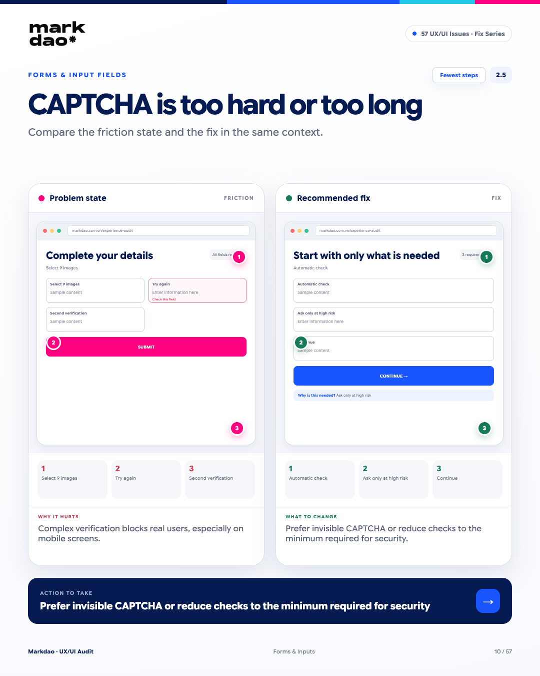
CAPTCHA is a layer of protection against bots, but if it requires too many actions or repeated verification, it can become a barrier to completing tasks. This issue is often more apparent on mobile, where selecting images, entering characters, or verifying multiple times is less convenient.
Signs to look for:
- Users have to perform multiple image selections or character entries to complete verification.
- CAPTCHA requires retries or multiple verifications even when the user has performed the task correctly.
- Verification actions are difficult to perform accurately on small screens.
- CAPTCHA appears for low-risk actions that do not require a high level of verification.
Impact: Complex verification processes increase friction, making it easy for real users to give up before completing an action, especially on mobile.
How to fix: Prioritize automatic verification or low-interaction CAPTCHA. Only require users to verify when the system detects a risk, and reduce the number of steps to the minimum necessary for security.
Post-fix check: Perform task → verified automatically if risk is low; only require verification when necessary → continue to complete the task.
Benchmark: The fewest verification steps possible while still meeting security requirements.
2.6 KYC form does not explain the reason for collection
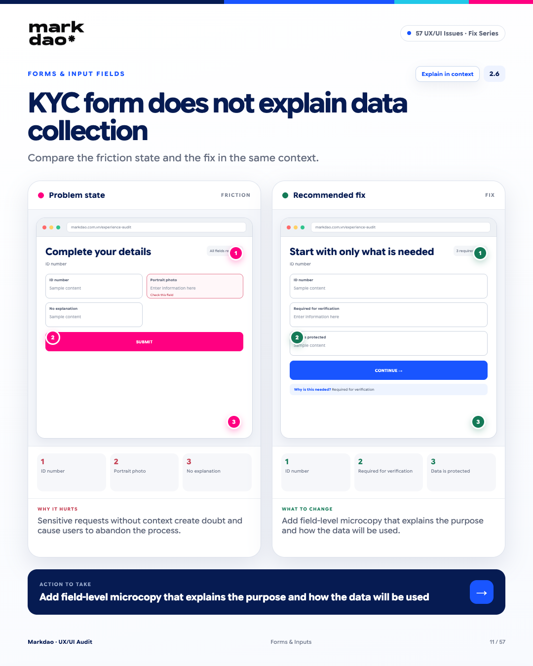
When a KYC form requests sensitive information but does not explain why it is needed and how the data will be used, users may feel insecure or fail to understand the purpose of the request. Short microcopy placed directly at the field provides the right context at the moment the user needs to make a decision.
Signs to look for:
- The form requests ID numbers, portraits, or personal information without any explanation.
- Users do not know the purpose for which the information is being collected.
- Information about security or data usage only appears on a different page or within lengthy terms and conditions.
- Sensitive fields lack supporting microcopy at the point of entry.
Impact: Requesting sensitive data without context increases hesitation and privacy concerns, thereby increasing the risk of users stopping or abandoning the KYC process.
How to fix: Add microcopy directly at the field or before a group of sensitive fields, briefly explaining the reason for collection, the purpose of use, and relevant security information. The content must be accurate and consistent with actual policies.
Post-fix check: Users look at the field → understand why the information is requested and what the data is used for without having to leave the form to find information.
Checkpoints: On-the-spot explanation + purpose-driven data usage.
3 Checkout errors and website conversion flows
Every unnecessary step in a conversion flow can become a drop-off point. The goal is not to cut steps at all costs, but to eliminate friction that does not add value, security, or compliance. This is also the category of errors that directly impacts revenue, as every extra step in the checkout process can cause users to leave.
3.1 Forcing account creation before showing prices
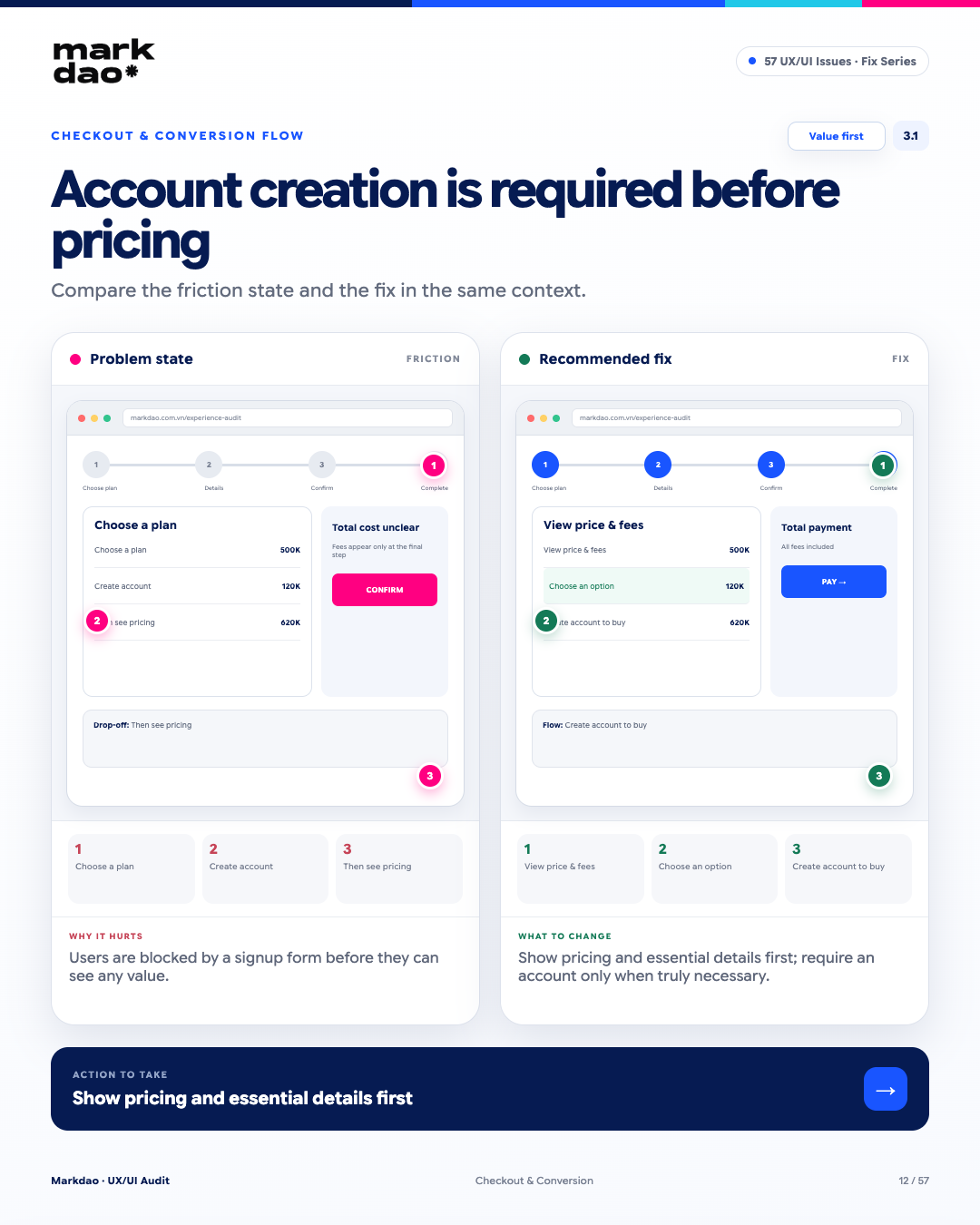
Requiring users to create an account before they can see prices, fees, or important product/service information creates friction right at the start of the journey. Users do not yet have enough information to evaluate the value but are already required to provide data or complete an additional registration step.
Signs to look for:
- Users must create an account before viewing prices or fees.
- Important product/service information is locked behind a registration form.
- Users cannot compare or evaluate options before registering.
- A registration form appears before the user has a clear reason to proceed.
Impact:
Users must perform a high-friction action before receiving the information needed to make a decision, increasing the likelihood of abandoning the journey.
How to fix: Apply the principle of Value First: Allow users to view prices, fees, and essential information upfront. Only require account creation when it is truly necessary for the next step, such as making a purchase, saving information, or using personalized features.
Post-fix check: View prices & fees → compare/select options → only create an account when the next step truly requires it.
Checkpoint: Value First + Account Later.
3.2 Hiding additional fees until the final checkout step
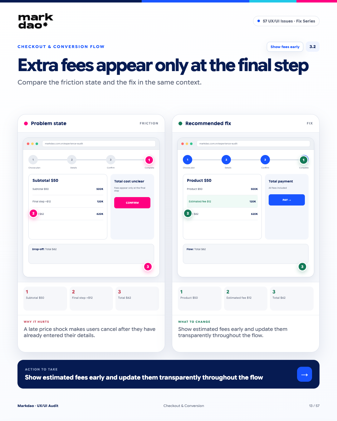
When fees only appear at the final step, users may experience “sticker shock” because the total cost is significantly higher than their initial expectations. This issue is even more severe when users have already spent time entering their information and are close to completing the transaction.
Signs to look for:
- Product prices are displayed, but additional fees are not disclosed.
- The total amount is only updated at the payment or final confirmation step.
- Additional fees appear unexpectedly after the user has already entered their information.
- Users cannot estimate the total cost before starting the checkout process.
Impact: Unexpected additional costs lead to sticker shock, causing users to reconsider their decision at the final step and potentially cancel the transaction.
How to fix: Display prices and estimated fees as early as possible. Update the total cost transparently whenever changes occur, and clearly explain each fee before the checkout step.
Post-fix check: Product price → estimated fees → total cost is estimated and updated before the user reaches the checkout step.
Benchmark: Early cost transparency + no surprise fees at the final step.
3.3 Multi-step flow without a progress bar
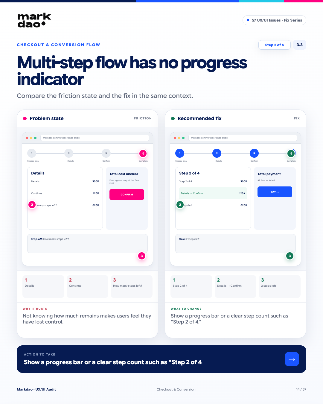
In a multi-step flow, users need to know where they are and how much further they have to go. Without a progress indicator, it is difficult for them to estimate the time required and they easily lose a sense of control over the journey.
Signs to look for:
- The flow has multiple steps but does not indicate the total number of steps.
- Users do not know which step they are currently on.
- It is impossible to estimate how much time or how many steps remain to complete the process.
- Steps are displayed sequentially but without a progress indicator.
Impact: Uncertainty about how much is left reduces the sense of control, especially when a flow requires a lot of information or consecutive actions.
Fix: Display a progress bar or clear step count, such as “Step 2/4,” and indicate the key stages of the journey if applicable.
Verification: Users can look at the flow and immediately answer: “Where am I?” and “How many steps are left?”
Checklist: Step 2/4 + clear progress indicator.
3.4 Deposit/withdrawal process has too many redundant confirmations
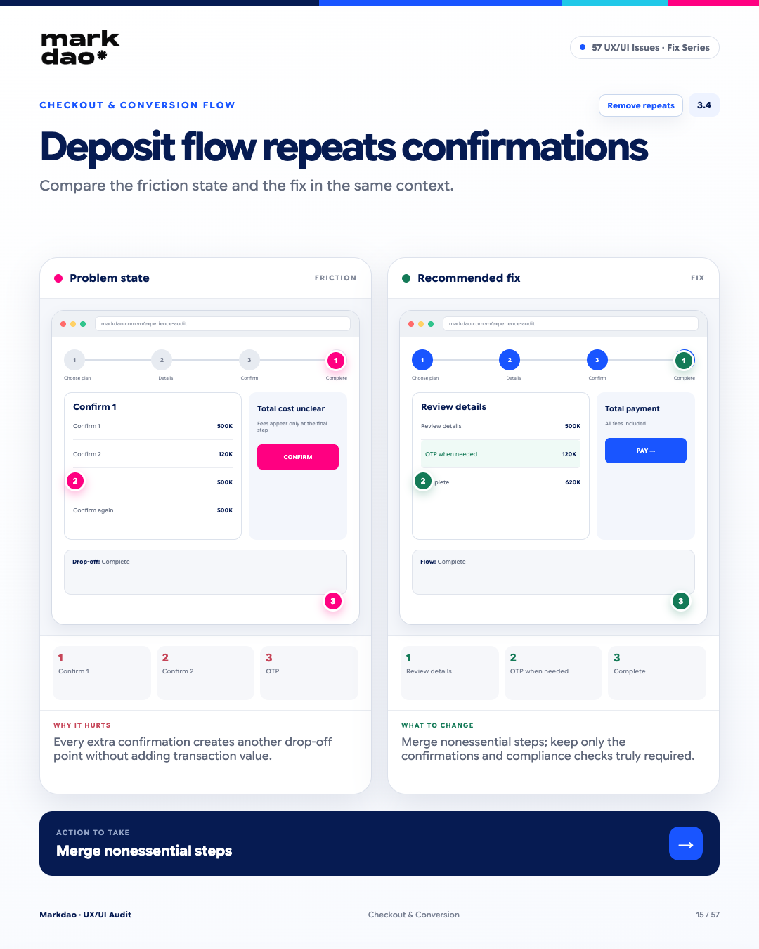
Every additional confirmation step is a new drop-off point, especially for small transactions where the time and effort required from the user are disproportionate to the value received. The flow should only retain steps that are strictly necessary for the transaction, security, or compliance.
Signs to look for:
- Users have to confirm the same information multiple times.
- There are multiple consecutive “Confirmation” screens that add no extra value.
- OTP or authentication is requested repeatedly even without significant changes.
- The flow could be completed in fewer steps but still retains intermediate screens.
Impact: Each additional confirmation step increases time and effort, creating friction without significantly improving transaction outcomes.
Solution: Review each step based on the principle: “Is this truly necessary?”. Consolidate redundant steps and retain only those required for transaction, security, or compliance purposes.
Post-fix check: Review information → OTP only when necessary → Complete.
Benchmark: Remove unnecessary steps + ensure every step has a clear purpose.
3.5 Editing a previous step clears all progress
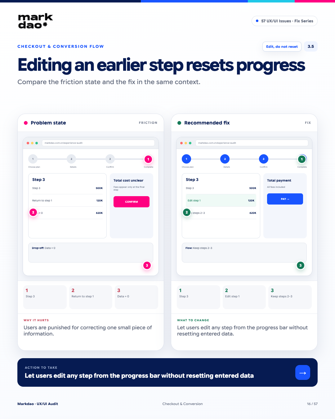
Figure 3.5. Illustration of the “Editing a previous step clears all progress” error and its solution.
This is an issue of User Control and Freedom: users need the ability to go back and edit information without being forced to restart the entire flow. When a minor change causes entered data to reset, users feel as though they are being “punished” for wanting to correct a mistake.
Signs to look for:
- The user is at step 3 but must return to step 1 to adjust information.
- Data from completed steps is deleted or reset.
- The user is forced to re-enter information after navigating back.
- There is no way to directly edit a specific step without affecting the others.
Impact: Losing entered data increases effort, time, and frustration, especially in long flows.
Fix: Allow users to edit step-by-step directly via a progress bar or Edit button, while retaining data from unchanged steps.
Verification: Currently at step 3 → edit step 1 → data in steps 2 and 3 remains intact.
Checklist: Edit does not reset data.
4 CTA & Button Errors
A CTA (Call to Action) is the transition point from intent to action. A weak CTA can undermine the effectiveness of the entire optimized experience leading up to it. A good CTA should clarify the primary action, the outcome after clicking, and the reason if it cannot be performed yet. Proper design helps reduce hesitation and encourages users to act at the moment of decision.
4.1 Multiple competing CTAs on the same screen
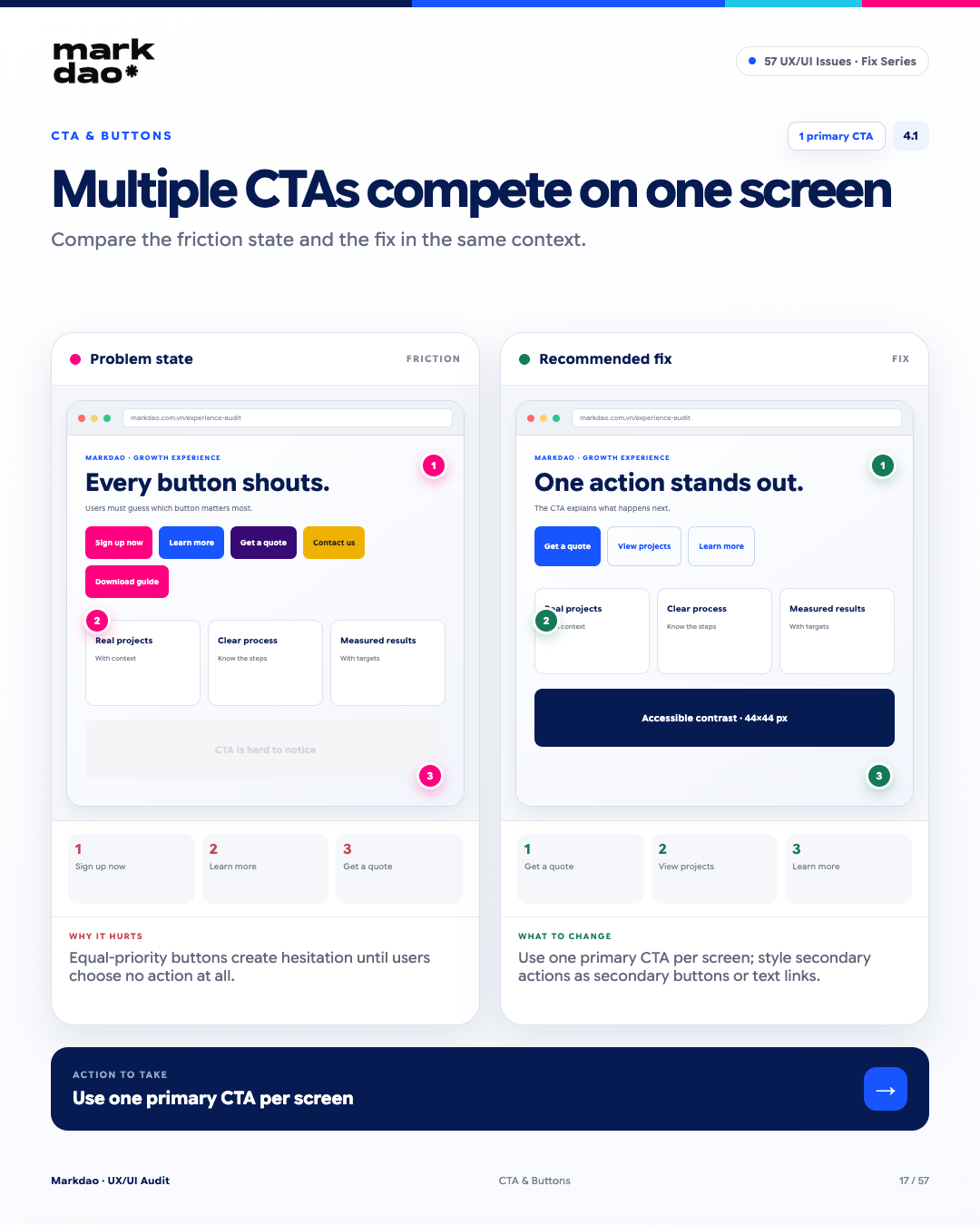
Figure 4.1. Illustration of the “Multiple competing CTAs on the same screen” error and how to fix it.
According to Hick’s Law, when there are too many equal choices, decision-making time increases and users struggle to determine the next action. Each screen should have one Primary CTA clear, secondary actions should be visually hierarchical.
Signs:
- A screen with multiple CTAs of the same size and prominence.
- Buttons that direct users to different actions without a clear priority.
- Users struggle to identify the primary action to take.
- Secondary CTAs compete directly with the primary CTA in terms of color, size, or placement.
Impact: Equal-weight options increase decision time and may cause users to hesitate or take no action at all.
How to fix: Define one primary CTA based on the goal of each screen. Use secondary buttons or text links with lower prominence for secondary actions.
Post-fix check: Look at the screen and immediately identify: “What is the main action I should take?”
Benchmark: 1 primary CTA + clear hierarchy for secondary CTAs.
4.2 CTAs that do not clearly state the action and result
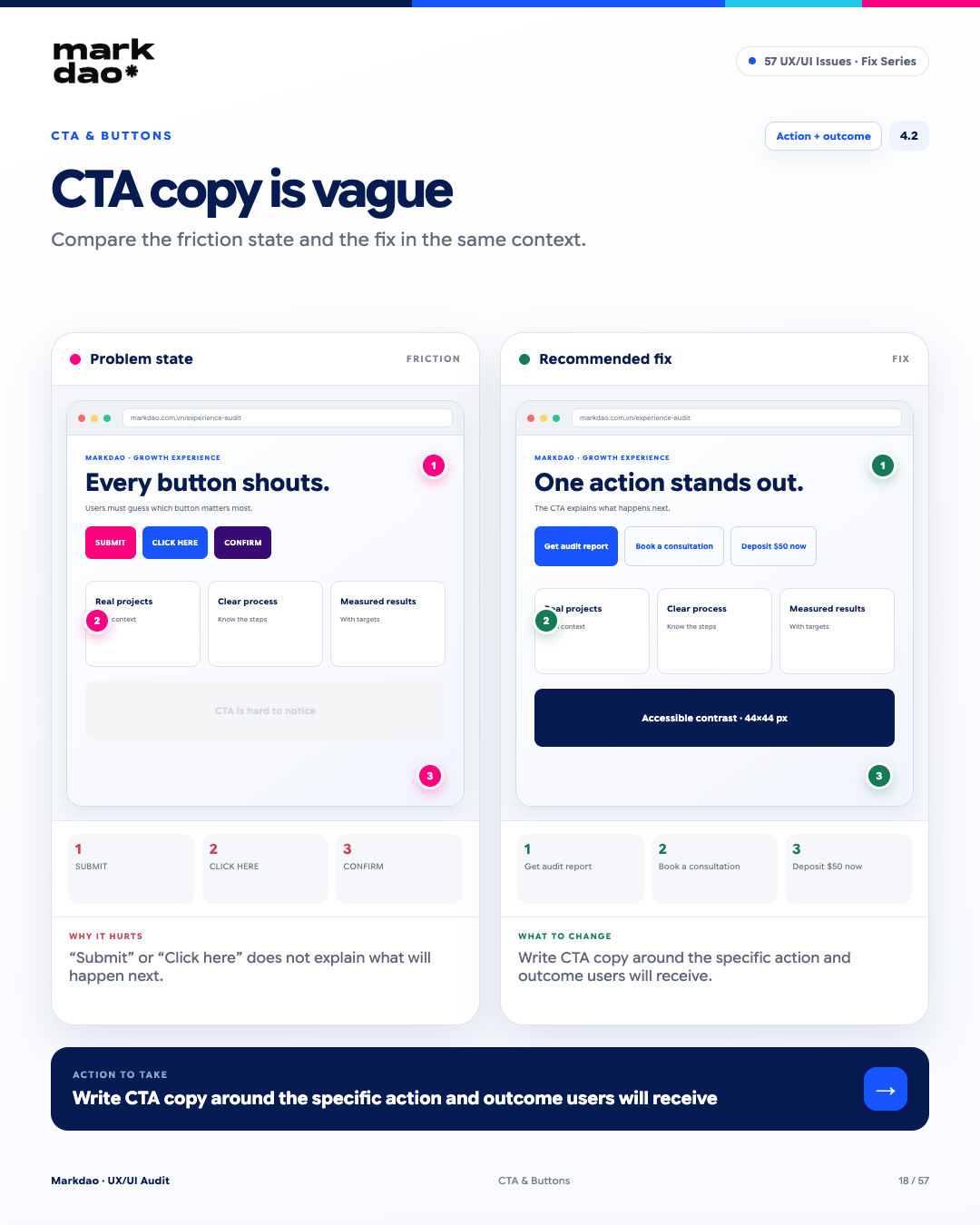
Figure 4.2. Illustration of the “CTA does not clearly state the action and result” error and how to fix it.
The CTA is the point where a user transitions from intent to action. Generic labels like “Submit,” “Click here,” or “Confirm” do not indicate what happens or what they get after clicking, which makes users hesitate right before the moment of decision.
Signs to look for:
- CTAs use generic labels like “Submit”, “Click here”, or “Confirm”.
- Users cannot predict the outcome after clicking.
- The CTA does not clearly describe the action or the value received.
- The same CTA label is used for multiple different actions.
Impact: CTAs lacking information reduce confidence and increase hesitation right before the user takes action.
How to fix: Write CTAs based on specific action + the result the user receives, instead of describing generic operations.
Post-fix check:
“Get audit report” → know they will receive a report.
“Book a consultation” → know they will schedule an appointment.
“Deposit $500 now” → clearly know the action and the amount.
Checklist: Action + Outcome.
4.3 Insufficient touch target size or spacing
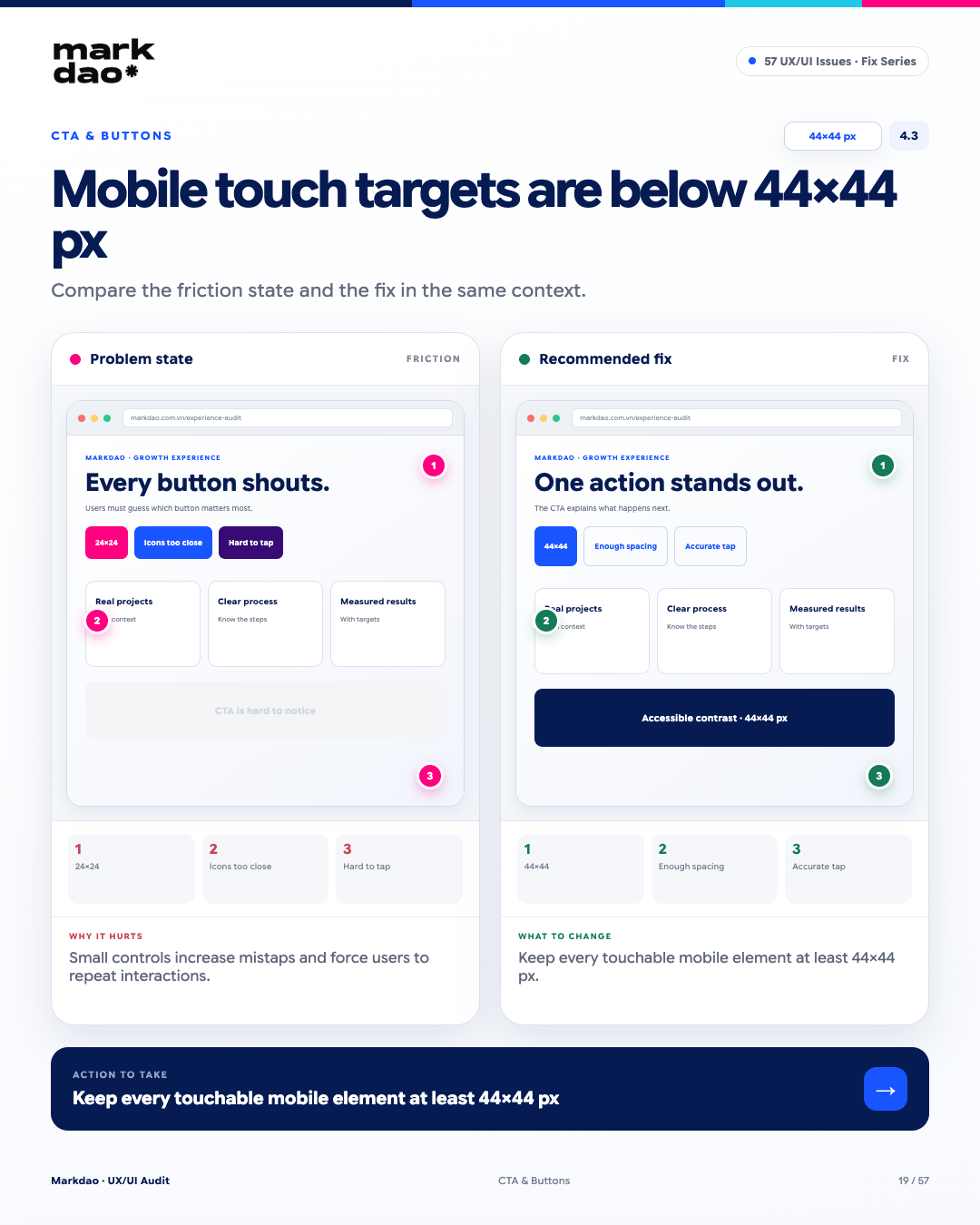
Figure 4.3. Illustration of the “Insufficient touch target size or spacing” error and how to fix it.
According to Fitts’s Law, the smaller or closer together targets are, the harder it is for users to tap them accurately. On mobile, touch targets that are too small or placed too close together often lead to accidental taps and force users to repeat their actions.
Signs to look for:
- Icons or buttons with a touch area smaller than the required display size.
- Clickable elements placed too close to one another.
- Users frequently tapping the wrong adjacent element.
- Requiring multiple taps to successfully trigger an action.
Impact: Small or overcrowded touch targets increase interaction errors, especially on mobile devices and when users are navigating quickly.
How to fix: Ensure touch targets are at least 24 × 24 CSS px as per WCAG 2.2, or meet the requirements for spacing between targets. For primary CTAs on mobile, it is recommended to prioritize a touch area of approximately 44 × 44 px for a more comfortable user experience.
Post-fix verification: Tap each target → no need for precise alignment on the icon → no accidental triggering of adjacent elements.
Benchmark: WCAG: ≥24 × 24 CSS px + 44 × 44 px is the usability recommendation.
4.4 CTA buttons lack sufficient contrast with the background
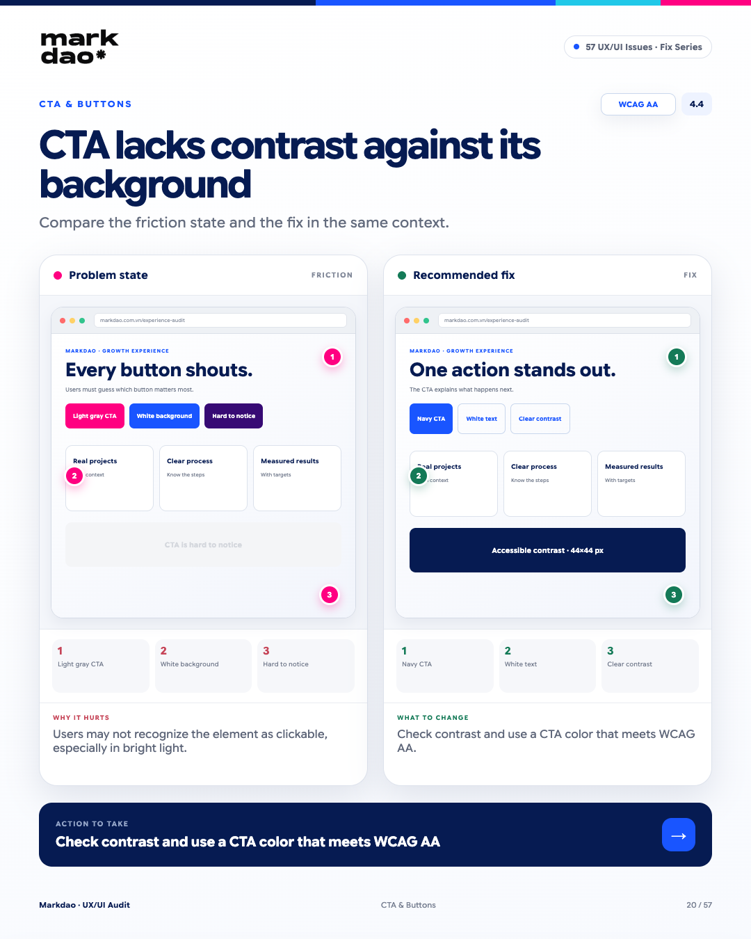
Figure 4.4. Illustration of the "CTA button lacks sufficient contrast with the background" error and how to fix it.
Low contrast reduces the distinguishability between the CTA and the background, making it difficult for users to identify interactive elements. This issue is particularly pronounced in bright lighting or for users with limited vision.
Signs to look for:
- The CTA color is too similar to the background color.
- The button text and background are difficult to distinguish with the naked eye.
- The button does not stand out from surrounding elements.
- Users have to look closely to identify which elements are clickable.
Impact: Poorly identifiable CTAs reduce discoverability and interaction, causing users to potentially overlook the intended action.
How to fix: Check the contrast between the text, the CTA background, and related elements. Ensure colors meet WCAG AA standards and do not rely solely on color to indicate interactivity.
Post-fix check: CTA stands out from the background → text is easy to read → clickable area is immediately recognizable.
Benchmark: WCAG AA: ≥4.5:1 for normal text.
4.5 CTA button is disabled without explanation
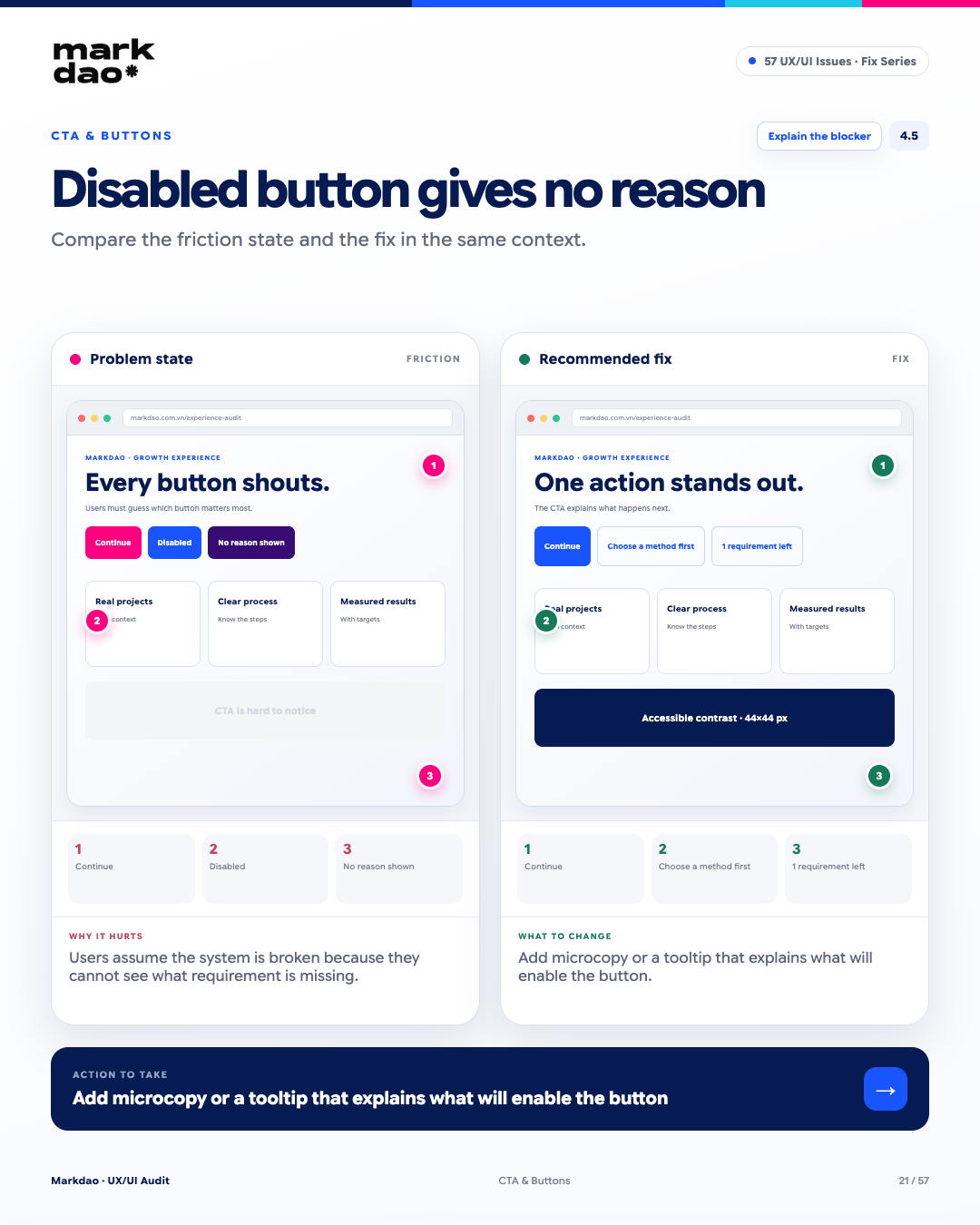
Figure 4.5. Illustration of the "CTA button is disabled without explanation" error and how to fix it.
When a button is disabled without an explanation, users do not know what requirements are missing to proceed.This easily leads them to believe the system is broken rather than knowing what they need to do.
Signs to look for:
- The "Continue" CTA is disabled without any guidance.
- Users do not know what information or action is missing.
- There is no status indicator or message specifying which conditions have not been met.
- Users have to try multiple times or figure out the cause on their own.
Impact: A lack of feedback leaves users feeling lost, thinking the system is broken, and potentially abandoning the flow.
How to fix: Display a short microcopy or tooltip explaining the missing requirements and how to complete them to activate the CTA.
Verification after fix: "Continue" CTA is disabled → user immediately sees "Please select a method" → condition is met → CTA is activated.
Checklist: Clearly state the missing requirements.
5 Visual Hierarchy & Layout Errors
When everything on the page is highlighted, nothing truly stands out.. This is a common error in websites built by multiple teams that lack a unified Design System. Visual Hierarchy determines what users see first, understand first, and where they take action. When every element competes for attention, users are forced to guess which information is actually important.
5.1 Every element is highlighted at the same time
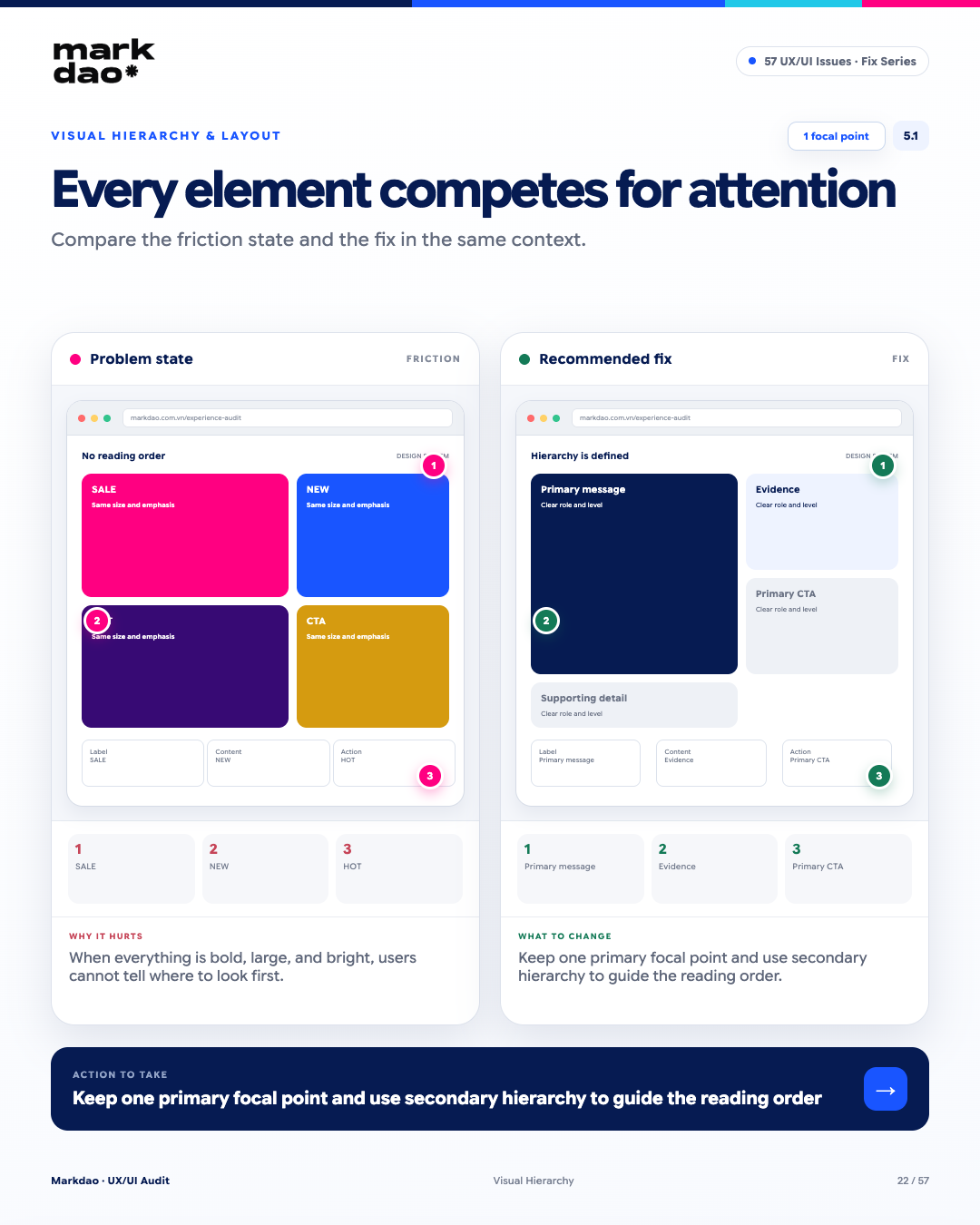
Figure 5.1. Illustration of the "Every element is highlighted at the same time" error and how to fix it.
When too many elements have the same level of prominence, Visual Hierarchy is broken. Users don't know what order to look at, read, or act in. Each screen should have one primary focal point, followed by lower levels of visual hierarchy to guide the eye.
Signs to look for:
- Multiple elements using large fonts, bold text, or vibrant colors simultaneously.
- SALE, NEW, HOT, CTAs, and banners all competing for attention.
- Inability to identify the main message when looking at the screen.
- Unclear order of reading and action.
Impact: When every element is highlighted, nothing truly stands out. Users have to determine for themselves what information is important, which increases cognitive load and reduces the ability to focus on the primary CTA.
How to fix: Define a primary focal point for each screen. Prioritize the remaining elements in this order: key message → evidence → CTA → secondary information.
Post-revision check: Look at the screen for a few seconds → immediately identify the key message and the required action.
Benchmark: 1 primary focal point + clear hierarchy.
5.2 Important content hidden in tabs
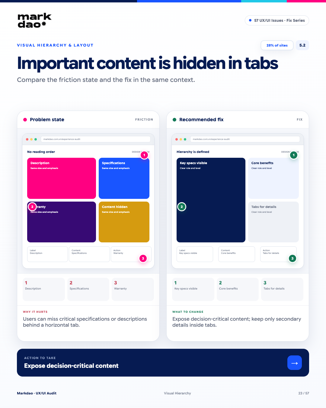
Figure 5.2. Illustration of the "Important content hidden in tabs" error and how to fix it.
Baymard notes that 28% of websites use horizontal tabs, causing core content like specifications or descriptions to be overlooked by users because they do not scroll down or click the tabs. Horizontal tabs can cause important content to be hidden behind a click, especially when users do not realize there is content inside the tabs. For information that directly influences decisions, it should be displayed directly on the page instead of being placed behind a tab.
Signs to look for:
- Specifications, descriptions, or important policies are located in separate tabs.
- Decision-critical content is hidden from the default view.
- Users must click a tab or scroll horizontally to access the information.
- The tabs do not clearly indicate which one contains important information.
Impact: Users may overlook information necessary for evaluating a product or service, leading to decisions based on incomplete information.
Fix: Move content that directly influences decisions out of the tab. Only use tabs for supplementary information or content that the user does not need to see immediately.
Verification after fixing: Key metrics displayed → core benefits displayed → tabs only contain secondary details.
Checklist: Decision-making content is not hidden behind tabs.
5.3 Misleading spacing between elements
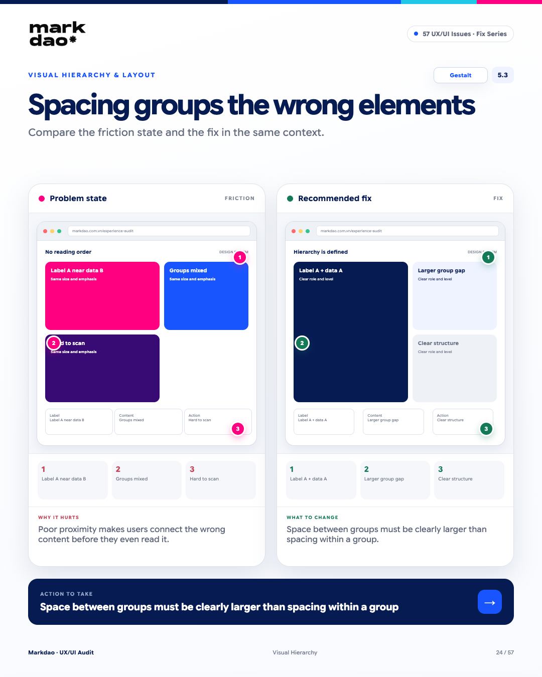
Figure 5.3. Illustration of the "Misleading spacing between elements" error and how to fix it.
According to the Gestalt Law of Proximity, users tend to perceive elements placed close together as a single group before reading the content. If spacing is distributed incorrectly, users may misassociate components and misunderstand the information structure.
Signs to look for:
- A field label is closer to another field's data than to its own.
- The spacing between groups is equal to the spacing between elements within the same group.
- Content groups are visually blended together.
- Users struggle to identify which elements belong to the same group.
Impact: Incorrect proximity causes users to misgroup elements at first glancebefore even reading the content, which increases processing time and the likelihood of misinterpretation.
How to fix: Use spacing to define relationships: place elements within the same group close together, and clearly separate different groups. The space between two groups should be significantly larger than the space within a group.
Post-fix check: Label A → Data A → clear group spacing → Label B → Data B.
Checklist: Gestalt Proximity + group spacing > internal spacing.
5.4 Inconsistent font sizes and spacing
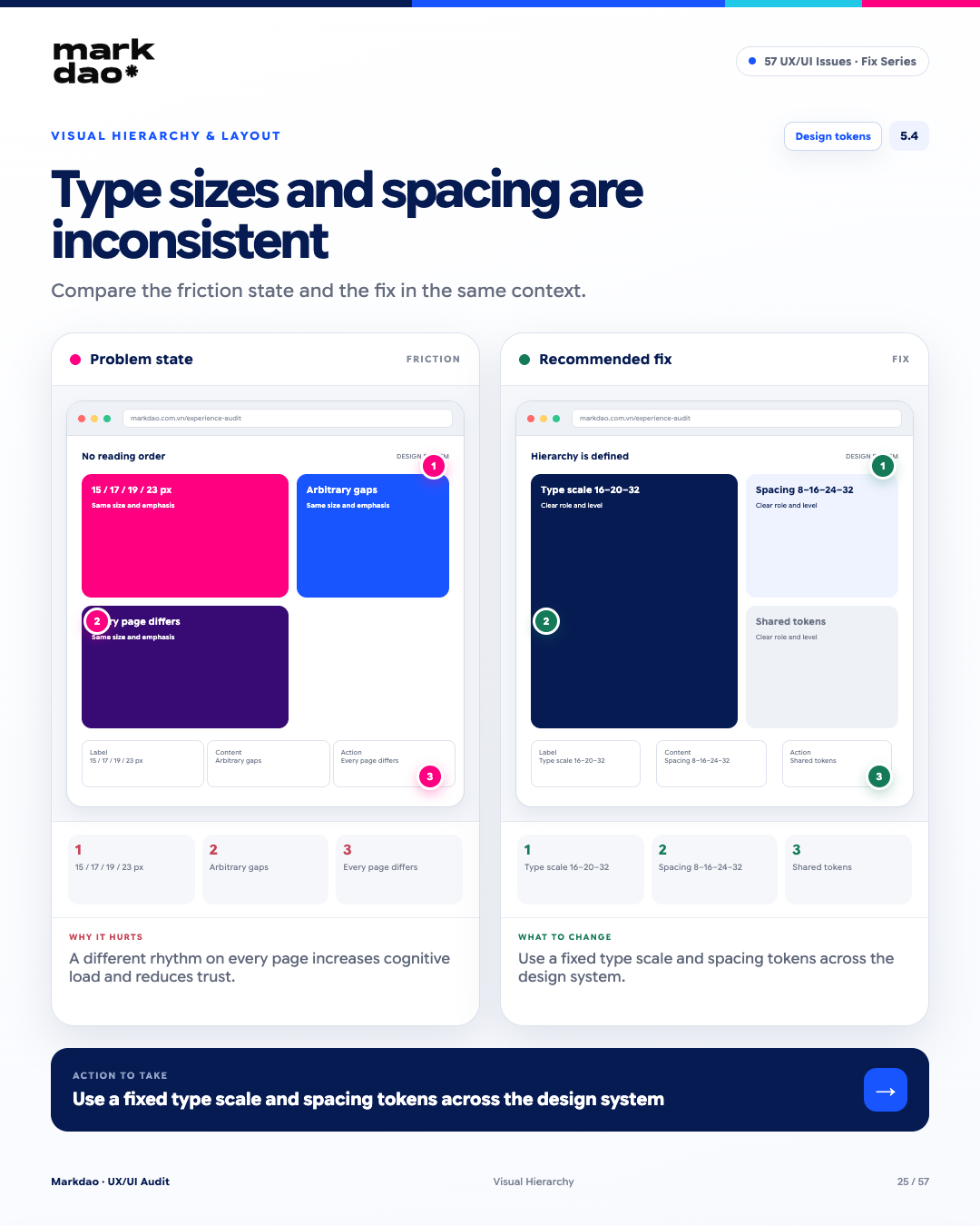
Figure 5.4. Illustration of the "Inconsistent font sizes and spacing" error and how to fix it.
When typography and spacing change across pages or components, users must constantly adapt to a new interface "rhythm." This increases cognitive load, while making the website feel inconsistent and less professional.
Signs to look for:
- Using multiple font sizes for the same level of content.
- Spacing between sections or components that follows no pattern.
- The same type of component having different spacing across pages.
- Each page feels like it has its own unique typography and spacing system.
Impact: Inconsistency makes it difficult for users to identify information hierarchy and the relationships between elements, while also diminishing the overall consistency of the experience.
How to fix: Build type scale and spacing tokens within your design system. Clearly define font sizes, line heights, and spacing for every level, component, and layout, then apply them consistently across the website.
Verification: Font sizes follow the scale → spacing follows the tokens → identical components follow the same rules on every page.
Benchmark: A unified type scale and spacing system used across the entire website.
6 Mobile & Responsive Errors
Most traffic today comes from mobile, yet many websites are still designed with a desktop-first mindset and simply shrunk down. Mobile is not just a shrunken desktop version. Content, interactions, touch targets, and hierarchy must be designed specifically for narrow screens and finger-based navigation.
6.1 Designing for desktop first and shrinking for mobile
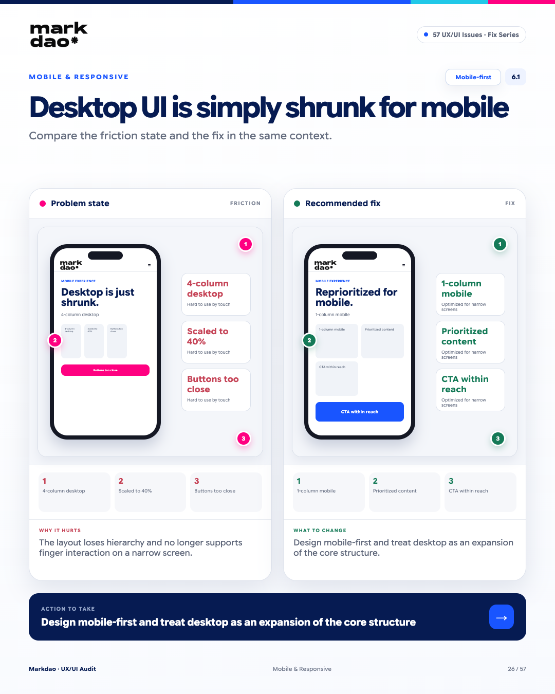
Figure 6.1. Illustration of the "Designing for desktop first and shrinking for mobile" error and how to fix it.
Designing for desktop and scaling directly down to mobile often destroys the visual hierarchy, creates clutter, and fails to optimize for touch interactions. Mobile-first helps define core content and actions within limited screen space first, before expanding for desktop.
Signs to look for:
- Multi-column desktop layouts compressed into cramped blocks on mobile.
- Important content pushed down or losing its priority.
- Buttons and interactive areas placed too close together.
- Users have to zoom or scroll horizontally to view and interact with content.
Impact: The layout lacks hierarchy and is not optimized for screen space or touch interactions on mobile devices.
Fix: Design mobile-first, defining the core content, hierarchy, and CTAs for small screens first. The desktop version should be an expansion of this structure, not a shrunken version of the desktop layout.
Post-fix check: Single-column mobile layout → priority content placed first → CTAs located within easy reach.
Benchmark: Mobile-first approach and hierarchy maintained across all breakpoints.
6.2 Text is too small to read without zooming
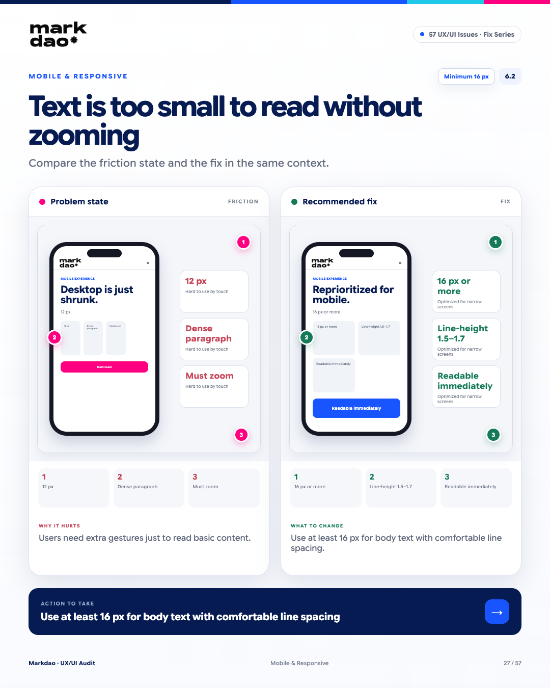
Figure 6.2. Illustration of the "Text is too small to read without zooming" error and how to fix it.
Font sizes that are too small reduce readability on mobile screens, forcing users to zoom in or perform extra actions just to consume basic content. For primary mobile content, prioritize a sufficiently large font size and generous line height.
Signs to look for:
- Primary content uses a font size that is too small, especially in the 12–14px range.
- Long paragraphs have high text density, making them difficult to scan.
- Users have to zoom in to read the content.
- Low line height causes lines of text to overlap or appear cramped.
Impact: Reduced readability, forcing users to perform extra actions and making them more likely to skip content on small screens.
Fix: Use at least 16 px for main content on mobile and set a line-height that is spacious enough to improve readability.
Check after fixing: Font size ≥16 px → line-height around 1.5–1.7 → content is readable at default zoom level.
Checklist: Main content ≥16 px + sufficient line-height.
6.3 Layout shifts when images or ads finish loading
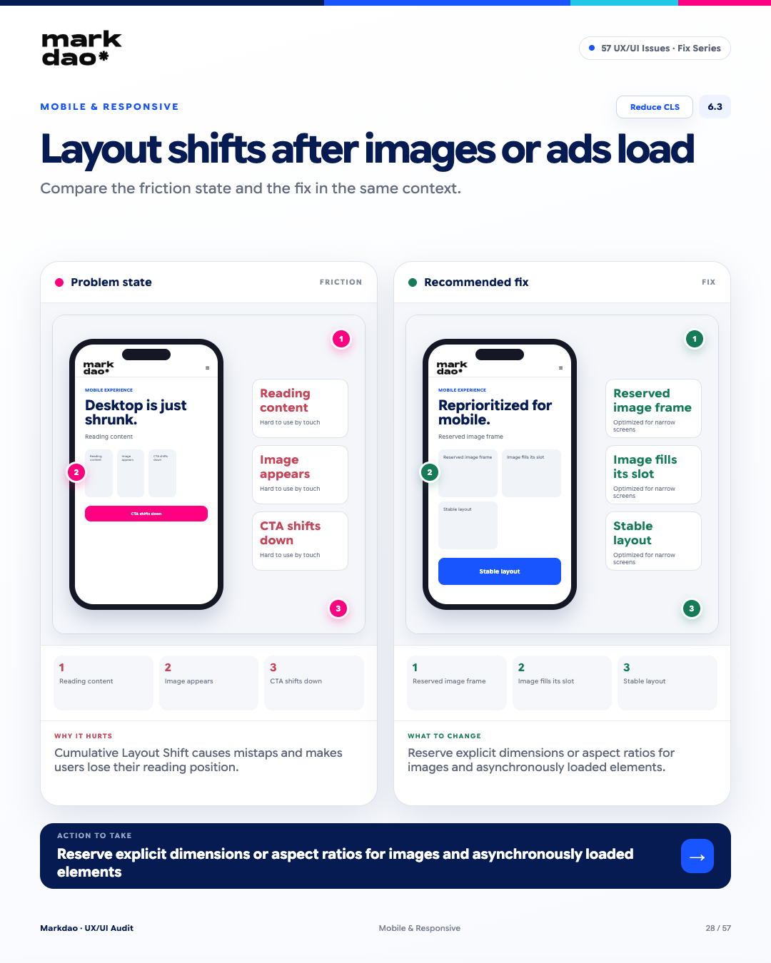
Figure 6.3. Illustration of the "Layout shift when images or ads finish loading" error and how to fix it.
This phenomenon is known as Cumulative Layout Shift (CLS), a metric within Core Web Vitals. When content or components load asynchronously and shift the position of elements, users may lose their place or accidentally click the wrong element.
Signs to look for:
- The content you are reading is suddenly pushed down or moved to a different position.
- Images or banners appear, causing the layout to resize.
- CTAs or interactive buttons move just before the user clicks them.
- Users have to find their place again after the page continues to load.
Impact: An unstable layout disrupts the experience, leads to accidental clicks, and causes users to lose their place or interrupt their actions.
How to fix: Reserve dimensions or aspect ratio for images, videos, ads, and asynchronously loaded elements before the actual content appears.
Check after fixing: The image frame remains fixed → content loads into the correct position → the CTA does not shift.
Checklist: Stable layout + reduced CLS.
6.4 Mobile popups that cover the screen and are difficult to close
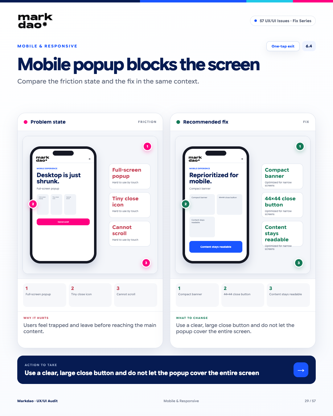
Figure 6.4. Illustration of the "Mobile popup covers the screen and is difficult to close" error and how to fix it.
Popups that take up the entire screen without a clear way to close them reduce User Control and Freedom. Users need to be able to exit or continue viewing the main content without having to figure out how to deal with an interface layer blocking the screen.
Signs to look for:
- Popup occupies nearly or the entire mobile screen.
- Close button is small, hard to see, or placed in a hard-to-tap area.
- Cannot close the popup with a clear action.
- Content behind is completely blocked even though the popup is not strictly necessary.
Impact: Users feel trapped, find it difficult to access the main content, and may leave the page instead of continuing to interact.
How to fix: Use a clear, large, and easy-to-tap close button. Avoid full-screen popups; if not strictly necessary, keep part of the background content visible so users remain aware of the context.
Post-fix verification: Compact popup/banner → easily identifiable close button → touch target area of 44 × 44 px → main content remains accessible.
Checklist: One-tap exit + no being trapped in the popup.
7 Performance & Loading Issues
Actual speed is important, but perceived wait time is just as critical. Users need to know the system is processing, that their action has been registered, and when to expect results. Loading speed directly impacts user experience and SEO performance, especially through Core Web Vitals.
7.1 Slow page load without a loading state
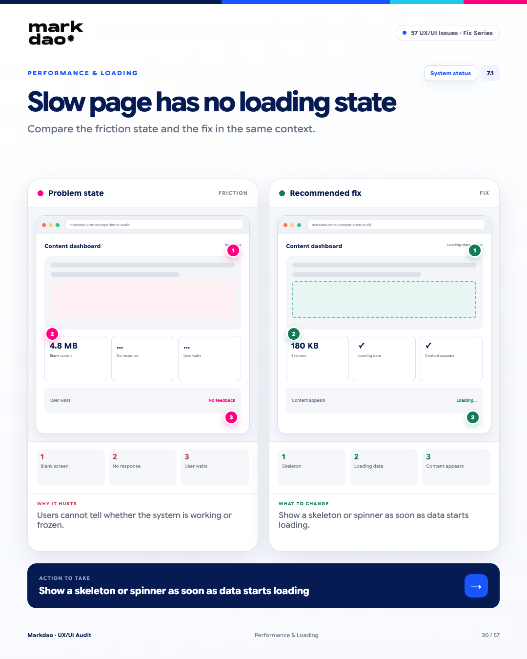
Figure 7.1. Illustration of the "Slow page load without a loading state" error and how to fix it.
According to the Visibility of System Status heuristic by the Nielsen Norman Group, systems should keep users informed about what is happening through appropriate feedback within a reasonable time. When a page takes time to load without a loading state, users cannot distinguish between "processing" and "system freeze."
Signs to look for:
- A blank screen or empty content during the wait time.
- There is no system indicator that data is loading.
- Users are unsure if their action has been registered.
- Users tend to reload the page or repeat the action.
Impact: Users lose a sense of control and may assume the system is broken or frozen, leading them to reload, repeat actions, or leave the page.
Solution: Display a skeleton screen or spinner as soon as loading begins; for actions that require processing time, display an appropriate status such as “Processing...”.
Verification: Perform an action → loading state appears immediately → user knows the system is processing → content displays upon completion.
Benchmark: Visibility of System Status + loading state appears as soon as the system begins processing.
7.2 Images are not optimized for size
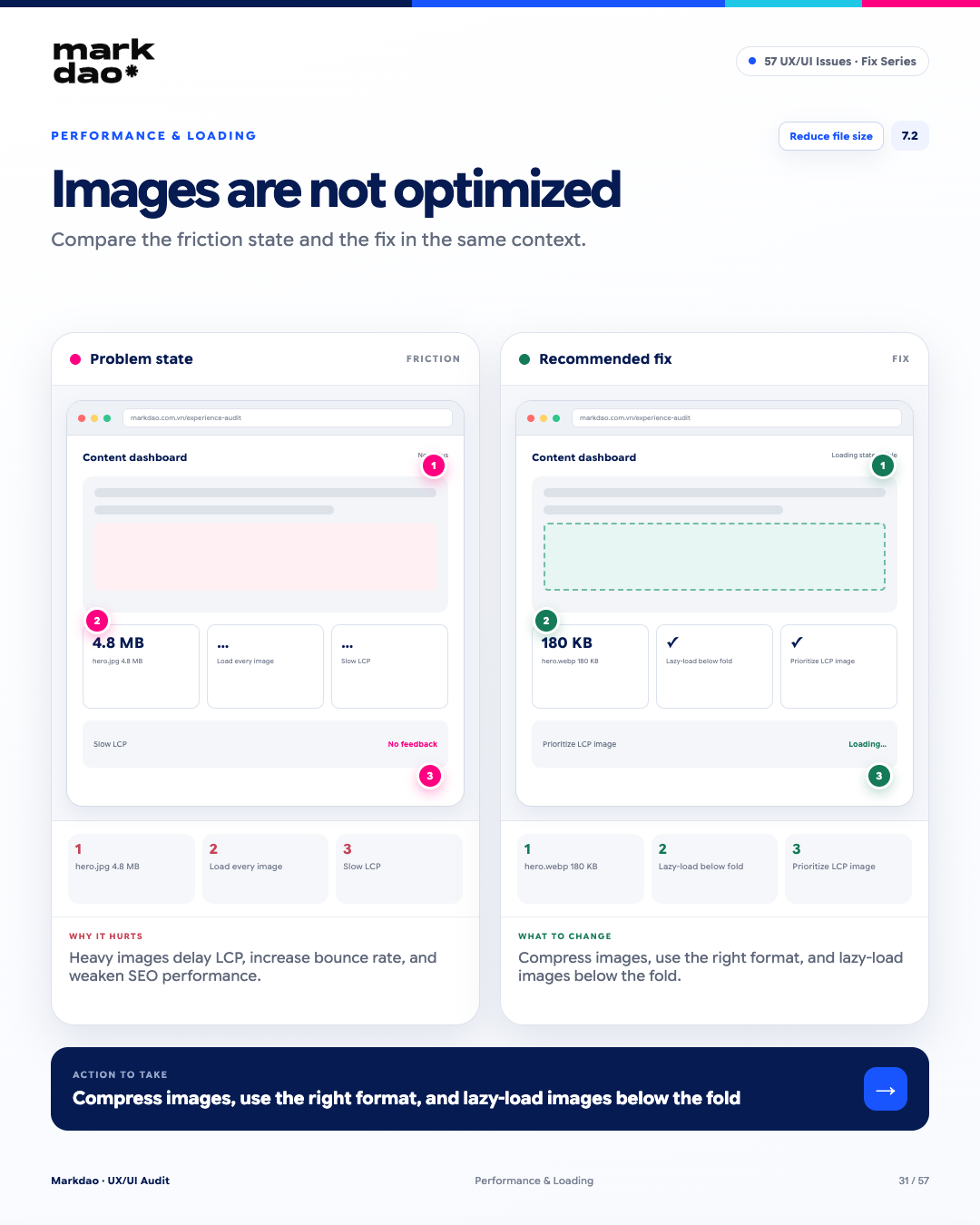
Figure 7.2. Illustration of the “Images not optimized for size” error and how to fix it.
Large image files increase resource loading time and can directly impact Largest Contentful Paint (LCP), especially for hero images or content within the initial viewport. Images below the fold should be lazy-loaded to avoid loading unnecessary resources too early.
Signs to look for:
- Hero images are too large and not optimized for the display size.
- Multiple images load immediately upon page opening, even if they are not yet visible on the screen.
- LCP is negatively impacted by image loading times.
- Image file sizes are significantly larger than what is actually needed for display.
Impact: Increased page load time, slowing down LCP and forcing users to wait longer before the main content appears.
How to fix: Compress images, use appropriate formats like WebP/AVIF, serve images sized appropriately for the viewport, and lazy-load images below the fold. Do not lazy-load the LCP image.
Post-fix verification: Images are compressed → below-the-fold images load only when needed → LCP image is prioritized → re-check LCP and total page size.
Checkpoints: Image size + LCP + Lazy loading.
7.3 Action in progress but no feedback
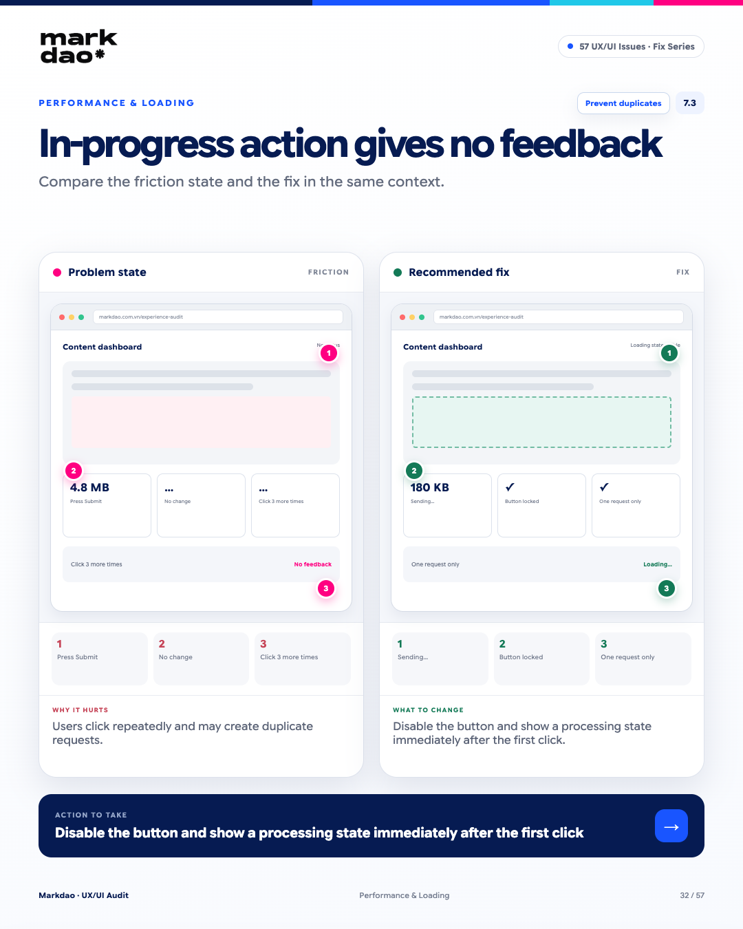
Figure 7.3. Illustration of the “Action processing without feedback” error and how to fix it.
When an action is being processed but the interface provides no feedback, users may assume the action wasn't registered and try again. This increases friction and can lead to duplicate requests.
Signs to look for:
- Clicking Submit, but the button state doesn't change.
- No loading indicator or processing message.
- Users may repeatedly click the button.
- A single action generates multiple consecutive requests.
Impact: Users lose confidence in the system status, are prone to repetitive actions, and risk creating duplicate data or transactions.
How to fix: Immediately after the first click, disable the button and display a status such as “Sending…”. Additionally, handle the backend processing to be idempotent where appropriate to prevent duplicate requests.
Verification after fix: Click Submit → button changes to “Sending…” → button is temporarily disabled → only one request is recorded.
Checkpoints: Immediate Feedback + Duplicate Request Blocking.
For industries requiring high reliability such as finance, healthcare, or products involving user funds, this category of errors directly impacts the decision to use the product, rather than being merely an aesthetic issue. Trust is built through small but consistent evidence: operating entity, contact information, policies, licenses, and verifiable reviews.
8.1 Hidden legal information and operating entity
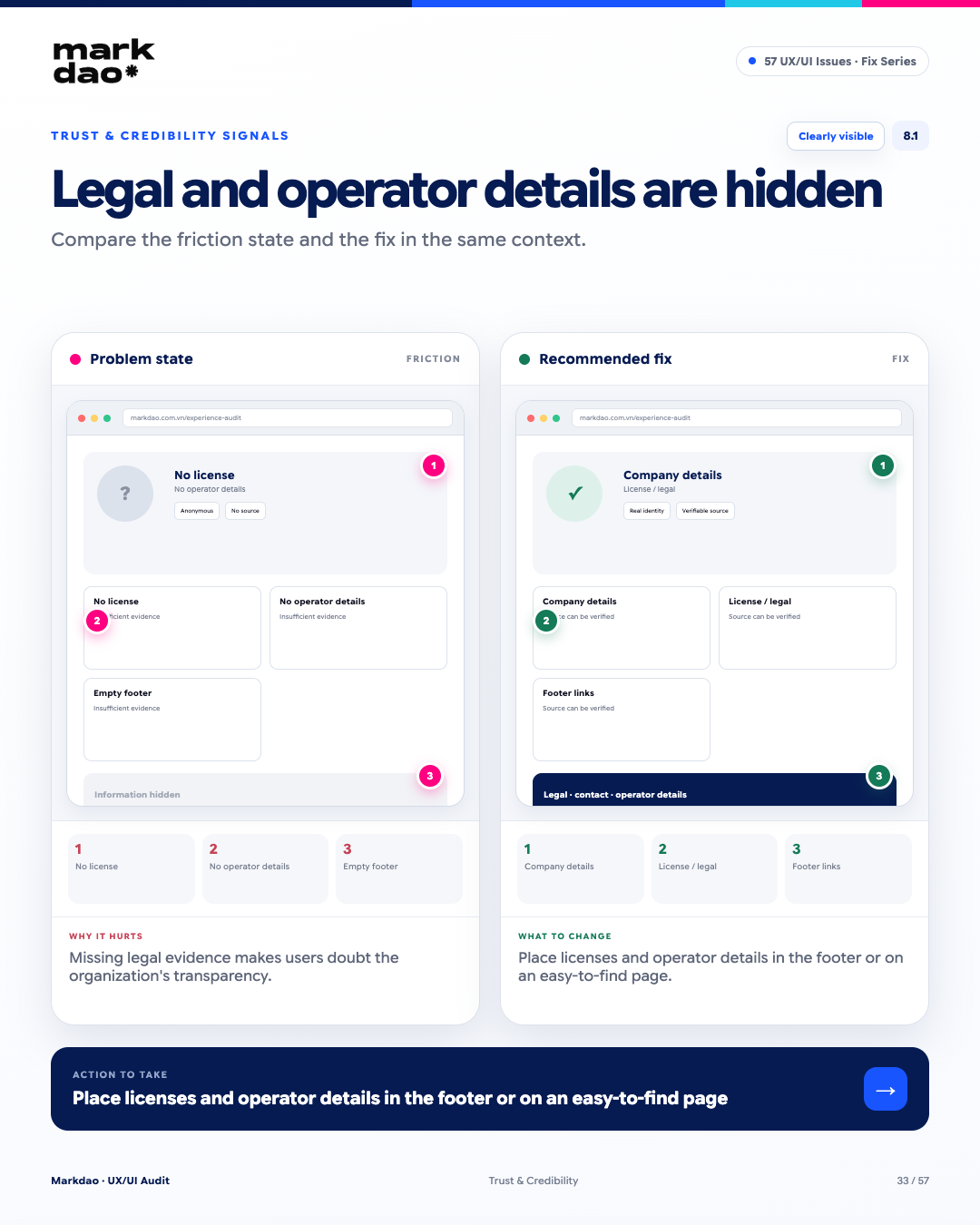
Figure 8.1. Illustration of the "Hidden legal information and operating entity" error and how to fix it.
For finance and cryptoproducts, information regarding the legal entity, operator, and licenses are critical factors for users to assess transparency and trustworthiness. If this information is difficult to find or not clearly provided, users may hesitate before signing up, depositing funds, or trading.
Signs to look for:
- Legal entity or operating entity information cannot be found.
- License information is not clearly disclosed.
- The footer lacks basic business and legal information.
- Users have to navigate through multiple menu layers to find the information.
- No links to verify license sources when needed.
Impact: Users lack the basis to evaluate transparency and may be less inclined to trust the platform when performing actions involving financial risk.
How to fix: Publicly disclose legal entity information, operating details, and licenses in the footer or on a dedicated, easily accessible legal page. For verifiable licenses, include links to official sources where appropriate.
Post-fix verification: Footer → business information → licenses/legal → directly accessible verification sources.
Checkpoints: Legal Transparency + Information Findability
8.2 Unverifiable Testimonials
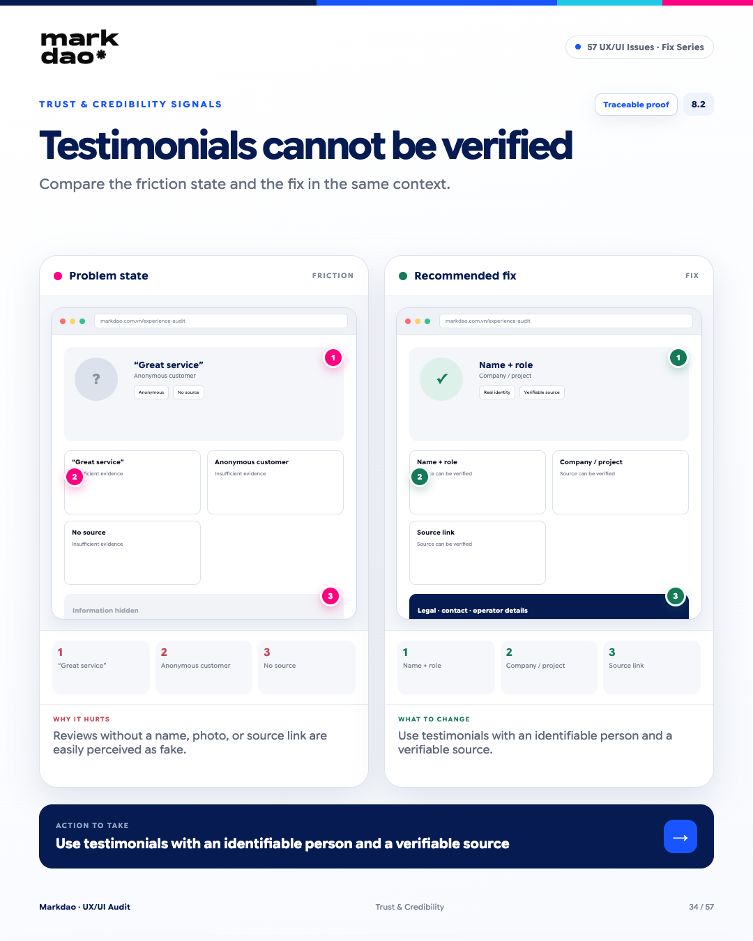
Figure 8.2. Illustration of the "Unverifiable Testimonial" error and how to fix it.
Testimonials are a form of social proof, but their persuasive value depends on the ability to verify the source. Reviews that are too generic, lack identity, or provide no clear references can make it difficult for users to gauge their credibility.
Signs to look for:
- Testimonials containing only generic content such as "Great service."
- No name or identifying information for the reviewer.
- No company, job title, or context of use provided.
- No links or sources available for verification.
- Many testimonials have similar writing styles, lengths, or structures.
Impact: Users lack evidence to verify reviews, which diminishes the value of social proof and may lead them to doubt the authenticity of the content.
How to fix: Prioritize testimonials with verifiable identities, context, and sources. You can include names, job titles, company/project names, and links to the original source when permitted.
Post-fix checklist: Name + job title → company/context → review content → verifiable source.
Checkpoint: Traceable Social Proof.
8.3 Contact information is hard to find
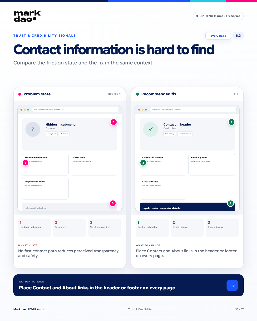
Figure 8.3. Illustration of the "Contact information is hard to find" error and how to fix it.
Contact information is a part of transparency and trust. When users cannot easily find how to get in touch or identify the entity behind the website, they may hesitate, especially for products that require transactions or the submission of personal information.
Signs to look for:
- The Contact page is buried deep within a sub-menu.
- There are no Contact or About links in the standard locations.
- The website only provides a form with no other contact channels.
- There is no clear email, phone number, or address.
- Users have to go through multiple steps to figure out how to get in touch.
Impact: Increases the effort required to find information and diminishes the perception of the organization's transparency and support capabilities.
Solution: Place Contact and About in easily recognizable locations such as the header or footer across the entire website. Provide appropriate contact channels such as email, phone, and address.
Post-fix verification: Open any page → locate Contact/About → access directly → see clear email, phone, and address information.
Verification milestone: Contact Findability + Site-wide Access.
8.4 Creating false urgency with dark patterns
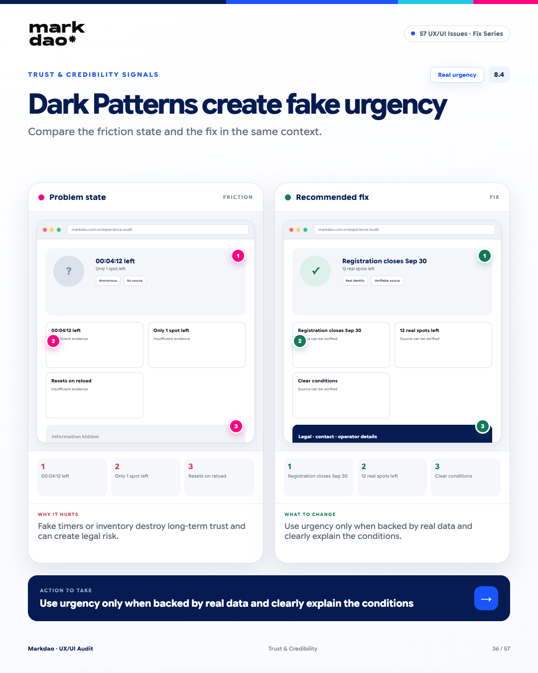
Figure 8.4. Illustration of the "Creating false urgency with dark patterns" error and how to fix it.
Using unsubstantiated urgency such as fake countdown timers or inaccurate stock levels can create unnecessary pressure and erode trust. When displaying deadlines, quantities, or offers, the data must reflect the actual status.
Warning signs:
- Countdown timer hits zero, but the offer continues.
- “Remaining” stock levels change erratically or do not match actual data.
- Countdown or stock levels reset upon page reload or revisit.
- No clear conditions or deadlines provided for urgent information.
Impact: Users may feel pressured or misled, which diminishes trust and, in some markets, can lead to legal risks.
How to fix: Only use urgency when backed by real data . Clearly display deadlines, quantities, or terms and conditions, and ensure the data is updated consistently.
Post-fix checklist: “Registration deadline 09/30” → real deadline → “12 spots left” → verifiable against actual data → clear terms and conditions.
Key criteria: Real Urgency + Data Accuracy + Clear Conditions.
9 Feedback & System Status Errors
These errors may seem minor, but they can directly impact user trust in the system from the very first interaction. Every action requires appropriate feedback. When users receive no signal after clicking a button, they are likely to click again, doubt the system, or abandon the process.
9.1 Button click with no feedback
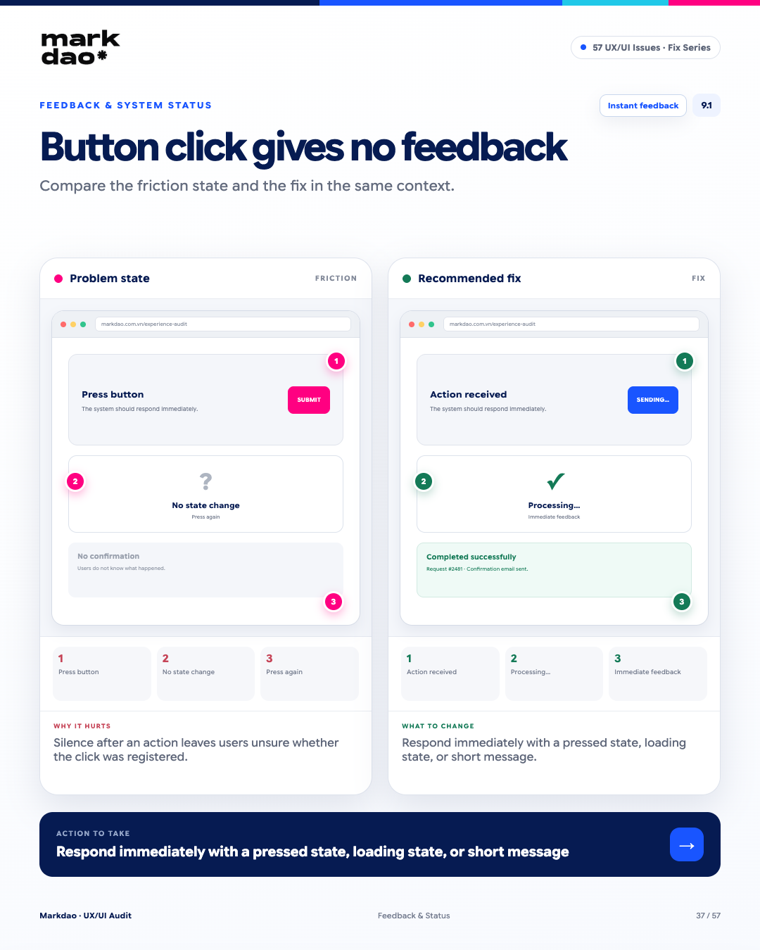
Figure 9.1. Illustration of the “Button click with no feedback” error and how to fix it.
The user clicks a button but receives no response. This error violates the Visibility of System Status heuristic from the Nielsen Norman Group. Every action must be acknowledged within a reasonable timeframe, even if it is just a minor state change.
Signs to look for:
- The button is clicked, but the interface does not change.
- No pressed state, loading indicator, or notification.
- The user clicks again because they are unsure if the action was registered.
- The result of the action is not reflected in the interface.
Impact: A lack of feedback leaves users disoriented, prone to repetitive actions, or convinced that the system is broken.
How to fix: Provide immediate feedback through press states, loading indicators, interface changes, or brief notifications depending on the action.
Post-fix verification: Button press → immediate feedback → “Recorded” or “Processing…” → display result upon completion.
Checklist milestone: Immediate Feedback + Visibility of System Status.
9.2 Successful submission without clear confirmation
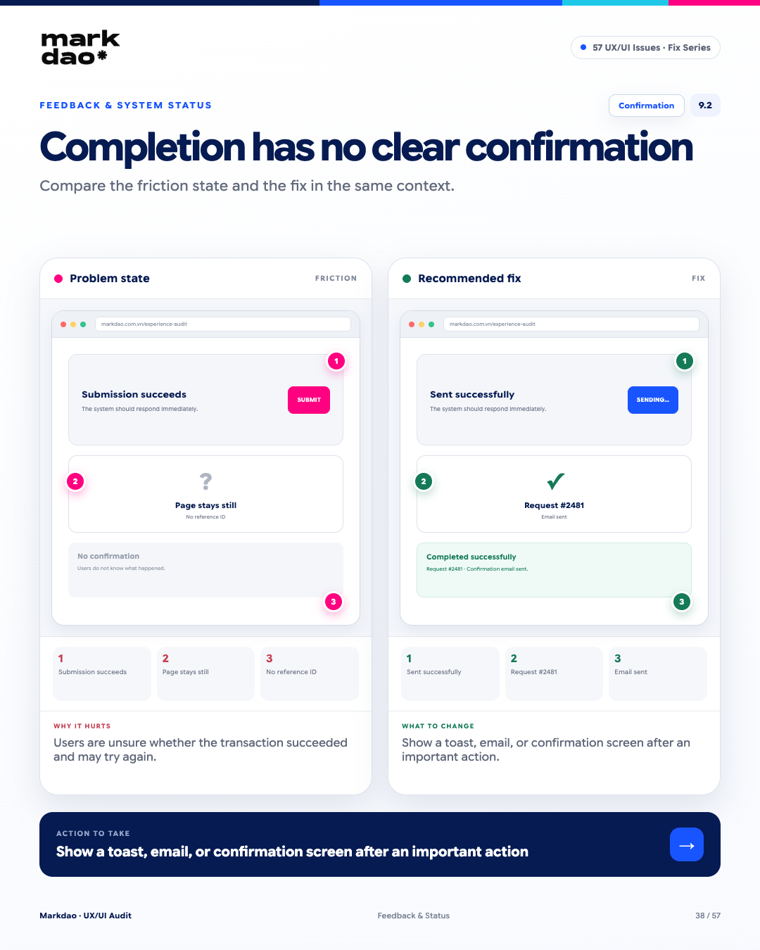
Figure 9.2. Illustration of the “Successful submission without clear confirmation” error and how to fix it.
After a significant action, users need to know that the operation is complete and what the outcome is. If the interface does not provide clear confirmation, users may doubt the transaction status and repeat the action.
Signs to look for:
- Submission is successful, but the interface remains virtually unchanged.
- No confirmation message regarding the result.
- No transaction ID, request code, or reference information provided when needed.
- Users must check their email or transaction history to verify the result.
Impact: Users are unsure if the action was completed, leading them to resubmit, create duplicates, or abandon the flow in a state of uncertainty.
How to fix: Display confirmation immediately upon completion. For important actions, provide reference information such as a request or transaction ID, and send an email or additional notification when appropriate.
Post-fix verification: Submit → “Submission successful” → request code #2481 → confirmation email has been sent.
Verification milestone: Clear Confirmation + Result Visibility.
10 Error Handling & Recovery
How a website handles errors clearly reflects the maturity of its product design. A standard error message shouldn't just state that there is a problem; it should help the user understand where the error is, why it happened, what to do next, and what data has been preserved.
10.1 Vague error messages
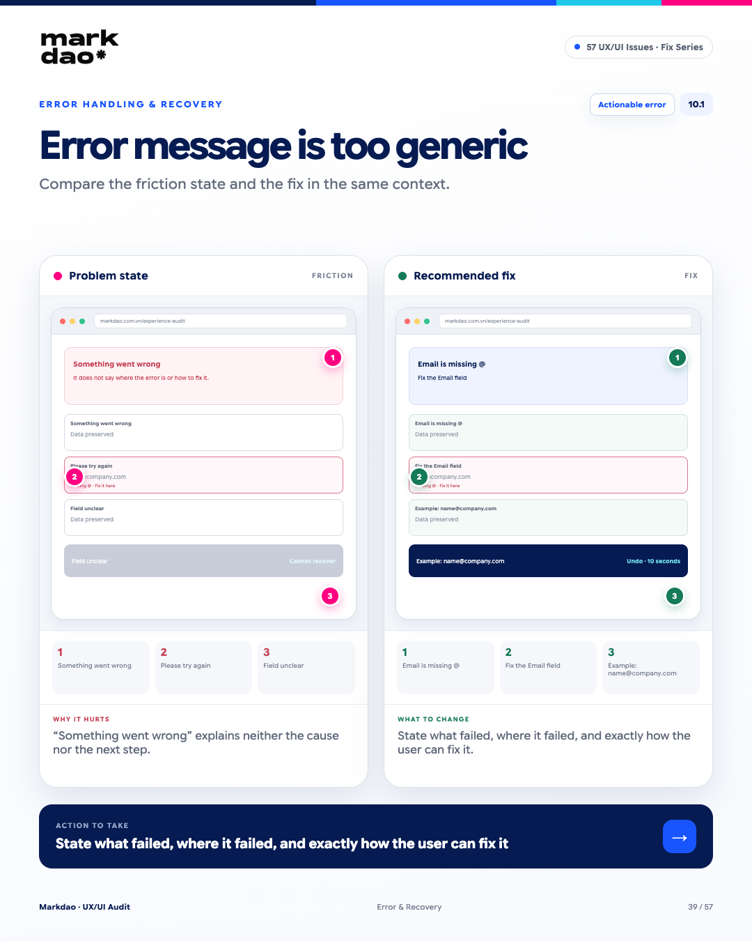
Figure 10.1. Illustration of a “Vague error message” and how to fix it.
Error messages should help users understand what happened, where the error is, and what to do next. Messages like “An error occurred” or “Please try again” do not provide enough information for users to resolve the issue themselves.
Signs to look for:
- Only display "An error occurred" or "Please try again."
- The field or step causing the error is not identified.
- No explanation of the cause or the required conditions is provided.
- Users must try multiple times to figure out how to resolve the issue.
Impact: Users cannot identify the cause or how to fix it, leading them to try random actions or give up entirely.
Solution: Error messages should clearly state what the error is + where it occurred + how to fix it, placed near the error location, and provide examples when necessary.
Verification after fix: Enter an invalid email → "Invalid email format" → clearly indicated at the Email field → "Example: name@company.com".
Checkpoints: Actionable Error + Clear Recovery Path.
10.2 Losing all entered data upon encountering an error
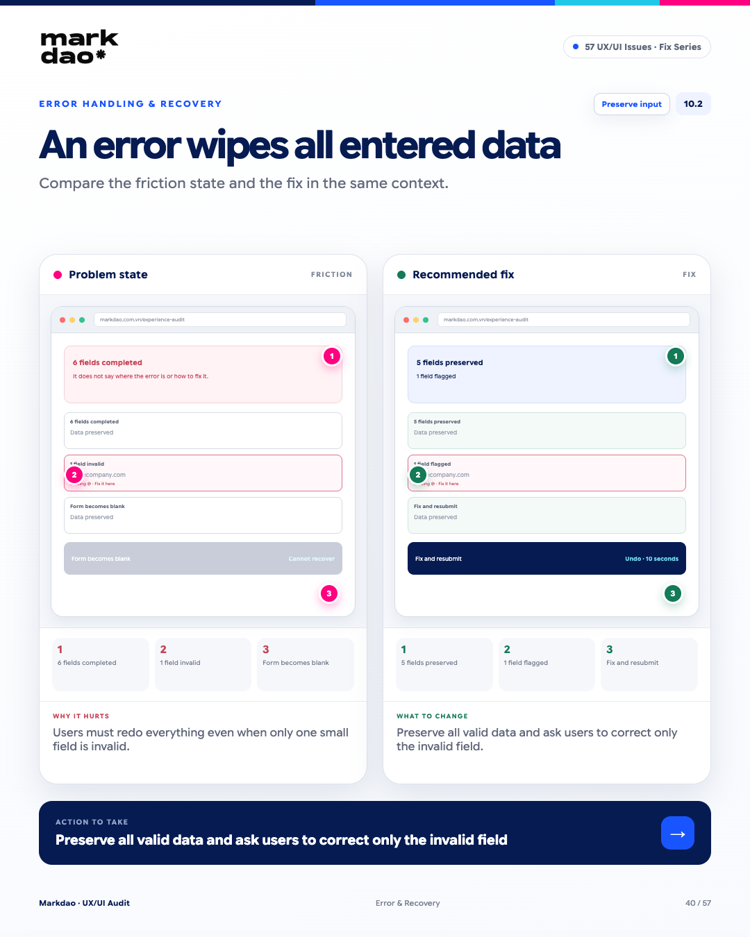
Figure 10.2. Illustration of the "Losing all entered data upon encountering an error" issue and how to fix it.
When a form encounters an error but clears all previously entered data, users are forced to redo tasks unrelated to the error. The system should retain valid data and only require the user to correct the invalid portion..
Signs of the issue:
- The user has filled out multiple fields, but the form resets after a submission error.
- Only one field is incorrect, yet all data is cleared.
- The user is forced to re-enter information that was already valid.
- There is no mechanism to recover data after an error or page reload.
Impact: Wasted effort leads to frustration and increases the likelihood of users abandoning the form, especially with longer ones.
Solution: Preserve all valid data after an error; only highlight the invalid field and ask the user to correct that specific part.
Verification after fix: Submit → 5 valid fields are retained → 1 invalid field is highlighted → correct the field → resubmit successfully.
Checkpoint: Preserve Input + Field-level Recovery.
10.3 No Undo for critical actions
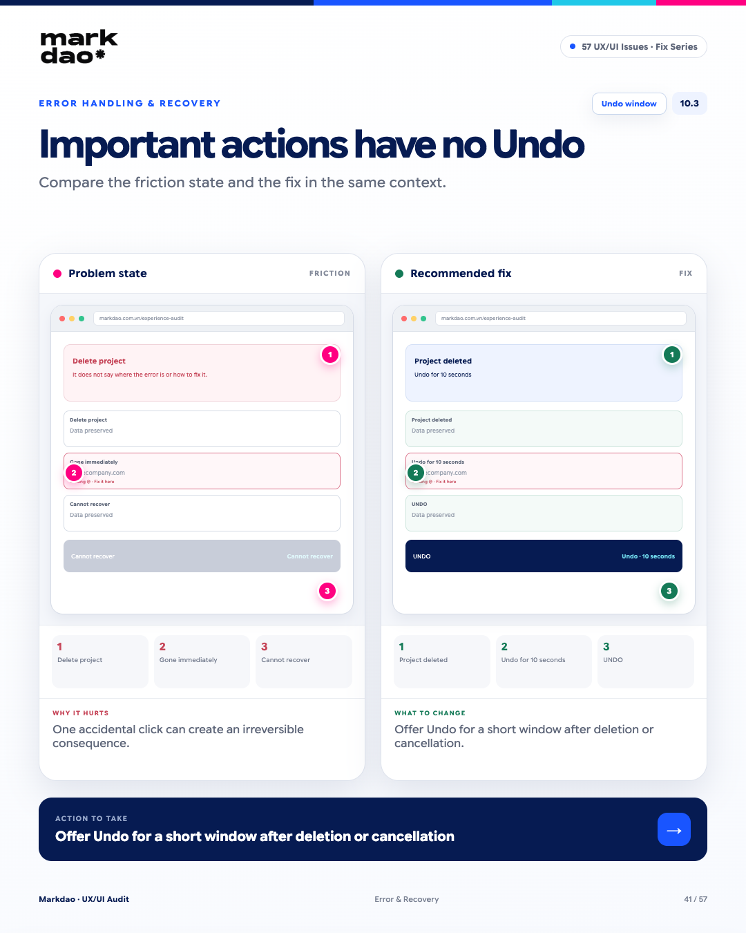
Figure 10.3. Illustration of the "No Undo for critical actions" error and its solution.
According to the heuristic User Control and Freedomusers need a way to exit or recover if they perform an action by mistake. For operations like delete or cancel, if the system executes them immediately without the possibility of recovery, a single accidental click can have irreversible consequences.
Signs to look for:
- Delete/cancel actions are executed immediately after a click.
- No Undo or recovery mechanism.
- Data disappears instantly and cannot be retrieved.
- Users have no opportunity to review or cancel the action before it is completed.
Impact: A single accidental action can lead to data loss or unintended state changes, increasing risk and frustration.
How to fix: For reversible actions, provide an Undo option for a short period after execution. For irreversible actions, there should be a clear confirmation step before execution.
Verification after fix: Delete project → “Project deleted” → Undo within 10 seconds → data is restored.
Checkpoints: User Control + Undo Window.
11 Search & Filter Errors
For websites with a large amount of content or products, Search and Filter are often the shortest path to the goal, but they are also easily overlooked when optimizing UX. When search is ineffective, the page shows no results, or filters are too complex, the user journey can easily turn into a dead end.
11.1 Search cannot handle typos
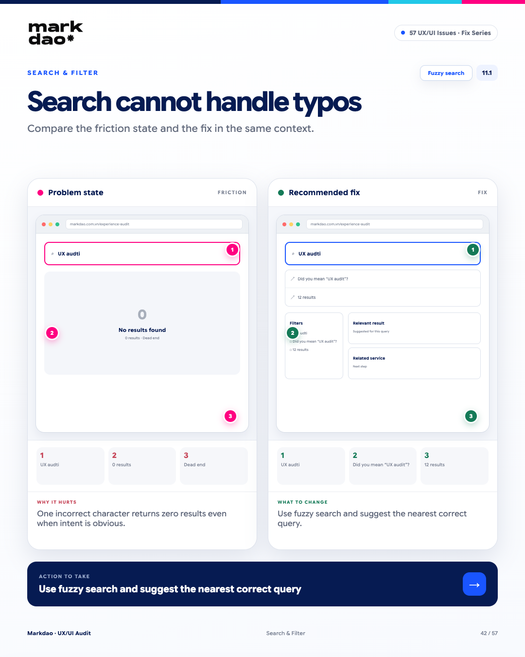
Figure 11.1. Illustration of the "Search cannot handle typos" error and how to fix it.
Search should be able to handle common typos and fuzzy queries instead of returning zero results as soon as the user mistypes a few characters. When the search intent can still be identified, the system should suggest or return relevant results.
Signs to look for:
- A single typo results in zero search results.
- No suggestions for similar keywords.
- No suggestions on how to correct the query.
- Users have to guess and re-enter the keyword themselves.
Impact: A small input error can prevent users from finding content even when the system has relevant results.
How to fix: Use fuzzy search, typo tolerance, and suggestions for the closest keywords. When confidence is high, the query can be automatically corrected with a notification to the user.
Verification after correction: Enter “audti UX” → “Did you mean audit UX?” → display relevant results.
Checkpoints: Fuzzy Search + Typo Tolerance.
11.2 No autosuggest while typing
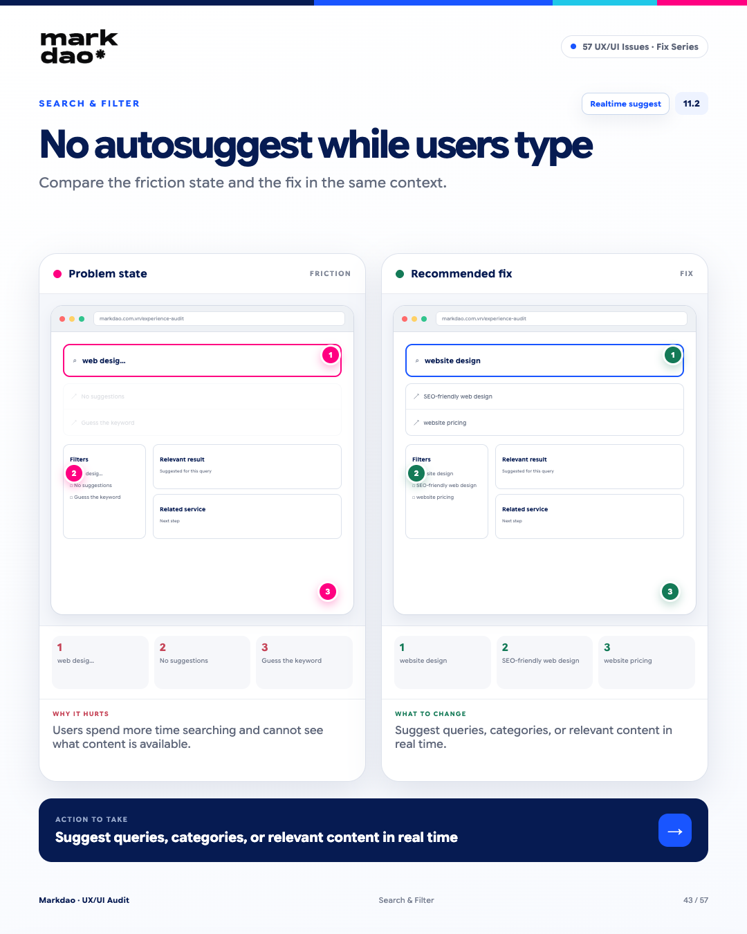
Figure 11.2. Illustration of the “No autosuggest while typing” error and how to fix it.
Autosuggest helps users refine their queries as they type and quickly access relevant content. Without suggestions, users must complete keywords themselves and remain unaware of related content available in the system.
Signs to look for:
- Users must enter the full keyword before seeing any results.
- No query suggestions appear while typing.
- No related content or categories are proposed.
- Users have to try multiple phrasings to find the right content.
Impact: Increases search time and the number of re-entries, while reducing the likelihood of users discovering the content they are looking for.
Fix: Display real-time autosuggest, which can combine query suggestions, categories, and popular or relevant content based on the keywords being entered.
Verification after fix: Enter “web design” → suggests “website design” → “SEO-friendly web design” → “website design quote”.
Benchmark: Realtime Autosuggest + Relevant Suggestions.
11.3 Zero-results page offers no next steps
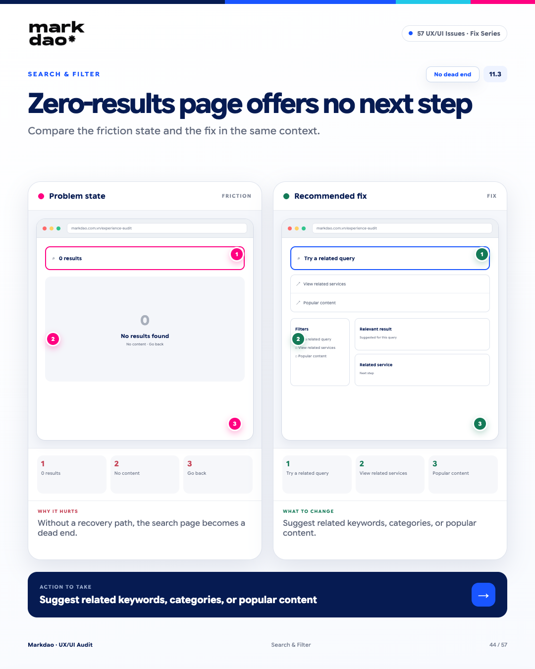
Figure 11.3. Illustration of the “Zero-results page offers no next steps” error and how to fix it.
A zero-results page should not be the end of the search journey. When no relevant content is found, the system should help users continue by suggesting queries, categories, or related content.
Signs to look for:
- Displays “0 results” but provides no further guidance.
- No suggestions for approximate keywords or alternative search methods.
- No links to related categories or content.
- Users are forced to go back or restart their search from scratch.
Impact: Users are left with no path forward, turning the search page into a dead end and increasing the likelihood of them leaving the website.
How to fix: When there are no results, display approximate keywords, related categories, popular content, or other search suggestions.
Post-fix verification: 0 results → suggest closest keywords → related services → popular content.
Milestone: No Dead End + Recovery Path.
11.4 Displaying too many filter options
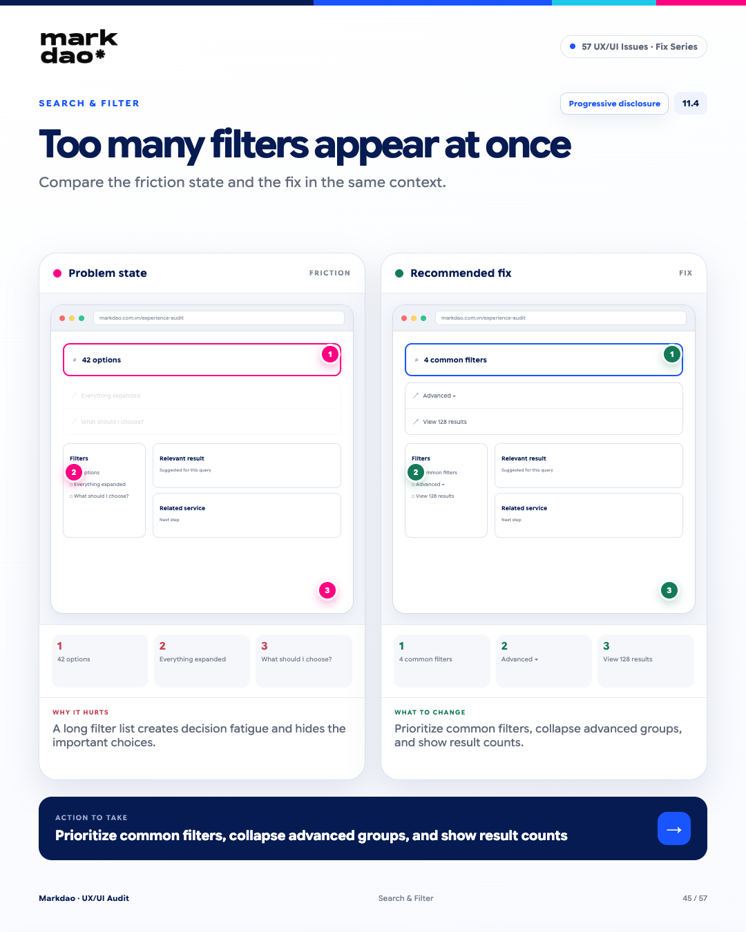
Figure 11.4. Illustration of the "Displaying too many filter options" error and how to fix it.
Filters with too many options displayed at once increase cognitive load and makes it difficult for users to identify important criteria. This is a case where you can apply Hick’s Law and the Progressive Disclosureprinciple: prioritize popular choices and only show advanced options when needed.
Signs to look for:
- Too many filter options displayed at once.
- All filter groups are expanded by default, regardless of their usage frequency.
- Rarely used options take up more space than important filters.
- Users spend time trying to figure out which filter to start with.
- Lack of clear grouping or prioritization.
Impact: Long filter lists increase decision time, cause choice overload, and make it hard to identify important criteria.
How to fix: Prioritize the most frequently used filters; group advanced options into “Advanced filters” or an accordion; display the expected number of results when appropriate.
Post-fix check: 4 popular filters → Advanced filters ▾ → select filter → View 128 results.
Checklist: Progressive Disclosure + Filter Prioritization.
12 Accessibility Issues
Accessibility is often viewed as “nice to have”, but in reality, it impacts the usability for a significant portion of users and can support SEO. Accessibility helps many people complete tasks under various usage conditions. It is not just a final checklist item, but a quality criterion that should be integrated from the product design phase.
12.1 Substandard text-to-background contrast
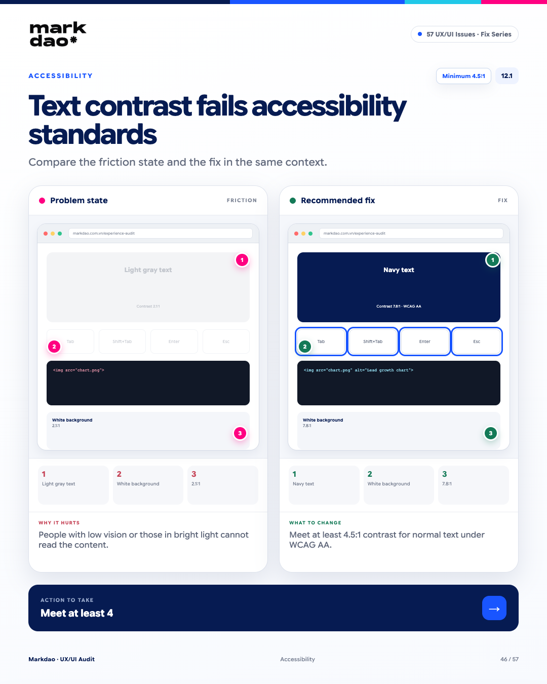
Figure 12.1. Illustration of the “substandard text-to-background contrast” error and how to fix it.
Low text-to-background contrast reduces readability, especially for users with visual impairments or when using devices in poor lighting conditions. According to WCAG 2.2, normal text must meet a minimum contrast ratio of 4.5:1 to meet AA standards.
Signs to look for:
- Light gray text on a white or similar background.
- Content that is difficult to read when screen brightness is lowered or lighting conditions change.
- Secondary text with significantly lower contrast than the main content.
- Contrast checker tools return a result below 4.5:1 for normal text.
Impact: Reduced readability and accessibility, especially for users with low vision or in poor lighting environments.
How to fix: Increase the contrast between text and background; ensure a minimum of 4.5:1 for normal text and 3:1 for large text according to WCAG AA.
Verification after fix: Navy text → white background → 7.8:1 contrast → meets WCAG AA.
Benchmark: WCAG AA: ≥4.5:1 for normal text.
12.2 Meaningful images missing alt text
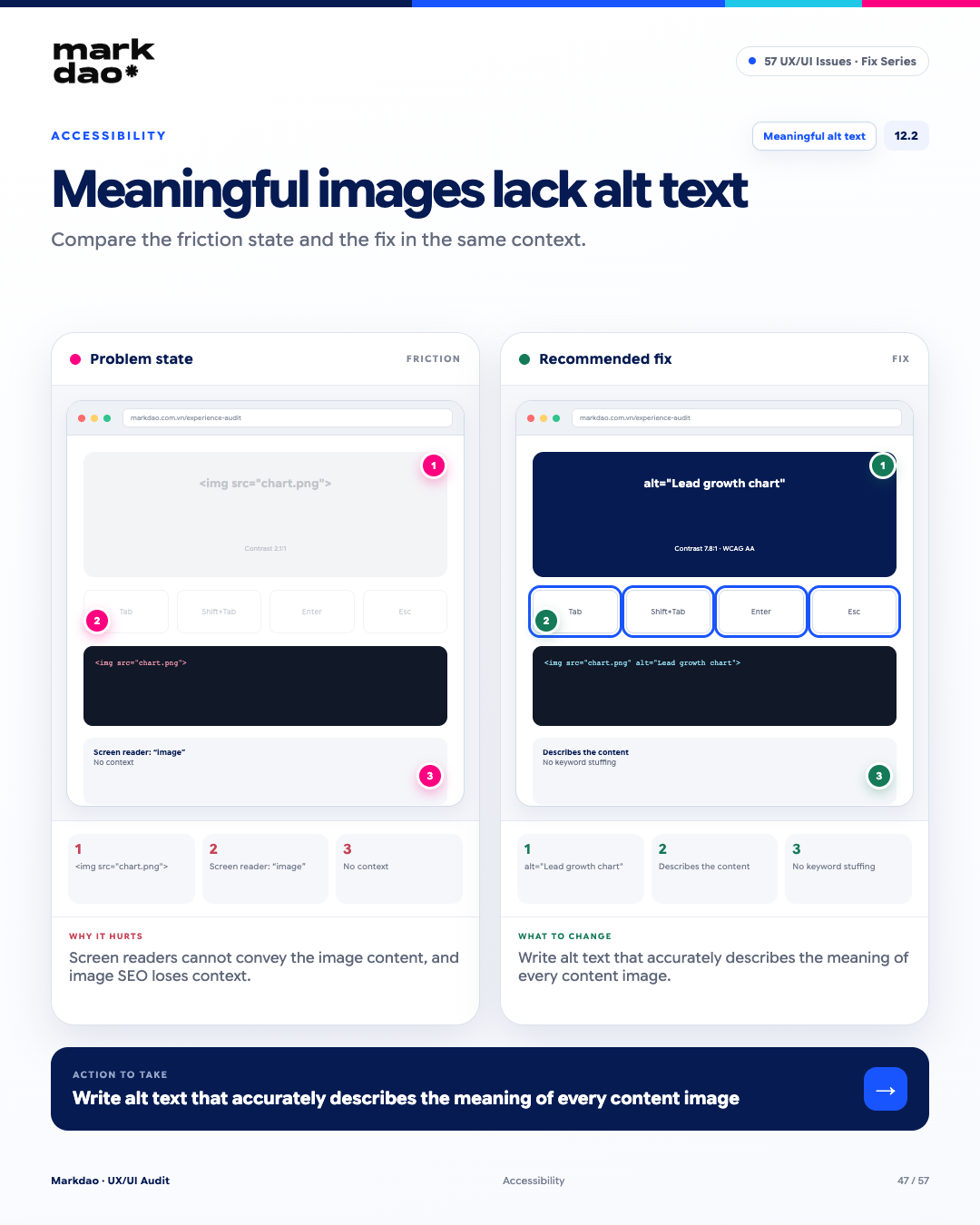
Figure 12.2. Illustration of the "Meaningful image missing alt text" error and how to fix it.
Images that contain information or convey content meaning must have alt text so that assistive technology can identify and communicate that content. Alt text also helps search engines understand the context of the image.
Signs of the issue:
- The image contains charts, infographics, or important information but lacks an alt attribute.
- Screen readers only announce "image" or provide no useful information.
- When the image fails to load, users have no way of knowing what content it was meant to convey.
- The alt text is just a filename like chart.png or image01.jpg, or it contains irrelevant keywords.
- The image is content-heavy, but the alt attribute is left empty without a valid reason.
Impact: Users relying on screen readers cannot access the information within the image; meanwhile, the website misses an opportunity to provide context to search engines.
How to fix: Write concise, accurate alt text that correctly describes the meaning of the image. For purely decorative images, use alt=""; do not keyword-stuff the alt text.
Post-fix verification: Chart image → alt="Quarterly lead growth chart" → accurately describes content → no keyword stuffing.
Checklist: Meaningful Alt + Accurate Description + No Keyword Stuffing.
12.3 Unable to complete flow using keyboard
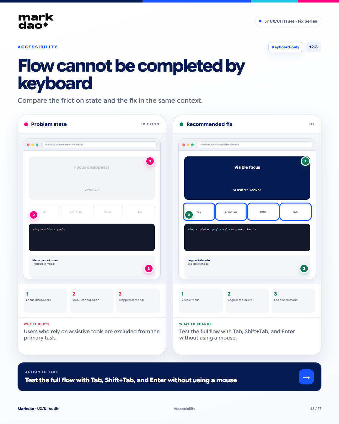
Figure 12.3. Illustration of the "Unable to complete flow using keyboard" error and how to fix it.
According to WCAG 2.2, all website functionality must be operable via keyboard without requiring a mouse. This is a critical requirement to ensure users can complete tasks using a keyboard or assistive technology.
Signs to look for:
- Pressing Tab results in no visible focus or the focus is lost.
- Focus order does not follow the interface logic.
- Menus, dropdowns, or buttons cannot be opened using a keyboard.
- Focus gets trapped inside a modal or does not return to the appropriate element after closing.
- There are steps in the flow that can only be performed with a mouse.
Impact: Users are unable to complete key tasks without a mouse, creating accessibility barriers and potentially rendering the functionality unusable for some users.
How to fix: Ensure all interactive elements are keyboard-operable; maintain visible focus, a logical Tab order, and proper focus management when opening/closing modals, dropdowns, or menus.
Post-fix verification: Execute the entire flow using only the keyboard → Tab/Shift + Tab to navigate in the correct order → Enter to activate → Esc to close modals where appropriate → complete the flow without a mouse.
Checklist: Keyboard-only + Visible Focus + Logical Focus Order.
13 Content & Microcopy Errors
Content and microcopy form the most direct line of communication between a product and its users, which is especially critical in jargon-heavy industries like fintech and crypto. Well-crafted copy clarifies actions, conditions, consequences, and technical concepts at the right moment.
13.1 Unexplained technical jargon
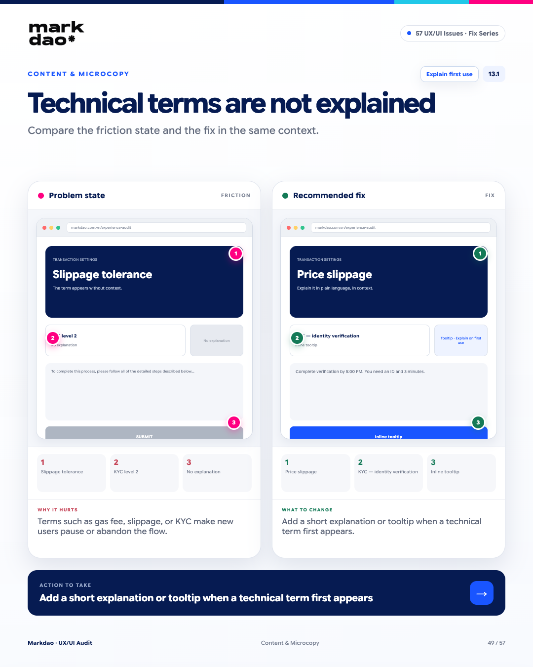
Figure 13.1. Illustration of the "Unexplained technical jargon" error and how to fix it.
According to the Match Between System and the Real Worldheuristic, interfaces should use language that aligns with how users understand and describe concepts. For technical terms like gas fee, slippage, KYC, new users need a brief explanation right at the moment they encounter the term.
Signs to look for:
- Technical jargon appears without any explanation.
- Users have to leave the flow to look up the meaning.
- Tooltips or notes are missing where the term is used.
- The same term is used throughout without an initial contextual explanation.
Impact: Users do not understand the terms or costs involved, leading to hesitation, errors, or abandoning the flow.
Solution: Provide a concise explanation the first time a term appears; use microcopy, tooltips, or a “Learn more” link depending on the complexity.
Post-fix verification: Slippage tolerance → “Slippage tolerance” → short tooltip explanation → user understands before proceeding.
Checklist: First-use Explanation + Contextual Help.
13.2 Verbose copy that lacks focus
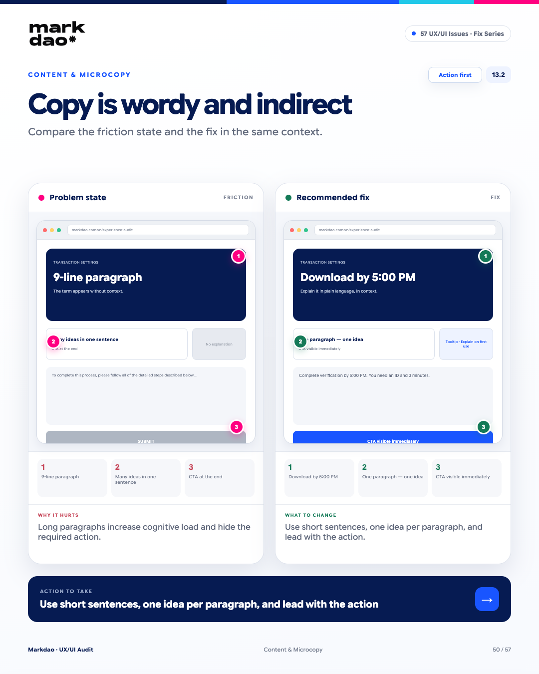
Figure 13.2. Illustration of the “Verbose copy that lacks focus” error and how to fix it.
Interface content should help users quickly grasp information and know what to do next. Copy that is too long or packs too many ideas into one paragraph increases cognitive load, making it easy to overlook important actions.
Signs to look for:
- A long, multi-line paragraph without a clear structure.
- A single sentence containing too many ideas or unnecessary information.
- The primary action is buried after a long explanation.
- The CTA or critical information is lost within the content.
Impact: Users spend too much time reading, struggle to identify key information, and are likely to miss the required action.
How to fix: Write short sentences, one idea per paragraph, and place critical information and the primary action at the beginning. Move supplementary explanations to the end or into a tooltip if needed.
Post-fix check: “Download report by 5:00 PM” → action appears immediately → brief explanation follows.
Checklist: Action First + One Idea per Paragraph.
13.3 Using multiple labels for the same action
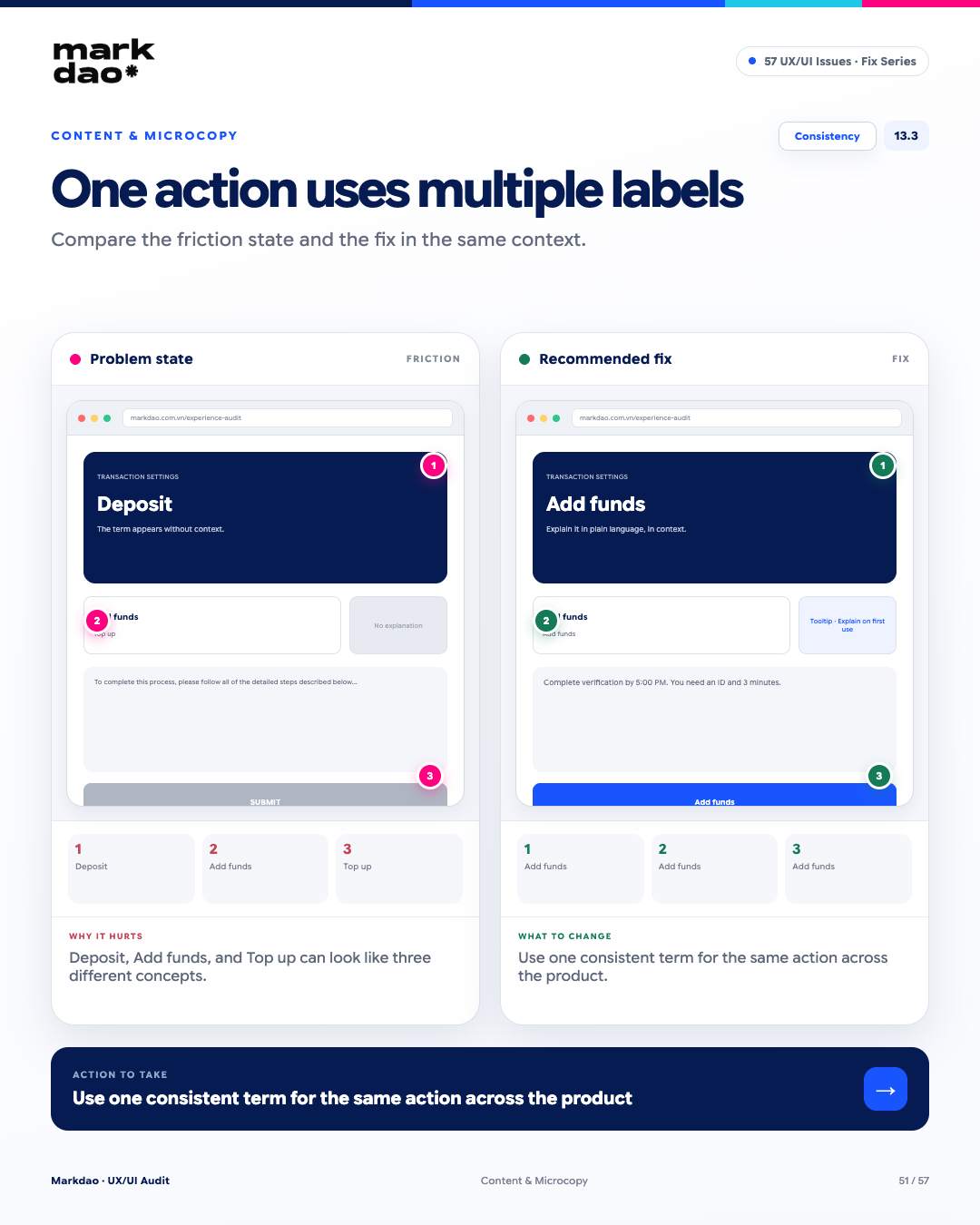
Figure 13.3. Illustration of the “Using multiple labels for the same action” error and how to fix it.
According to the Consistency and Standardsheuristic, the same action or concept should be referred to by a consistent term throughout the product. Changing labels between screens forces users to figure out whether different terms refer to the same action.
Signs to look for:
- Using multiple labels for the same action, such as “Nạp tiền”, “Deposit”, and “Add funds”.
- One term is used in the menu, while a different one appears on the CTA.
- The same function is referred to by different names across different steps in a flow.
- Users are forced to guess whether different labels represent the same function.
Impact: Increases cognitive load, reduces recognition, and may lead users to mistakenly believe these terms refer to different functions.
How to fix: Define a standard term for each action/concept and apply it consistently across menus, CTAs, headings, forms, notifications, and documentation.
Post-fix verification: Same action → “Deposit” in the menu → “Deposit” on the CTA → “Deposit” in the confirmation.
Checklist: Consistency + One Concept, One Label.
14 Onboarding & Empty State Errors
Onboarding determines whether users stay long enough to realize the value of your product. The goal is to get them to their first "aha!" moment as quickly as possible.. An empty state shouldn't just indicate that there is no data; it needs to explain what is happening and what the user should do next.
14.1 Onboarding is too long before showing value
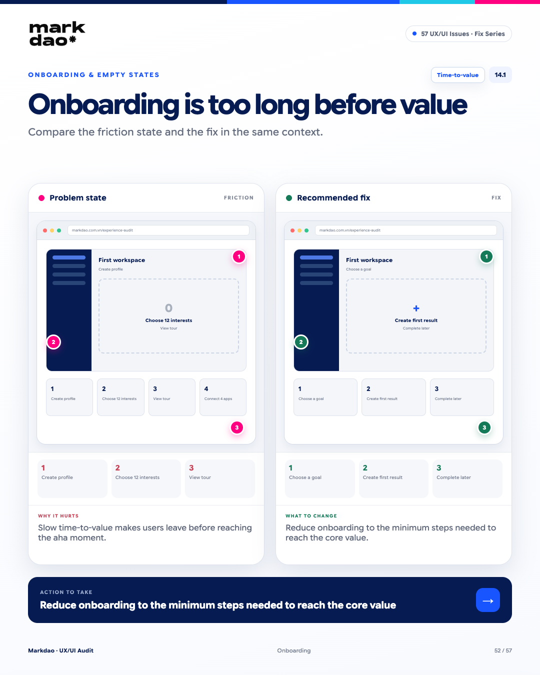
Figure 14.1. Illustration of the "Onboarding is too long before showing value" error and how to fix it.
Onboarding should lead users to the first core value as quickly as possible. When users have to complete too many steps before seeing what the product is useful for, the time-to-value increases, and users may drop off the flow before reaching their "aha moment."
Signs to look for:
- Users must complete many steps before they can use the main features.
- Requesting more information or setup than is necessary to get started.
- Steps like selecting interests, taking a tour, or connecting apps appear before the core value.
- Users haven't achieved their first result but are already required to complete a long series of setup tasks.
Impact: Increases time-to-value, reduces motivation to continue, and increases the likelihood that users will abandon onboarding before experiencing the actual value.
How to fix: Apply Progressive Onboardingonly request the information strictly necessary to get started, guide users to their first result quickly, and allow for additional information to be added later.
Post-fix check: Select goal → generate first result → experience value → add information as needed.
Checkpoints: Time-to-Value + First Value Delivered.
14.2 Empty state left blank, no guidance
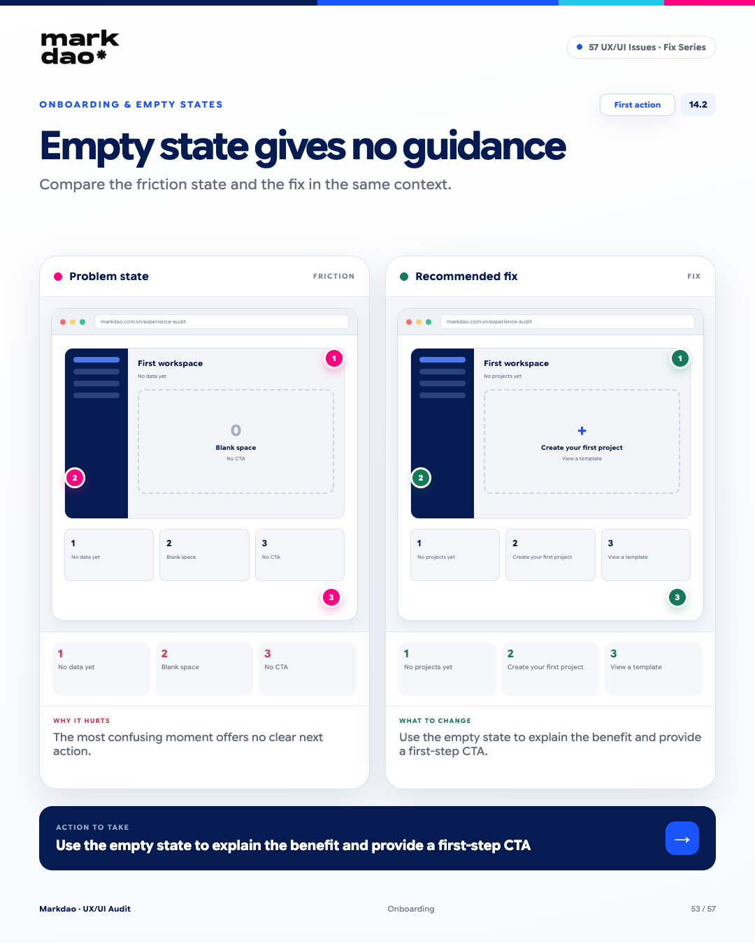
Figure 14.2. Illustration of the "Empty state left blank, no guidance" error and how to fix it.
Empty state should not only inform the user that there is no data yet but also serve as an opportunity to guide them toward the next step. When an empty state lacks context or a CTA, users may not know where to begin.
Signs to look for:
- Content area only displays "No data available" or is left blank.
- No explanation of why there is no data or what to do next.
- No CTA for the initial action.
- Users have to search for the menu or function themselves to get started.
Impact: Users encounter an empty state without guidance, which disrupts their journey and increases the likelihood of abandonment.
How to fix: Design an empty state that includes context + benefits + CTA, focusing on the first action the user needs to take.
Post-fix check: “No projects yet” → “Create your first project to get started” → Create project → add View templates if applicable.
Checklist: First Action + Actionable Empty State.
14.3 Onboarding tours that block the screen and force reading
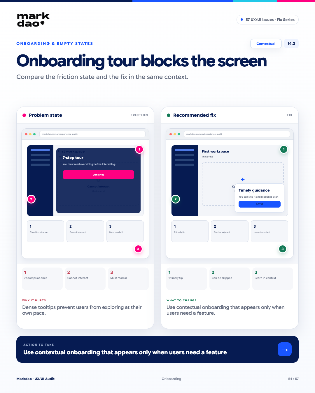
Figure 14.3. Illustration of the “Onboarding tour blocks screen and forces reading” error and how to fix it.
Onboarding should help users get familiar with the product without hindering their experience. Tours or tooltips that appear too frequently, cover content, or force users to complete the entire guide can disrupt their journey and limit their ability to explore on their own.
Signs to look for:
- Multiple tooltips appear in succession as soon as the user enters the product.
- Tooltips cover CTAs, content, or areas where the user needs to interact.
- Users cannot continue using the product until they have finished the entire tour.
- There is no option to skip or close the guide.
- Instructions appear before the user actually needs to use the feature.
Impact: Onboarding becomes a barrier rather than a support, disrupting the user journey and making it difficult for users to explore the product at their own pace.
How to fix: Prioritize Contextual Onboarding: display short instructions exactly when the user begins using the relevant feature, allowing them to skip and not blocking unnecessary actions.
Post-fix check: User opens feature → 1 short, timely tip appears → can be skipped → continue interacting immediately.
Checklist milestone: Contextual + Optional + Non-blocking Onboarding.
15 Dark Pattern Errors
Dark patterns are a distinct category of errors because they are not just design flaws, but can be intentional design choices aimed at guiding or manipulating user behavior. Such designs may improve short-term metrics while simultaneously undermining user control, transparency, consent, and trust. In highly regulated industries like finance, the risks can even extend to Compliance and legal.
15.1 Pre-ticked newsletter checkbox
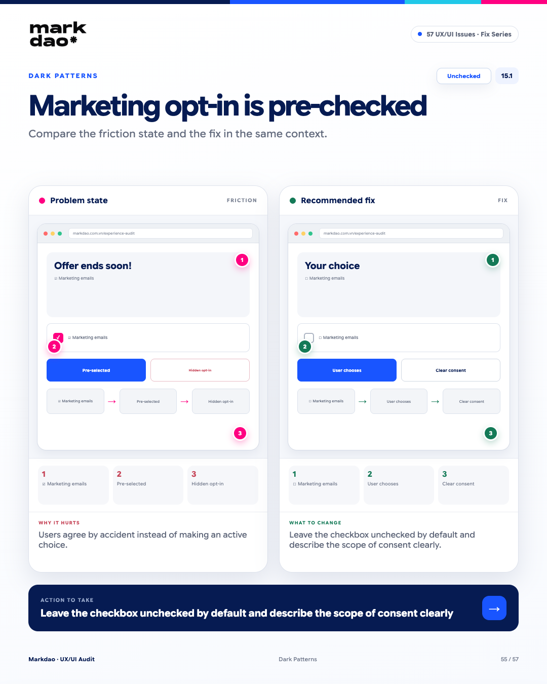
Figure 15.1. Illustration of the “Pre-ticked newsletter checkbox” error and how to fix it.
Newsletter subscription checkboxes should require users to actively opt-in. When a checkbox is pre-ticked, users may unintentionally agree to receive marketing communications without actively confirming their choice. For data consent collection, this design may also fail to meet legal requirements depending on the market and the purpose of data processing.
Signs to look for:
- The email/SMS marketing checkbox is already ticked.
- Users must manually uncheck the box to opt out.
- Consent language is bundled with other terms, making it difficult to determine the scope of consent.
- There is no clear choice between opting in and opting out.
Impact: Users may provide consent unintentionally, reducing their control and the transparency of the consent process.
How to fix: Leave the checkbox unchecked by default, and clearly state the content and scope of the consent. Do not bundle marketing consent with mandatory terms if the purposes are different.
Post-fix verification: Open the form → the checkbox is in the ☐ state → the user actively selects it → the consent content is clear.
Checklist: Unchecked by Default + Explicit Consent + Clear Scope.
15.2 Decline buttons using confirm shaming
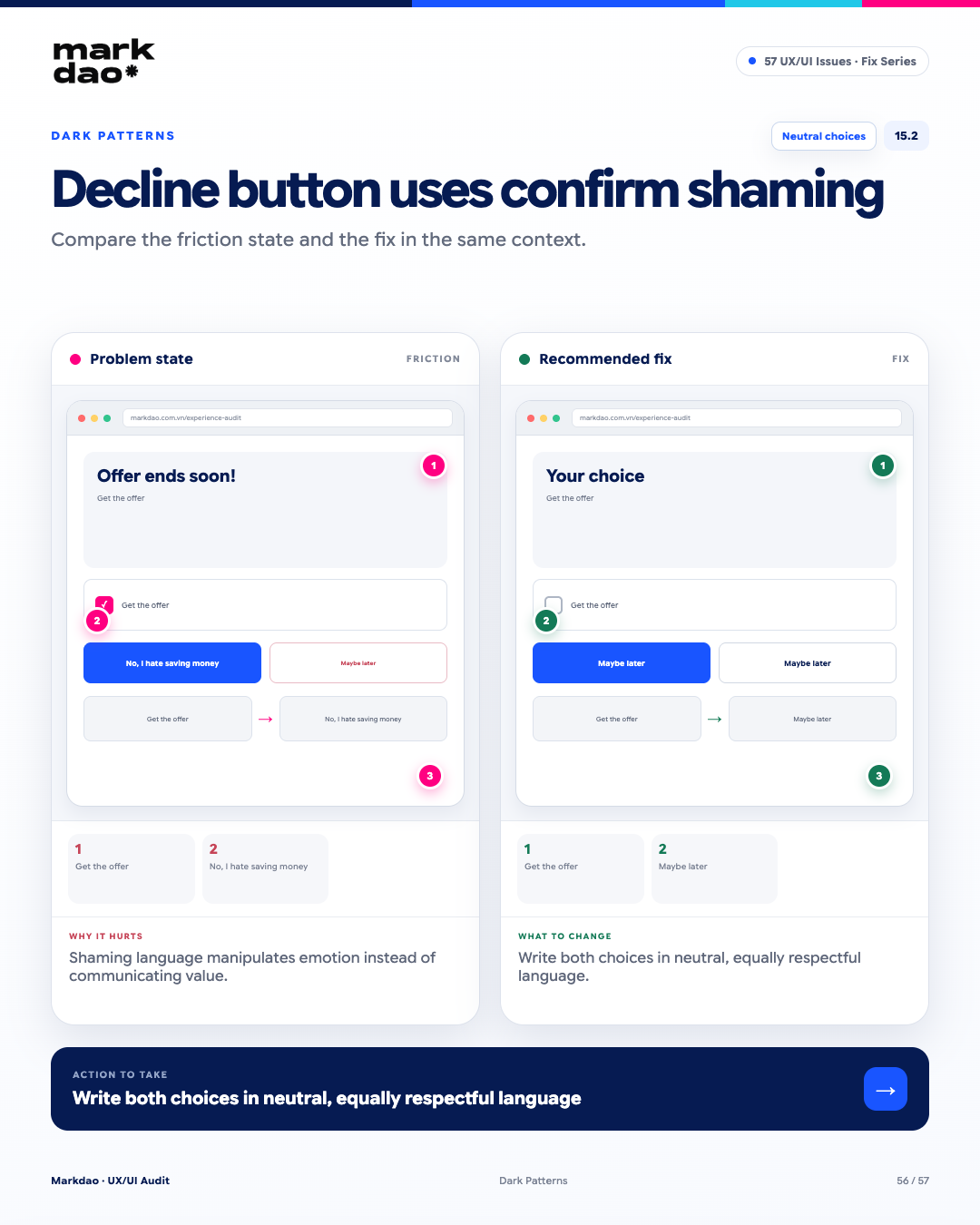
Figure 15.2. Illustration of the “Decline button using confirm shaming” error and how to fix it.
Confirm shaming is the use of language that makes users feel guilty or ashamed for declining an offer. Instead of helping users make choices based on value, this type of copywriting creates emotional pressure and diminishes their sense of autonomy.
Signs to look for:
- The decline button uses negative or judgmental language.
- The acceptance option is written positively, while the decline option is written to induce guilt.
- Users feel as though they have to explain or justify their decision to decline.
- The two options lack a comparable level of neutrality.
Impact: It diminishes the user's sense of autonomy and creates psychological pressure instead of helping them make a voluntary choice.
How to fix: Write both options using neutral, clear, and balanced language, without assigning moral value to the decision to decline.
Post-fix check: Get offer → Maybe later → both options are neutral and create no pressure.
Checklist: Neutral Language + Equal Choice Weight.
15.3 Cancellation flow is much harder than the sign-up flow
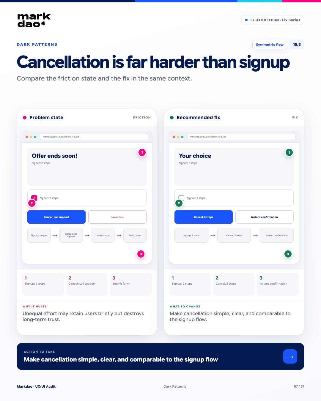
Figure 15.3. Illustration of the "Cancellation flow is much harder than the sign-up flow" error and how to fix it.
Flow cancellation should not intentionally create significantly more friction than the sign-up flow. This asymmetry in effort can make users feel trapped against their will and erode trust.
Signs to look for:
- Sign-up takes only a few steps, but cancellation requires significantly more.
- Sign-up is online, but cancellation requires calling a hotline or submitting a manual request.
- Users must navigate through multiple persuasion screens before being allowed to cancel.
- There are unnecessary waiting periods or cancellation conditions.
- Cancellation cannot be completed directly through the same channel used for sign-up.
Impact: Increases friction and reduces the sense of control; it may retain users in the short term but negatively impacts trust and long-term experience.
How to fix: Allow cancellation simple, clear, and consistent with the registration flow, keeping only the steps strictly necessary for verification, security, or legal requirements.
Post-fix check: Registration → 2 steps → Cancellation → 2 steps → clear confirmation of cancellation status.
Milestones: Symmetric Flow + User Control + No Unnecessary Friction.
How to prioritize website UX/UI issues
Not every UX/UI issue needs to be fixed immediately. Prioritization should be based on the impact on task completion, conversion, data integrity, risk, and user experience, rather than just how visible the issue is.
Principle: Prioritize by Impact × Frequency × Risk, then consider effort and dependencies to determine the implementation order.
90-minute website UX/UI audit process
1. Identify the 3 most important tasks
Choose actions directly tied to website goals, such as:
- Submitting a contact form.
- Placing an order or checking out.
- Finding products or key information.
Do not audit by "going through every page." Start with user goals and business goals.
2. Run each task on mobile first
Record where users:
- Get stuck.
- Have to guess.
- Don't know the next step.
- Have to redo a step.
- Receive no feedback.
- Are at risk of giving up.
3. Check high-friction points
Focus on:
- Navigation and information architecture.
- Search and filters.
- Forms and validation.
- CTAs.
- Loading and system feedback.
- Error messages.
- Post-submission confirmation.
- Data persistence when navigating back or encountering errors.
This aligns with Nielsen Norman Group's usability principles, which state that systems should keep users informed about their current status and help them recognize and recover from errors rather than leaving them to guess.
4. Performance and accessibility testing
Use PageSpeed Insights, Lighthouse, and Search Console to check actual performance and identify technical issues that can be detected automatically.
For Core Web Vitals, Google currently uses three main metrics:
- LCP: ≤ 2.5 seconds.
- INP: < 200 ms.
- CLS: < 0.1.
These are the thresholds Google recommends for a good user experience.
At the same time, perform keyboard accessibility testing to detect:
- Unclear focus indicators.
- Incorrect tab order.
- Keyboard traps.
- Components that cannot be operated via keyboard.
- Forms or errors not clearly described with text.
WCAG 2.2 requires that functionality must be keyboard-accessible and input errors must be identified and described in text.
5. Record evidence, not just opinions
Each issue should include:
Issue → Evidence → Impact → Recommendation → Priority → Owner
Example:
Issue: The “Sign up” CTA is unresponsive after clicking.
Evidence: No loading state or confirmation appears within 3 seconds.
Impact: Users may click repeatedly or assume the system is broken.
Fix: Display a loading state and confirmation after submission.
Priority: P1.
6. Categorize issues from P0 to P3
At the end of the audit, group issues by priority and add them to the backlog along with evidence, impact, owner, and status.
The goal is not to find the most bugs, but to identify the ones most worth fixing.
How UX/UI impacts SEO
UX/UI and SEO are related, but UX should not be equated with a ranking factor.
Google has confirmed that Core Web Vitals are used in its ranking systems, while also recommending that websites provide a good overall page experience. However, Google has also made it clear that achieving a good Core Web Vitals score does not guarantee a top ranking, as the Search system considers many other signals.
The relationship can be understood in three layers:
- UX/UI → reduces friction → makes it easier for users to achieve their goals
- Technical performance → improves loading, responsiveness, and visual stability → supports Page Experience
- SEO → requires a combination of helpful content, crawlability/indexability, relevance, technical SEO and many other signals
Google also emphasizes that helpful, reliable, people-first content remains the foundation of Search; Page Experience does not replace content quality and relevance.
Therefore, do not audit UX/UI by only asking: "Is the Lighthouse score high enough?"
Instead, ask: "Can users find information, understand the interface, and complete tasks quickly, clearly, and with minimal friction?"
That is the intersection of UX, Conversion, Accessibility, Performance, and SEO.
Conclusion
You don't need to fix all 57 checklist items at once. Start with tasks that generate revenue or leads, document the evidence, prioritize P0 and P1 issues, and measure the results after each round of fixes. Once an issue is resolved, the completion criteria should describe the new behavior, not just note that the interface looks better.
FAQ

UI (User Interface) refers to what users see and directly interact with, such as buttons, colors, typography, and layout. UX (User Experience) covers the entire journey and experience users have while trying to accomplish a goal. UI is one part of UX.
Fix P0 and P1 issues first, especially those that prevent users from completing tasks, cause data loss, break checkout or forms, make CTAs non-functional, hide or obscure fees, or create accessibility barriers that prevent users from accessing content.
Yes. Start with three important user tasks, test them on mobile, try navigating with keyboard only, and use tools such as Lighthouse or PageSpeed Insights. A deeper UX audit may still require behavioral data, user interviews, or usability testing with real users.
Good UX supports a better page experience and can improve user satisfaction and conversions. It can also contribute to technical factors such as Core Web Vitals. However, Google does not guarantee higher rankings simply because a page has a good UX score or passes Core Web Vitals.
A UX/UI issue is considered fixed when its root cause has been resolved, the intended user flow works as expected, and the issue no longer occurs under the defined conditions. Verify the fix through functional, usability, responsive, and accessibility testing, supported by analytics or user feedback where relevant.