

Have you ever wondered why professional websites always look clean, balanced, and easy to read despite having tons of content? The secret lies in the grid, a magical system that many designers consider the backbone of any layout. Beyond just keeping things organized, the grid is a creative tool that helps you build beautiful, responsive, and highly effective websites. Let's join Markdao in exploring what a grid is and how to leverage it to transform your website from cluttered to perfect!
What is a grid in web design?
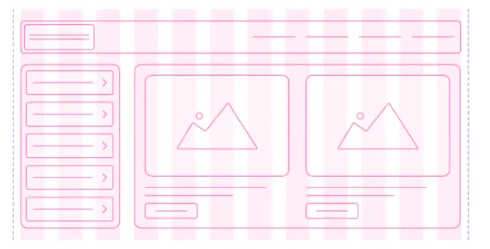
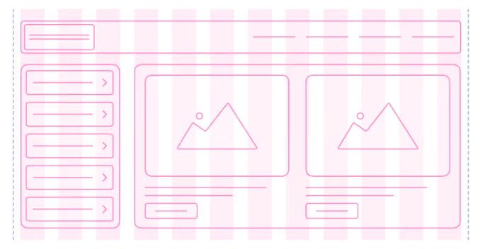
In web design, a grid (or grid system) is a structure consisting of imaginary or visible lines that help arrange elements on a webpage in an orderly, balanced, and visually appealing way. Grids aren't lines that users see when visiting your site; rather, they are the hidden framework that helps designers and developers organize content—from images, text, and videos to buttons and banners.
The Role of the Grid
1. Creating order and balance: A website without a grid is like a room without shelves: everything ends up cluttered, making it hard for users to focus. A grid ensures that every element is aligned in rows and columns with consistent spacing, making the website look polished and professional.
2. Supporting user experience (UX): A grid makes it easier for users to read content, identify key sections, and navigate the page intuitively. When everything is in its right place, the user experience becomes smoother, which in turn increases engagement.
3. Ease of management and design optimization: Designers can quickly add, remove, or move elements without breaking the overall layout. Grids also help development teams easily implement responsive design, allowing the layout to automatically adjust for desktops, tablets, or mobile phones.
Key Features of a Grid
- Columns: Divide the layout into columns to organize content vertically. For example, a 12-column layout is common in frameworks like Bootstrap.
- Rows: Columns are placed within rows to maintain consistent horizontal spacing.
- Gutter: The space between columns or rows, allowing content to "breathe" and preventing it from appearing cluttered.
- Margin: The distance from the content to the edge of the page, creating overall balance.
In summary, the grid is an indispensable tool in modern web design. It not only helps keep layouts organized but also optimizes user experience, supports responsive design, and ensures consistency across the entire website. If you want your website to be both visually appealing and professional, mastering the grid is an essential first step you cannot afford to skip.
Common types of grids
A grid is not just a fixed frame; in web design, there are many different types of grids, each serving a specific purpose and allowing designers to arrange layouts flexibly.
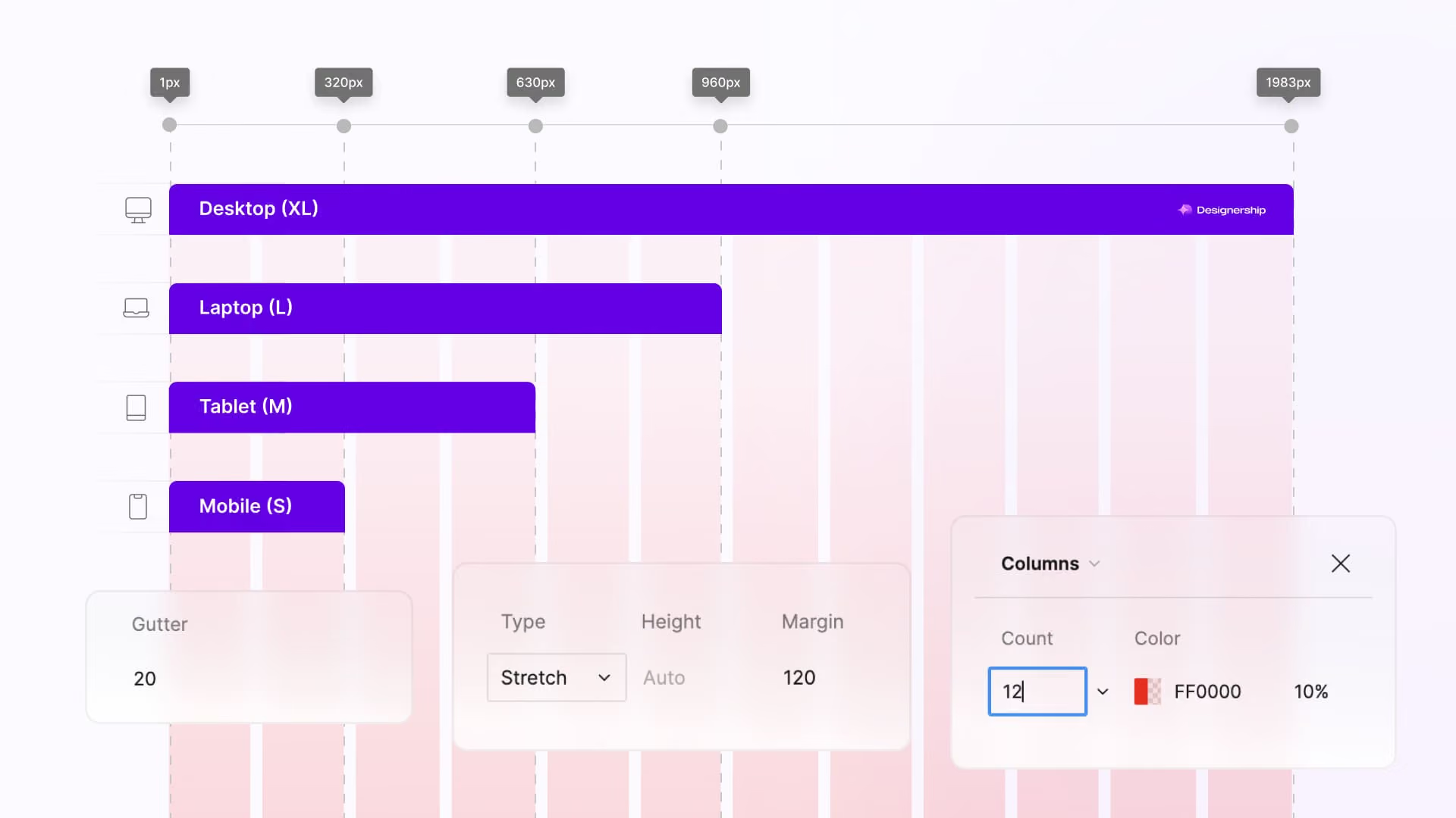
Here are the most common types of grids:
1. Column Grid
- Description: The layout is divided into multiple vertical columns, typically using 12 or 16 columns in frameworks like Bootstrap.
- Application: Easily divides content into sections such as headers, articles, sidebars, and footers.
- Advantages:
- Makes it easy to organize content vertically.
- Supports responsive design when switching to smaller screens.
- Example: A blog page divides the main layout into 12 columns, with the article section taking up 8 columns and the sidebar 4 columns.
2. Modular Grid
- Description: The grid is divided into equal squares or modules , aligned both by rows and columns.
- Application: Suitable for interfaces that need to organize multiple images, icons, or products.
- Advantages:
- Easy to arrange elements uniformly.
- Enhances aesthetics and visual balance.
- Example: An e-commerce page displaying products in a “grid gallery” format, where each product sits within a module cell.
3. Hierarchical Grid
- Description: Uneven column or row sizes, arranged based on content hierarchy.
- Application: Websites that need to emphasize different elements, such as prominent banners, key articles, or large images.
- Pros:
- Allows for visual differentiation and highlights key information.
- Flexible for creative design.
- Example: News sites with a large main banner and smaller secondary articles, maintaining order despite the uneven layout.
4. Baseline Grid (typography grid)
- Description: Based on line height , typography elements are aligned to baseline guides to create consistency.
- Application: Websites with long-form text that require high readability, especially news sites, blogs, and documentation.
- Pros:
- Helps text appear uniform and easy to read.
- Creates harmony with other elements on the page.
- Example: In blog content, the spacing between headings, paragraphs, and images is aligned to the baseline.
Each type of grid has its own role in creating web layouts:
- Column Grid → organizes the overall layout.
- Modular Grid → arranges multiple elements uniformly.
- Hierarchical Grid → emphasizes important content.
- Baseline Grid → synchronizes typography and enhances aesthetics.
Understanding these grid types will help you choose the right tool for each project, creating websites that are both visually appealingand provide a smooth user experience.
The role and benefits of Grids in web design
In modern web design, grids are more than just organizational tools; they offer significant benefits, helping websites achieve both aesthetic appeal and an optimized user experience.
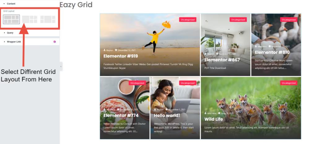
Here are the key roles and benefits:
- Creating order and layout balance: Grids help organize every element on the page into logical rows, columns, and spacing, preventing cluttered layouts and ensuring the website looks clean and professional.
- Enhancing user experience (UX): When every element is placed in its proper "spot," users can easily read, follow, and interact with content without visual distraction.
- Supporting responsive design: Grids allow website designs to automatically adjust their layout across various screen sizes, from desktops to tablets and phones, maintaining consistency on every device.
- Saving time in design and management: Designers and developers can easily add, remove, or move elements without breaking the overall layout, while minimizing errors during edits.
- Creating consistency throughout the website: Using a grid ensures that subpages have a synchronized layout, enhancing professionalism and brand identity.
- Supporting flexible creativity: Although grids create order, when combined with hierarchical or modular grids, designers can still create unique and standout layouts without feeling restricted.
Thanks to these benefits, the grid is not just a technical tool but a "powerful assistant" that helps designers create websites that are both visually appealing and effective, delivering the best experience for users.
Principles for using Grids
Grids are more than just simple rows and columns. When used correctly, they make a website clean, intuitive, easy to view, and optimized for user experience.
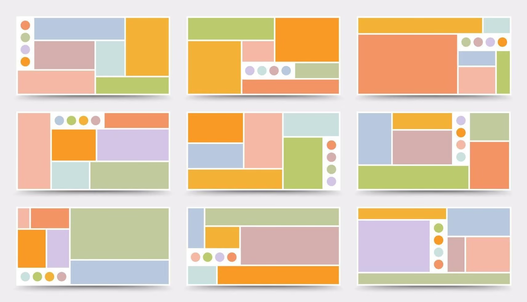
To achieve this, you need to master the following principles:
1. Maintain consistent proportions and spacing
One of the most important principles is maintaining consistent proportions and spacing between elements. When all columns, rows, gutters, and margins are kept uniform, a website immediately becomes balanced, harmonious, and professional.
- Uniform spacing makes it easier for the user's eye to follow the content without feeling cluttered.
- Proper proportions apply not only to text and large images but also to icons, buttons, and secondary banners—every small element on the page requires careful consideration.
- When designing new sections, maintaining these proportions ensures everything fits seamlessly into the overall layout, preventing a cluttered look when adding new content.
Practical example: On a blog, if posts, sidebars, and ad banners all maintain consistent proportions and spacing, users can easily focus on the main content without being distracted by secondary elements.
2. Choose the right number of columns for your layout
The number of columns you choose directly impacts content organization and the user experience:
- 12 columns: Suitable for simple layouts, such as personal blogs, landing pages, or product introduction pages. Basic elements can be easily organized and made responsive.
- 16–24 columns: Suitable for complex layouts, such as dashboards, e-commerce websites, or content-heavy portals. This helps clearly define sections, maintaining balance and ease of management.
Choosing the right number of columns also affects responsive design: elements will scale or stack smoothly across various screen sizes. A quick tip is to visualize how elements will appear on small phones or tablets to determine the optimal number of columns.
3. Use gutters and margins effectively
Gutters and margins are "silent" but crucial elements:
- Gutter: The space between columns, allowing elements to "breathe" and preventing them from appearing cramped.
- Margin: The distance from the content to the edge of the page, creating overall balance.
Principles:
- If the gutter is too narrow → the layout feels cramped, making content difficult to read.
- If the gutter is too wide → the layout feels disjointed, and elements lose their visual connection.
Additional notes:
- Adjust gutters and margins based on the importance of the content. Main sections can have wider spacing to stand out, while secondary sections should maintain moderate spacing.
- Check the layout across multiple devices to ensure gutters and margins remain harmonious, avoiding a cluttered or overly sparse appearance.
4. Combine with visual hierarchy
A grid provides an orderly layout, but to guide users on what to look at first, you need to incorporate visual hierarchy:
- Large headings spanning multiple columns serve as the primary focal point when users land on the page.
- Banners or key images spanning the full width capture attention immediately.
- Secondary elements like icons, buttons, and smaller articles are neatly arranged lower down, creating visual balance.
Thanks to this combination:
- Users can easily distinguish between primary content and supplementary information.
- The visual experience is smoother, which helps increase interaction with the website.
For example, on an e-commerce site, best-selling products or special offers might span multiple columns to stand out on the screen, while other products are arranged in a neat modular grid.
5. Stay flexible
While a grid creates order, don't be too rigid. Sometimes, breaking the grid creates a powerful focal point:
- Full-width banners to grab attention.
- Prominent call-to-action buttons that encourage users to sign up or make a purchase.
- Unique layouts for key content, such as featured articles or sliders.
The key takeaway: maintain overall balance. Elements outside the grid should harmonize with the rest of the design so that the visual experience remains cohesive while still feeling unique and engaging.
A grid is only truly effective when you test it across multiple devices:
- Check if elements look crowded or misaligned.
- Observe how text, images, and buttons scale and rearrange responsively.
- Adjust gutters, margins, or column counts as needed to keep the layout balanced and smooth.
An important principle is to always test with real users. Their feedback will help you refine your grid, ensuring a better visual experience and an optimized layout.
By following these principles, the grid becomes a powerful tool that keeps your website clean, readable, responsive, and creatively flexible. Every layout you design can be both professional and engaging, enhancing the overall user experience and aesthetic. At this point, the grid is no longer just a framework; it is an essential partner in helping you build websites that are perfect in both layout and experience.
How to apply a grid in practice
Applying a grid to website design not only keeps the layout tidy but also enhances user experience and increases professionalism. Here are some practical ways you can implement a grid:
- Start with wireframes: Before designing the actual interface, create wireframes based on a grid. This helps you logically determine the placement of elements, the order of information display, and the proportions between sections. Wireframing is also a crucial preparatory step to identify any overlapping or cluttered areas before starting the final design.
- Choose the right grid type: Depending on the purpose and type of website, you can choose:
- 12 columns: simple and easy to manage for blogs and landing pages.
- 16–24 columns: for content-heavy, complex sites like dashboards or e-commerce platforms.
- Modular or hierarchical grids can also be combined to create flexibility while maintaining order.
- Use CSS Grid or Flexbox: Modern grid systems in front-end development are typically implemented using CSS Grid or Flexbox, making it easy to adjust layouts for various screen sizes. With CSS Grid, you can precisely define columns, rows, and spacing; Flexbox helps elements shift positions fluidly while remaining balanced.
- Leverage frameworks like Bootstrap or Tailwind: If you want to save time, you can use frameworks that provide built-in grid support. For example:
- Bootstrap: provides a responsive 12-column grid, making it easy to arrange layouts across desktop, tablet, and mobile.
- Tailwind CSS: allows for flexible design using utility classes, making it easy to customize gutters, margins, and responsive breakpoints.
- Test your layout across multiple devices: Applying a grid is just the first step; testing on desktop, tablet, and mobile is crucial. Ensure every element is balanced and doesn't overlap or look disjointed. Adjust gutters, margins, and column counts as needed to keep the layout seamless.
- Use grids to balance visual hierarchy: When applying a grid, use it to emphasize key elements:
- Large banners, main headings, and calls-to-action should span more columns.
- Secondary content or small icons should follow a modular grid to create visual cohesion and balance.
- Be flexible when you need to break the grid: Grids provide order, not restrictions. Feel free to break the grid when you need to highlight banners, CTAs, sliders, or featured sections. The key is to maintain overall balance, creating a creative feel without causing visual clutter.
When you apply grids practically, you will find your website becomes clean, balanced, and easy to interact with, while remaining flexible enough for your design needs. A grid is not just a technical tool; it is an assistant that makes every layout intuitive, beautiful, and professional, taking the user experience to a new level.
Conclusion
A grid is more than just lifeless rows and columns on a screen; it is a powerful tool that helps every design become clean, balanced, and easy to read. By mastering the principles—from maintaining proportions and choosing the right number of columns to using gutters and margins effectively, incorporating visual hierarchy, and knowing when to break the grid—you will find that every layout is not only beautiful but also optimized for the user experience.
In practice, applying grids through wireframes, CSS Grid, Flexbox, or frameworks like Bootstrap not only saves time but also helps websites adapt smoothly across all devices. The grid is a tool that creates order while opening up space for creativity, allowing designers to freely express ideas while ensuring the overall design remains balanced and intuitive.