


Have you ever wondered why the same color tone can make one website look vibrant and energetic, while another feels soft and sophisticated? The secret lies in Saturation. In web design, saturation is not just an aesthetic element; it is an "emotional language" that helps shape the user experience. Understanding what saturation is and knowing how to adjust it properly will help you create an interface that is both visually appealing and perfectly aligned with your brand identity. Join Markdao as we explore how to master saturation to turn every color on your website into a powerful communication tool!
What is saturation?
In graphic design and web design, saturation refers to the "purity" or "intensity" of a color. Simply put, it represents the degree of mixture between the base color and gray:
- When saturation is high, colors become bright, vivid, and eye-catching.
- When saturation is low, colors lose their intensity, becoming softer, more neutral, or grayer.
For example: take the color red; if you decrease the saturation, it shifts toward a pale pink or gray, whereas increasing the saturation makes the red deeper, bolder, and more attention-grabbing.
Distinguishing saturation from hue and brightness
To truly understand its nature, you need to distinguish saturation from the other two elements in the HSB (Hue – Saturation – Brightness) color system:
- Hue: the actual color itself—for example, red, blue, yellow, etc.
- Saturation: the intensity or dullness of that color.
- Brightness: indicates how light or dark that color is.
When you change the Saturation, you are not changing the Hue, but only the "strength" or "weakness" of that color.
The emotional role of Saturation
Color is not just visual; it is also emotional. Saturation contributes to creating a visual language that directly influences how users perceive a website:
- High saturation colors: convey a sense of energy, modernity, and strength – suitable for youthful, creative brands.
- Low saturation colors: create a sense of sophistication, minimalism, and professionalism – often seen in luxury brands or the finance and technology sectors.
Example:
- The Coca-Cola website uses highly saturated red to express energy and joy.
- Meanwhile, Apple uses desaturated colors to highlight sophistication and luxury.
Why do designers need to understand Saturation?
Because with just a skillful adjustment of saturation, you can:
- Highlight important areas (CTAs, banners, key products).
- Guide the viewer's eye to the desired location.
- Maintain a balance between aesthetics and readability.
- Create a consistent and memorable brand identity.
Saturation is the soul of color, defining the emotion and vitality of an interface. Understanding and controlling saturation helps you transform your website into a visual communication space that is both eye-catching and professional.
The importance of saturation in website design
In website design, saturation acts as a bridge between aesthetics and emotion. It not only determines whether colors appear vibrant or muted but also profoundly influences how users perceive your brand. A website that uses saturation effectively can evoke positive emotions, helping visitors easily remember your message and feel engaged throughout their experience.
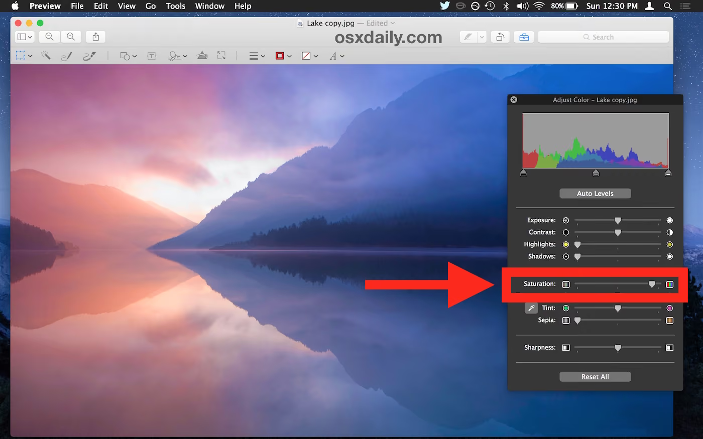
Saturation directly impacts user psychology. High-saturation colors often convey strong, youthful, and bright energy, making them ideal for creative, tech, or fashion brands.
Conversely, low-saturation colors create a sense of elegance, sophistication, and reliability, often seen on high-end websites or businesses aiming for minimalism. Therefore, by simply fine-tuning saturation, designers can "steer" the viewer's emotions to align with the message the brand wants to convey.
Beyond the emotional aspect, saturation also significantly influences user experience (UX) and readability. Over-saturated colors can make an interface cluttered and cause eye strain during prolonged viewing, while colors that are too muted can make content lose its impact. The secret lies in finding a visual balance where elements remain prominent without distracting the viewer.
Furthermore, saturation can directly affect user behavior and conversion rates. Call-to-action (CTA) buttons with high-saturation colors are often more effective at grabbing attention and encouraging clicks. For example, vibrant orange or deep blue are frequently used to highlight "Sign Up" or "Buy Now" buttons, thanks to their ability to stimulate the eyes and evoke a sense of trust.
Finally, saturation contributes to building brand identity. Every business has its own "color signature" expressed through the characteristic saturation in its design. Bold colors can symbolize youth and enthusiasm, while muted tones convey minimalism and class. When applied consistently across a website, social media, and marketing materials, saturation becomes a visual thread that helps the brand leave a lasting impression on customers.
In summary, saturation is an indispensable element in building a website that is both beautiful and effective. It helps balance aesthetics, emotion, and functionality—the three key pillars of modern user experience. A designer who masters the art of adjusting saturation can "breathe life" into an interface, turning every color tone into an emotional part of the brand's story.
How to effectively adjust saturation in web design
To use saturation effectively, designers must understand that simply increasing or decreasing it isn't always the answer. Adjusting saturation correctly helps a website interface look both attractive and easy on the eyes, while emphasizing the brand's message.
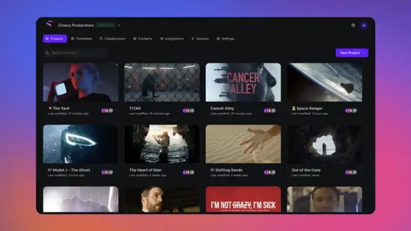
Adjusting saturation in website imagery
Images occupy a large portion of a website, so fine-tuning the saturation of your visuals is crucial.
- Increasing the saturation of key images helps highlight products or main subjects.
- Reduce saturation in backgrounds or secondary images to keep the user focused on the main content.
- Consider the overall color tone of images to ensure consistency with your brand.
Using saturation for backgrounds and text
The saturation of background colors and text directly affects readability and the user experience.
- Low-saturation backgrounds help content stand out and make it easier to read.
- Text should be paired with moderate saturation to avoid eye strain while ensuring sufficient contrast against the background.
- Important elements like headings or CTA buttons can use highly saturated colors to grab attention.
Emphasizing CTAs and highlights
Call-to-action (CTA) buttons or key areas on a website often need to be highlighted.
- Use highly saturated colors for CTAs to guide the eye and encourage users to click.
- Coordinate with low-saturation backgrounds or surrounding elements to create a natural pop effect.
- Conduct A/B testing to determine the optimal saturation level for each CTA or banner location.
General principles for adjusting saturation
- Avoid overusing highly saturated colors, as they can easily cause visual glare and eye strain.
- Maintain a balance between highlighted areas and areas that provide visual rest.
- Sync saturation with your brand colors to maintain consistency and professionalism.
- Check the display on both desktop and mobile to ensure colors do not appear distorted.
Effective saturation adjustment not only makes an interface eye-catching but also optimizes the user experience, increases conversion rates, and strengthens brand identity. By mastering these principles, designers can turn every color tone on a website into a powerful and subtle tool for conveying messages.
Common mistakes when using saturation in web design
While saturation is a powerful tool for adding vibrancy and emotion to a website, many designers still make common mistakes that render interfaces ineffective or frustrating for users. Recognizing and avoiding these errors will help you optimize the visual experience and elevate your design.
Overusing high saturation
One of the most common mistakes is using too many highly saturated colors on a single webpage.
- The interface becomes "glaring," causing eye strain and making it difficult to focus.
- Users are easily distracted, which reduces readability and the ability to identify important information.
- It diminishes professionalism if overly vibrant colors do not align with the brand.
Excessively low saturation
Conversely, reducing saturation too much also causes problems:
- The website looks dull, lacks focal points, and struggles to capture attention.
- CTAs or product images fail to stand out, leading to lower conversion rates.
- The interface lacks vitality, making the user experience feel boring.
Ignoring brand identity
Every brand has its own color palette that reflects its identity and style.
- Using saturation inconsistently with brand colors can erode brand recognition.
- The interface no longer accurately reflects the brand's spirit, reducing credibility in the eyes of users.
Lack of testing and validation
Failing to check saturation across different devices or neglecting A/B testing is a common oversight.
- Colors can appear differently on desktop monitors, laptops, tablets, and mobile phones.
- Lack of testing means critical elements like CTAs, sign-up buttons, or banners may not stand out as intended.
Understanding and identifying common mistakes when using saturation helps designers adjust colors more effectively. Saturation is not just an aesthetic element; it also impacts user experience, readability, brand recognition, and conversion rates. Mastering the principles of saturation ensures that a website is visually appealing, professional, and effective at conveying its message.
Professional tools for adjusting saturation
Adjusting saturation is more than just basic color correction; it requires specialized tools to ensure your website interface remains visually appealing, consistent, and optimized for user experience. Here are the tools frequently used by professional designers:
Color and saturation adjustment tools for images and interfaces
- Adobe Photoshop: This is the top choice. By using adjustment layers like Hue/Saturation in Photoshop, you can precisely change saturation globally or for specific color ranges.
- GIMP: A powerful, free software that supports color editing, including the ability to adjust Hue/Saturation via HSV/HSL color modules.
- Pixlr: An online photo editor that provides intuitive Saturation and Vibrance sliders. It is convenient for quick edits without the need to install heavy software.
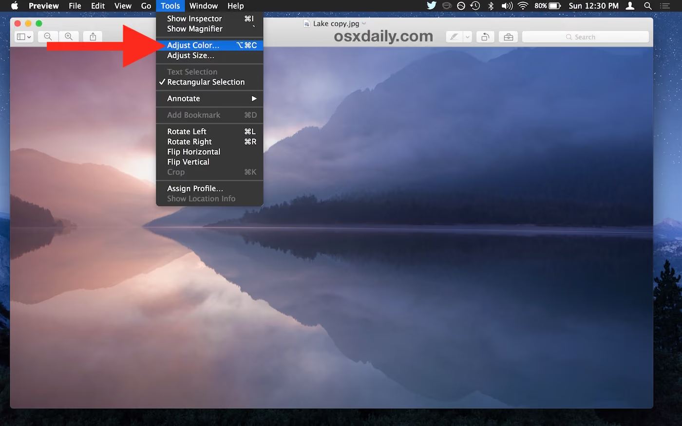
- Compact online tools like WU Image Editor (Adjust Saturation & Hue) allow you to upload images and quickly adjust saturation or desaturate colors.
Tools for color design and brand palettes
- Canva (Color Wheel & Color Picker): Allows you to view and adjust HSL (Hue-Saturation-Luminance) parameters, helping you understand the relationship between color and saturation.
- Additionally, color analysis tools, contrast checkers, and website palette generators are highly useful for ensuring that the colors used have the appropriate saturation for your brand while remaining readable with good contrast.
Tips for using tools to adjust saturation effectively
- When using Photoshop or GIMP: Instead of editing the entire image, use "Adjustment Layers" or "Selective Color" to target only the areas that need to stand out, avoiding unwanted changes to the rest of the interface. (For example: increase saturation only on a CTA button while keeping the background more muted).
- When using online or quick tools like Pixlr/WU: Experiment with presets like "Muted" (low saturation) or "Vivid" (high saturation), then manually fine-tune them to suit your website interface.
- For brand palettes or UI design: Use a Color Picker or Color Wheel to ensure that saturation levels align with your brand identity and do not cause eye strain during prolonged browsing.
- Always check your display after editing on both desktop and mobile devices, as saturation can appear differently depending on screen type, brightness, and ambient lighting.
Using the right tools will help you professionally control color saturation, from product images to website interfaces, and from brand palettes to CTA buttons. When you combine the right tools with sound principles, you turn color into a powerful tool for conveying your message—making it both striking and comfortable for users.
Conclusion
Saturation is not just a technical color parameter, but also an “emotional language” that determines how users experience your website. Understanding what saturation is, and knowing how to adjust and harmonize it with other design elements, will help make your interface more attractive, readable, and aligned with your brand identity. From increasing the prominence of CTAs and balancing background colors with text, to selecting the right tones for your brand, saturation is a powerful tool for making a strong first impression and enhancing the user experience.
With the principles, tips, and tools we have shared, designers and marketers can fully transform every color tone on their website into a tool that conveys messages with emotion, sophistication, and professionalism. Try applying these techniques today to make your website not only visually appealing but also deeply memorable for your users!