

You open a website on your phone. The banner fits the screen, the menu is clickable—does that mean the site is mobile-ready?
Not necessarily.
If a visitor has to scroll through four screens just to understand what you sell, if the contact button is hidden behind a chat widget, or if the form is so difficult to fill out that they give up, your website is still losing leads even if the layout isn't broken.
That is why a responsive website is not always a mobile-first website. Responsive design primarily helps the interface adapt to screen sizes. Mobile-first goes further: it determines what content should appear first, which actions must be easy to perform, and whether the page maintains its ability to convert on mobile devices.
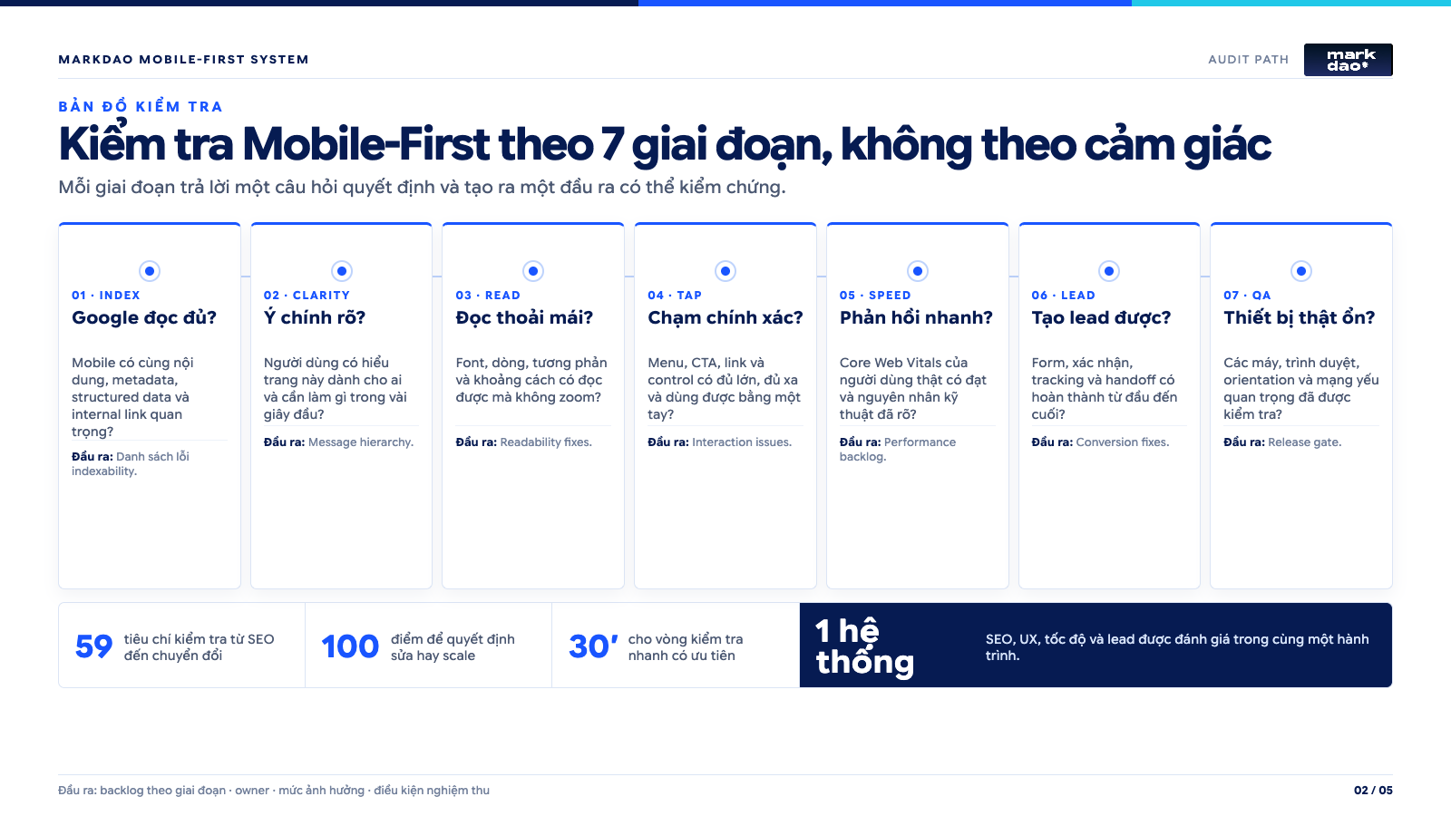
In this article, our mobile-first checklist is divided into 7 stages with 59 criteria. You can use it before launching a new website, after a redesign, or when mobile traffic is up but lead volume remains stagnant.
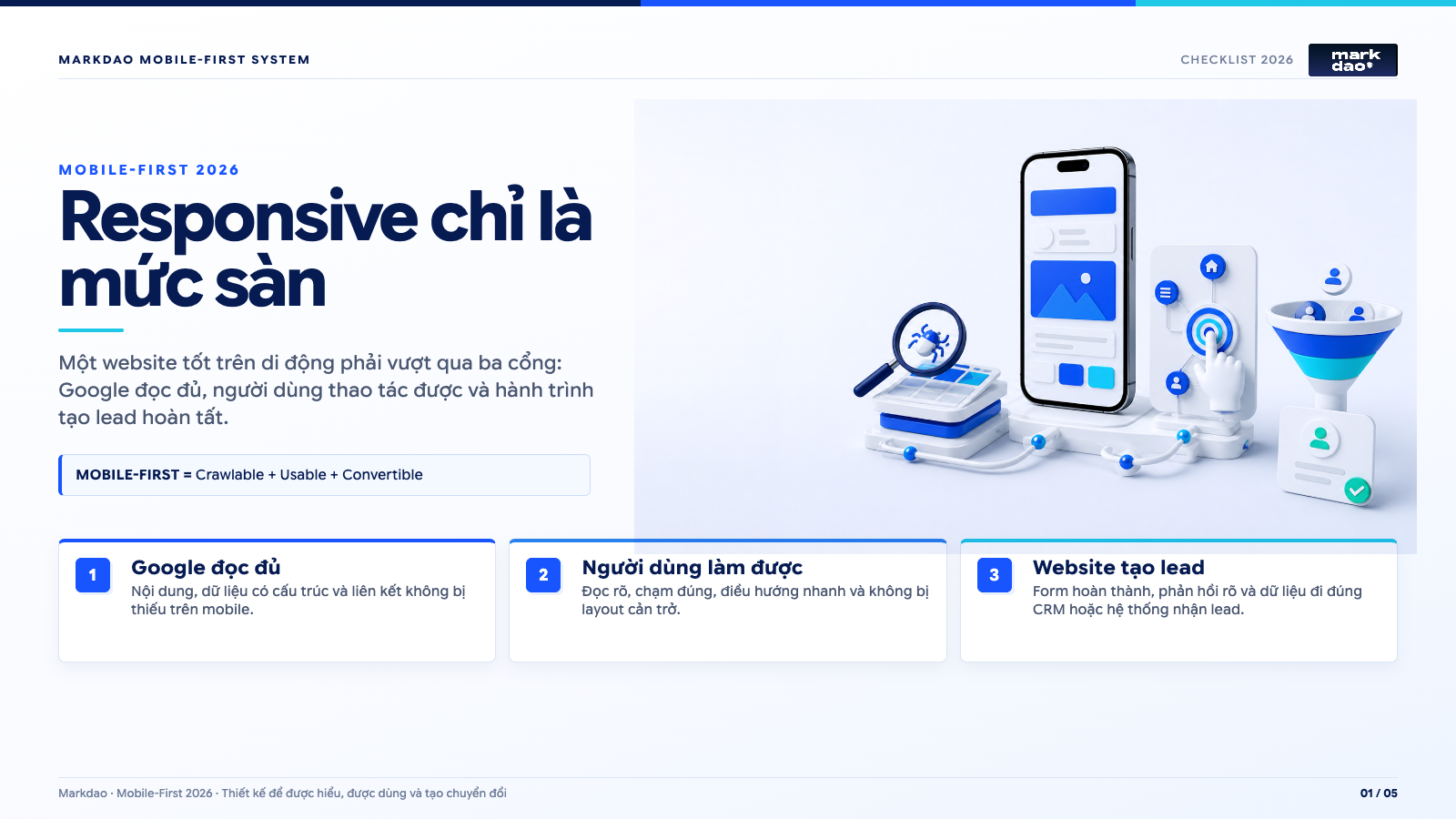
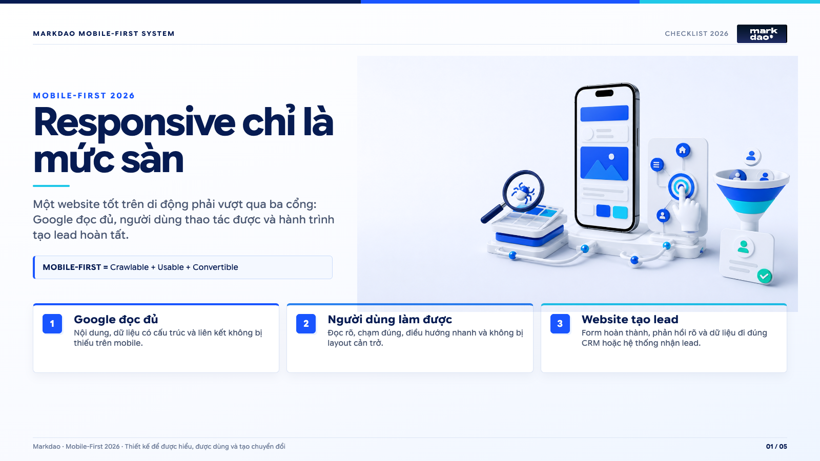
Mobile-First Checklist is built on three simple questions:
- Can Google fully read the mobile version?
- Do users understand the site and find it easy to navigate?
- Does the website help them complete key actions?
If you only need a quick check, spend 30 minutes on the process at the end of this article. If you are preparing to refresh your website, you can also refer to our SEO-standard website design process to integrate mobile-first principles into your project from the very beginning.
Download the 2026 Mobile-First Checklist (PDF)
You don't need to finish reading the entire article to start auditing. Markdao has converted the 59 criteria into a practical PDF file so your marketing, SEO, design, and development teams can audit against a common standard.
In the file, each criterion includes checkboxes for Pass, Fail, and N/A, along with space for evidence, the owner, and the deadline. You can also use the 100-point scoring system to determine whether you need a platform overhaul or just continued conversion optimization.
- 7 stages ranging from Google's ability to crawl the page to verifying leads in your CRM.
- A 30-minute quick audit process.
- A 100-point scoring system, P0-P2 priority levels, and a template for planning fixes within a single sprint.
DOWNLOAD THE 2026 MOBILE-FIRST CHECKLIST (PDF)
12-page PDF · 59 criteria · Printable or ready for website quality assurance.
What is Mobile-First? Why is a screen-fitting website not enough?
Mobile-First is a design and development approach that starts with the needs of users on small screens, then scales the experience for tablets and desktops. This method forces teams to prioritize what matters most, remove distractions, and make primary actions easy to complete via touch.
Responsive design and Mobile-First are not opposites.
- Responsive design is how an interface scales to fit various screen sizes.
- Mobile-First is how you prioritize content, performance, and the user journey starting from the small screen.
- Mobile SEO ensures Google crawls and indexes your mobile version accurately and completely.
- Mobile CRO helps users complete calls, forms, bookings, or orders with fewer obstacles.
For example, on a desktop, three pricing plans might sit side-by-side. On a phone, if you simply stack all three into a long column, the page remains responsive, but the customer has to scroll extensively to find the sign-up button. A mobile-first design forces the team to choose which plan to prioritize, condense the comparison, and place the call-to-action at the right moment.
Google now uses the mobile version as the primary basis for crawling and indexing. Therefore, missing important content on mobile not only makes it difficult for customers to use your site but also results in Google receiving a less informative version. You can view the official guidelines at Google's Mobile-First Indexing guide.
Before checking your website on mobile, determine why visitors are coming to the page
A checklist is only meaningful when tied to the goals of each specific page. Service pages, product pages, and blog posts cannot share the same conversion standards.
Before you begin, answer these five questions:
- Do users arrive from Google, ads, social media, or direct links?
- Do they want to read information, compare options, make a call, book an appointment, or make a purchase?
- What is the most important action on the page?
- What percentage of your current traffic and leads comes from mobile devices?
- Which pages have high mobile traffic but low conversion rates?
For a B2B service page, the goal isn't for visitors to read every word. They need to understand what problem the business solves, see relevant proof, and easily submit an inquiry. For an e-commerce page, the task is to help customers find the right product, compare options quickly, and check out smoothly.
Write the page goal in a single sentence. For example: “After viewing this page on mobile, a qualified lead can understand the service and submit a consultation form in under three minutes.” This sentence will help you distinguish between elements that truly need fixing and those that are merely aesthetic.
Phase 1: Does Google see the full mobile version?
A beautiful interface means little if Google only sees part of the content. The first phase of the mobile SEO checklist is to verify crawlability, indexability, and consistency between mobile and desktop.
8 criteria to check
- Can Googlebot Smartphone access the URL and receive a 200 status code?
- Is the main content on mobile as complete as it is on desktop?
- Are the title, meta description, and H1 relevant to the page topic?
- Is the structured data on mobile complete and valid?
- Are the robots meta, canonical, and hreflang tags configured correctly?
- Are critical CSS, JavaScript, images, and fonts blocked from Googlebot?
- Does the main content load without requiring the user to click, swipe, or perform any special actions?
- Are important internal links still present and accessible on the mobile interface?
How to check
Open URL Inspection in Google Search Console, enter the URL you want to check, and run a live test. View the screenshot Google captured, the rendered HTML, and the list of resources that failed to load.
Then, open the same URL on both your computer and phone. Compare the following:
- Service or product content.
- Headings and the main answer section.
- Images, videos, and alt text.
- Breadcrumbs and internal links.
- FAQs, reviews, and structured data.
- Contact buttons, forms, and business information.
Accordions and tabs can still be used on mobile, provided the content is already in the HTML and accessible to users through standard interactions. The key is to avoid loading main content only after a click, which Googlebot may not perform.
When is it considered successful?
Google sees the same main content, headings, links, and structured data as mobile users. The mobile version must not have a noindex tag, incorrect canonicals, or broken paths to important pages.
If it's not successful, where should you start fixing it?
Prioritize fixing indexing blocks first. Then, address discrepancies in content, metadata, schema, and internal links. If the website uses a separate m.domain.com version, you must also check redirects, canonicals, and hreflang tags between the two versions. For most business websites today, a responsive design using a single URL is easier to manage.
If you need a comprehensive audit beyond just Mobile SEO, you can refer to Markdao's holistic SEO services.
Phase 2: Do visitors understand the website within the first few seconds?
Mobile users often arrive with a specific question in mind. They want to know if they are in the right place and what to do next. If the initial screen only shows a large image, a generic introduction, and multiple competing buttons, visitors have to decode the page themselves before they can take action.
8 criteria to check
- Does the initial screen clearly state what the business offers?
- Can readers identify who the product or service is for?
- Are the main benefits specific rather than just a slogan?
- Does the page have one primary call-to-action that stands out from secondary ones?
- Do your CTAs use clear language like "Get a consultation," "View pricing," or "Book an appointment"?
- Does the hero image support your message rather than just serving as decoration?
- Do popups, cookie banners, or ads block content before the user has a chance to read it?
- Does important content appear early enough without being pushed too far down by banners and whitespace?
How to test
Hand your phone to someone unfamiliar with your brand. Let them view the page for five seconds, then turn off the screen. Ask them these three questions:
- What does this website offer?
- Who is it for?
- If you were interested, what would you click on?
If they cannot answer, the issue usually lies in the content hierarchy, not the colors or effects.
When is it considered successful?
A new visitor should be able to understand your core offer and identify the next step without reading the entire page. The first CTA doesn't necessarily have to be a hard sell, but it must match the reader's level of readiness.
If it's not working, where should you start fixing it?
Start by rewriting your hero section using these three layers:
- Who do you help?
- What results do you help them achieve?
- What should they do next?
Keep one primary CTA. Actions like viewing case studies, reading more, or following social media should have lower priority. If your page serves multiple customer segments, guide them with clear choices rather than trying to cram everything into a single introductory sentence.
Phase 3: Is the content truly readable on mobile?
Comprehensive content isn't necessarily easy to digest. An article might be SEO-optimized for desktop but feel overwhelming on mobile due to overly long paragraphs, wide tables, and infographics with tiny text.
8 criteria to check
- Is the content readable without zooming in?
- Does each paragraph focus on a single main idea?
- Do headings help readers scan quickly and find the section they need?
- Is the text well-spaced, not too long, or too cramped?
- Are tables responsive to small screens while remaining readable?
- Is the text in images and infographics large enough on mobile?
- Does the page scroll horizontally at widths of 320, 360, 390, or 430 px?
- Is important content removed from mobile just to make the page look shorter?
How to check
Don't just look at the page on the latest iPhone size. Check smaller screens too. Scroll from top to bottom and mark where you have to stop to zoom in, scroll horizontally, or re-read a section.
For tables, try these three methods:
- Convert each row into a card.
- Keep essential columns and move details into an expandable section.
- Allow horizontal scrolling with clear indicators if the table cannot be simplified.
For infographics, don't just take a desktop image and shrink it down. If the reader cannot read the text at its actual display size, the image no longer serves its purpose of explaining.
When is it considered successful?
Users can read, scan, and understand the content with one hand, without needing to zoom or encountering cut-off sections. Headings accurately reflect the questions readers are looking to answer, rather than just containing keywords for search engines.
If it's not there yet, where should you start fixing it?
Break long paragraphs into smaller blocks. Put conclusions first, followed by explanations. Convert wide tables into cards or side-by-side comparisons. For secondary content, you can use accordions, but do not remove it from mobile.
This is also a key principle when designing an SEO-friendly landing page: the content must be sufficient for Google to understand, yet organized so that visitors can find answers quickly.
Phase 4: Can users tap and navigate easily with one hand?
Many mobile issues only appear once real users start interacting. Buttons may look large enough, but the actual touch target is small. Menus might open but fail to close. Zalo, chat, cookie, and CTA bars might all crowd the bottom of the screen.
9 criteria to check
- Are buttons, links, and controls large enough to tap accurately?
- Is there enough spacing between adjacent actions to prevent accidental taps?
- Does the mobile menu open, close, and navigate back clearly?
- Does the entire navigation work via touch, without relying on hover states?
- Are key CTAs placed in easily accessible positions within the usage context?
- Do sticky bars obscure content, submit buttons, or error messages?
- Do chat, hotline, Zalo, and cookie banners overlap each other?
- Can users identify which element is currently selected or in focus?
- Does the page use clear colors, contrast, and control labels?
What should the touch target size be?
According to WCAG 2.2, touch targets at the AA level should be at least 24 x 24 CSS pixels or meet spacing exceptions. For primary CTAs, menus, and frequently used controls, about 44 x 44 CSS pixels is a more practical and user-friendly size. See details at W3C Target Size Minimum.
You shouldn't apply the "thumb zone" as a fixed map for every website. Easy-to-reach areas depend on the user's dominant hand, how they hold their device, their age, device size, and established habits. A menu at the bottom of the screen might be easy to reach but still confusing if it goes against the user's familiar conventions.
How to test
Hold your phone with one hand and complete the main tasks. Repeat with the other hand. Then, increase the system font size and zoom in on the browser to see if the interface remains usable.
Pay special attention to commonly overlooked areas:
- Popup close buttons.
- Terms and conditions checkboxes.
- Carousel arrows.
- Footer links.
- Back buttons in multi-level menus.
- Form submit buttons while the keyboard is open.
What counts as a pass?
The user does not have to constantly adjust their grip, rarely makes accidental taps, and no critical actions are obscured by other interface layers.
If it doesn't pass, where should you start fixing?
Fix conflicts between floating layers first. Then, increase touch targets, spacing, and focus states. If there are too many buttons fixed to the bottom of the screen, keep one primary action and move secondary actions to a menu or a less intrusive area.
Phase 5: Is the website fast for real users?
PageSpeed scores are not the ultimate goal. What matters is whether real visitors have to wait, tap without response, or experience unexpected layout shifts while reading.
8 criteria to check
- Does real-world mobile data meet Core Web Vitals?
- Is LCP 2.5 seconds or less at the 75th percentile?
- Is INP 200 milliseconds or less at the 75th percentile?
- Is CLS 0.1 or less at the 75th percentile?
- Is the hero image the correct size, format, and file size?
- Are critical fonts, CSS, and JavaScript slowing down the initial content?
- Are third-party scripts like chat, ads, and tracking under control?
- Has the website been tested under slow network conditions and on mid-range mobile devices?
What is the difference between field data and lab data?
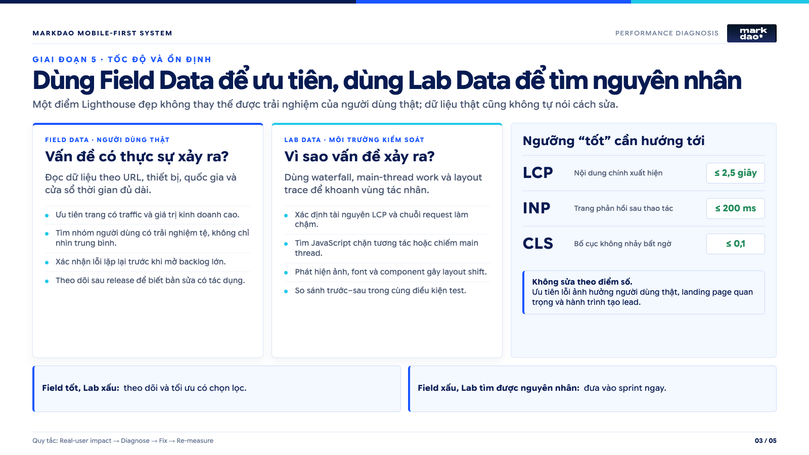
Field data is information from real users, typically aggregated in the Chrome User Experience Report and displayed on PageSpeed Insights or Search Console. Lab data is the result of simulations under specific test conditions.
Simply put:
- Field data shows what real users are experiencing.
- Lighthouse and lab data help identify the potential causes of those issues.
A single low Lighthouse score is not enough to conclude that all users are having a poor experience. Conversely, a score of 95 does not prove that the website is always fast on every device. Google also notes that performance scores can fluctuate based on the testing environment, device, browser extensions, and dynamic content. See more at Lighthouse performance scoring.
How to test
Open PageSpeed Insights and enter your URL. If real-world data is available, read the section on real user experience first. Then, use the diagnostics section to identify the causes.
Test by page template, not just the homepage:
- Homepage.
- Service or category pages.
- Product pages.
- Image-heavy blog post.
- Advertising landing page.
- Form or checkout process.
Common causes
Poor LCP is often caused by heavy hero images, slow server response times, render-blocking CSS, or critical resources being discovered too late.
Poor INP is usually related to heavy JavaScript, long tasks on the main thread, complex filters, or excessive third-party scripts.
Poor CLS often occurs when images lack declared dimensions, fonts shift after loading, or banners are injected above the content being read.
When is it considered passing?
All three Core Web Vitals metrics must reach the good threshold at the 75th percentile for mobile users. More importantly, the page must respond consistently on real devices, not just look good in a single favorable test. Official thresholds are updated at web.dev's Core Web Vitals.
If it doesn't pass, where should you start fixing it?
Prioritize page templates with high traffic or high revenue generation. Fix LCP issues, layout shifts, and long JavaScript tasks before optimizing minor details. Don't rush to delete all tracking. Identify which scripts are actually serving measurement needs and which are running but no longer in use.
Phase 6: Can the form and lead generation journey be completed?
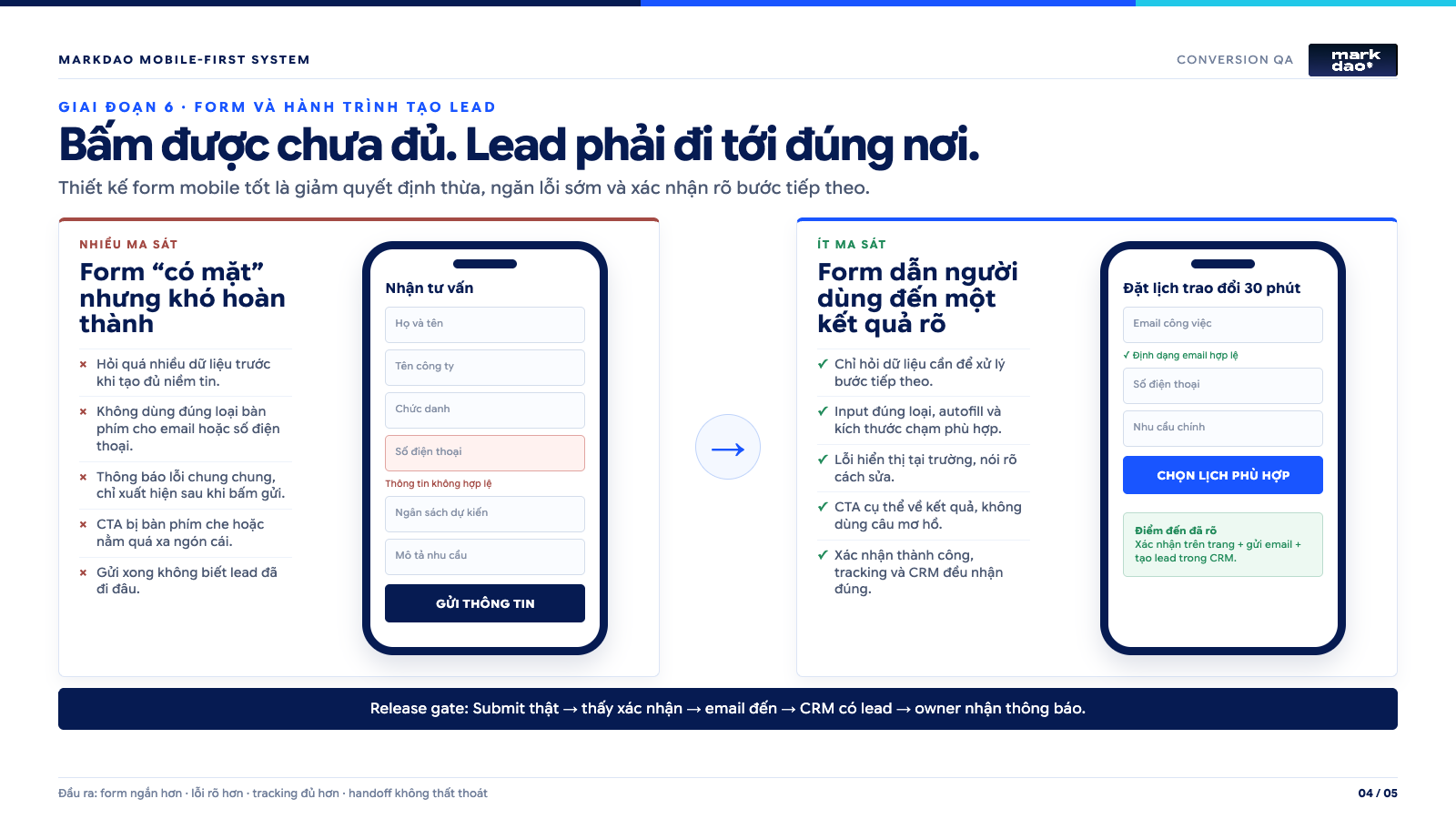
This is where a website can pass every technical test and still fail to produce results. A button that works doesn't mean the conversion journey is sound. Customers also need to understand what will happen next, enter information easily, and receive clear confirmation.
10 criteria to check
- Does the CTA lead correctly to the action promised by the content?
- Does the form only ask for information necessary for the current step?
- Does each field have a clear label that doesn't disappear when the user starts typing?
- Does the keyboard match the data type required, such as phone numbers, emails, or numeric codes?
- Can the browser autofill the relevant information?
- Do error messages clearly indicate which field is incorrect and how to fix it?
- Does the keyboard cover the input field, error message, or submit button?
- Does the submit button provide clear feedback to prevent users from clicking it multiple times?
- After submitting, do customers receive a clear notification or instructions on the next steps?
- Are leads, calls, or transactions correctly recorded in your tracking tools and CRM?
How to test
Don't just click the submit button. Act like a new customer and complete the entire journey:
- Find the page via Google or a campaign link.
- Read the introduction and social proof.
- Click the CTA.
- Fill out the form with valid data.
- Try leaving a required field blank.
- Try entering an invalid email or phone number.
- Submit the form while the keyboard is still open.
- Check for the success message.
- Verify that the lead reaches your email, CRM, or sales system.
- Check that the conversion event is recorded exactly once.
A form might submit successfully, but the lead may not reach the sales team. A call button might open the correct app but fail to trigger a tracking event. These errors don't show up in UI reports, but they directly impact revenue.
When is it considered a success?
A qualified lead can complete the primary action on their phone without guesswork, re-entering information, or being interrupted. The business receives accurate data and knows exactly which source the lead came from.
If you're not there yet, where should you start fixing things?
First, fix the errors that prevent the journey from being completed. Then, reduce the number of fields, improve error messages, and add autocomplete. Only then should you test CTA placement, copy, and social proof near the form.
To dive deeper into the relationship between interface and conversion, see 7 UX/UI principles for CRO.
Phase 7: Is the website tested on real devices and monitored after fixes?
Chrome DevTools is useful for catching errors early, but it cannot fully simulate the browsers, keyboards, touch interactions, fonts, and performance of individual phones. Website testing on mobile is only complete when using real devices and tracking data after changes are made.
8 criteria to check
- Has the website been tested on at least one iPhone using Safari?
- Has the website been tested on at least one Android phone using Chrome?
- Does it display correctly on both small and large screens?
- Do portrait and landscape modes break the layout or obscure buttons?
- Do large system font sizes and 200% zoom cause content to disappear or overlap?
- Have menus, popups, videos, forms, uploads, and payments been tested from start to finish?
- Have the bugs been documented with severity levels, screenshots, assigned owners, and deadlines?
- After making fixes, does the business monitor traffic, Core Web Vitals, and mobile conversions?
Minimum device matrix
For a typical business website, the minimum test suite should include:
- One small or medium-sized iPhone with Safari.
- A mid-range Android phone with Chrome.
- A large-screen device.
- Portrait and landscape modes.
- Slow Wi-Fi and mobile networks.
- Large system fonts and browser zoom.
If the majority of your customers use a specific line of devices or browsers, prioritize based on GA4 data rather than trying to test every device on the market.
When is it considered successful?
Critical journeys function smoothly on devices representing the majority of users. Every bug has an owner and is re-tested after being fixed. Changes are validated not just by intuition, but by actual data.
If it's not there yet, where should you start fixing?
Categorize bugs by impact:
- P0: Pages cannot be indexed, CTAs or forms are broken, payments fail, or core content is missing.
- P1: The journey can still be completed but is difficult to use, slow, or prone to misclicks.
- P2: Aesthetic and consistency issues that do not directly affect core tasks.
Fix P0 issues before running ads or driving more traffic. P1 issues should be handled in the next release. P2 issues can be bundled into a UI improvement sprint.
With the same checklist, different types of websites require different priorities.
A bug might be critical for one website but less important for another. Here is how to adjust priorities based on your business model.
B2B service website
B2B buyers often need to understand capabilities, see proof, and assess fit before reaching out. On mobile, prioritize:
- Clear messaging about the problem and the target audience.
- Services, industries served, and scope of work.
- Case studies or social proof near the CTA.
- Short forms for initial contact.
- Call, request, or booking buttons that function reliably.
- Company profile files optimized for mobile viewing.
For example, a service page might feature a very long expert article but hide the form five screens down. The fix isn't necessarily to cut the content. You can add contextual CTAs after the problem explanation and after the case study.
If your business is preparing to rebuild this journey, Markdao's professional website design services can help integrate content structure, user experience, and lead generation goals from the very beginning.
E-commerce websites
Mobile shoppers need to find items quickly, compare them easily, and check out smoothly. Prioritize:
- User-friendly search and filters.
- Product images that load quickly while remaining clear.
- Visible pricing, variants, stock status, and shipping fees.
- An unobstructed "Add to Cart" button.
- A shopping cart that accurately retains items and quantities.
- Discount codes that don't disrupt the checkout process.
- Payment methods optimized for mobile.
- Clear error notifications for failed transactions.
A beautiful filter that is slow to respond can be more harmful than a simple one. On small screens, response speed and the ability to easily return to the list are more important than transition effects.
Websites for clinics, restaurants, and local businesses
Users are often looking to take immediate action. They might be on the go, comparing locations, or checking opening hours. Prioritize:
- Call and booking buttons.
- Address, map, and opening hours.
- Easy-to-view services or menus.
- Pricing or how to get a quote.
- Reviews and social proof.
- Information consistent with your Google Business Profile.
- Short forms that don't require account creation unless necessary.
SaaS Websites
For SaaS, mobile goals may differ from desktop. A complex system doesn't necessarily need to bring the entire admin experience to mobile, but users still need to:
- Understand what problem the product solves.
- View features and use cases.
- Watch demos or videos without layout issues.
- Sign up for a trial or book a demo.
- Receive confirmation emails and next steps for onboarding.
- Log in and handle urgent tasks if the product supports mobile.
Mobile-First doesn't mean cramming every desktop task onto a small screen. It means identifying the tasks users actually need to perform on their phones and executing them well.
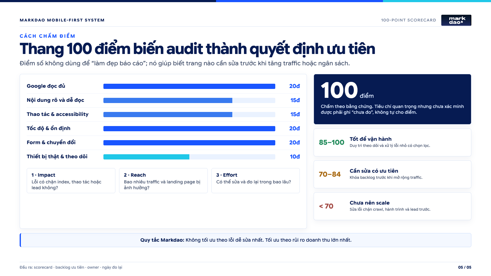
How to score your Mobile-First checklist out of 100
To avoid a long list with no clear starting point, score your site across these six categories:
- Fully crawlable by Google: 20 points.
- Clear and readable content: 15 points.
- Navigation, touch interactions, and accessibility: 15 points.
- Speed and stability: 20 points.
- Forms and conversions: 20 points.
- Real devices and tracking: 10 points.
How to interpret the results:
- 85 to 100 points: A solid foundation; continue addressing P1 issues and testing for conversions.
- 70 to 84 points: The website is functional but has significant bottlenecks. Do not scale up traffic until these are fixed.
- Below 70 points: You need to overhaul the foundation before investing further in SEO or advertising.
There is one important rule: a high total score cannot compensate for critical errors. If a page is set to noindex, a form fails to submit, or the checkout button is obscured on mobile, the website is not ready, even if the total score is above 85.
30-minute mobile website audit process
If you don't have time to go through all 59 criteria, use this streamlined process instead.
0 to 5 minutes: See what Google sees
- Inspect the URL using Search Console.
- Compare the main content between mobile and desktop versions.
- Check the title, H1, canonical tags, and indexing status.
5 to 10 minutes: See if users understand the page
- Open the page on a real mobile device.
- Read the first screen within five seconds.
- Identify the main message and CTA.
- Check if the popup obscures any content.
10 to 15 minutes: Try one-handed operation
- Open and close the menu.
- Click CTAs, carousels, and footer links.
- Check chat, Zalo, cookies, and the sticky bar.
- Test portrait and landscape modes.
15 to 20 minutes: Check speed
- Run PageSpeed Insights.
- Review real user data if available.
- Identify which LCP, INP, or CLS metrics are failing.
- Record the primary cause suggested by the tool.
20 to 25 minutes: Complete the main action
- Make a call, submit a form, book an appointment, or make a purchase.
- Test with invalid data.
- Check for the success notification.
- Verify if the lead or transaction was recorded.
25 to 30 minutes: Prioritize fixes
For each issue, record five details:
- URL and device where the error occurred.
- Screenshot or video recording of the error.
- Impact on SEO, user experience, or conversions.
- Priority level P0, P1, or P2.
- Owner and deadline.
12 common mobile design issues and how to fix them
Most mobile errors don't start with a wrong breakpoint. They arise when teams force a desktop layout onto a small screen, while users are skimming, operating with one hand, and potentially dealing with unstable connections. Therefore, each issue below is presented in the same format: identify, test, fix, and verify. Designers, developers, and marketers can use this directly when reviewing a page that is generating traffic or leads.
1. Hero section still follows desktop logic, burying the main message
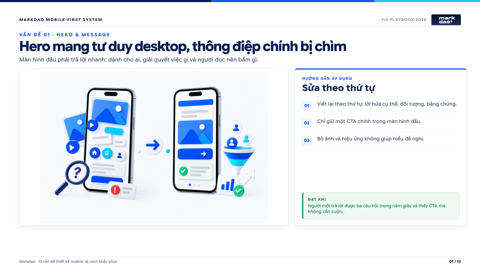
Implementation guide: 1) Rewrite in this order: specific promise, target audience, proof. 2) Keep only one primary CTA in the first screen. 3) Remove images and effects that don't help clarify the offer.
Success criteria: A new visitor can answer three questions in five seconds and see the CTA without scrolling.
Signs: The first screen contains large images, generic copy, multiple logos, or effects but fails to clearly answer who the business helps, what problem it solves, and what the reader should do next. The primary CTA is below the fold or competes with multiple secondary buttons.
Impact: Visitors from ads or Google have to scroll and piece information together before understanding the offer. For B2B service websites, this is a common lead drop-off point because potential customers don't know if the page is relevant to their industry and scale.
Practical testing method: Open the page on a phone, cover the part below the first screen, and ask someone unfamiliar with the brand to answer three questions in five seconds: What is this service? Who is it for? What is the next step? If they have to guess, the hero section is not effective.
How to fix: Arrange the hero section in the order of a specific promise, target audience, a brief piece of proof, and one primary CTA. Keep images only if they help the reader understand the product or the result. Move the CTA into the first screen; secondary CTAs like "view case study" can use text links or outlines to avoid competing for hierarchy.
Acceptance criteria: On screens 320 to 430 CSS px wide, the reader sees the full core message and CTA without zooming. There is only one primary CTA style throughout the page, and click events are tracked correctly.
Practical example: A web design service page shouldn't open with "Creating distinct digital experiences." A clearer sentence is "B2B website design that helps your sales team get qualified leads," followed by social proof and a "Get website structure consultation" button.
2. Mobile content is truncated or prioritized incorrectly
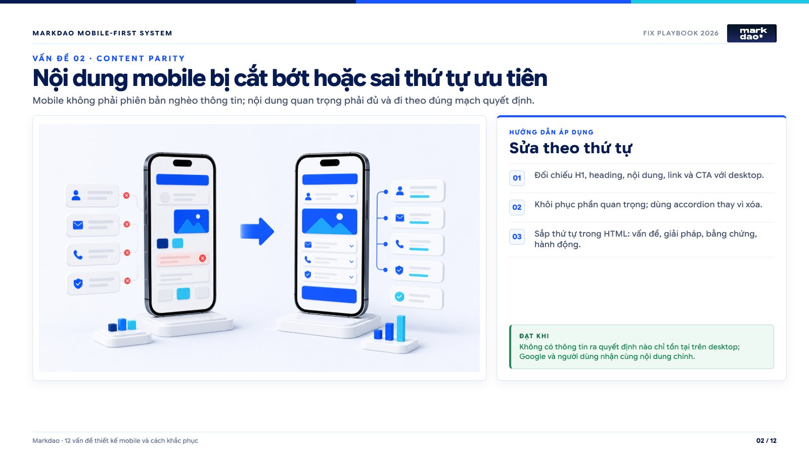
Implementation guide: 1) Compare H1, headings, content, links, and CTAs with the desktop version. 2) Restore important sections; use accordions instead of deleting content. 3) Reorder HTML structure: problem, solution, proof, and call to action.
Success criteria: No decision-making information is exclusive to desktop; Google and users receive the same core content.
Signs: Desktop displays service descriptions, case studies, FAQs, or important links that are hidden on mobile via CSS. Another sign is sufficient content but an illogical order: images appearing before headings, CTAs placed before proof, or pricing tables separated from their explanations.
Impact: Users lack the information needed to make decisions, and Google may receive a diluted mobile version. Mobile-First does not mean shortening by deletion; the goal is to reorganize so that important content is more accessible.
Practical testing method: Place desktop and mobile windows side-by-side. Compare H1, headings, main content, internal links, structured data, and CTAs. Then, read the mobile version from start to finish to see if the "problem, solution, proof, action" flow is seamless.
How to fix: Keep the same important content but break it into short paragraphs, lists, tabs, or clearly labeled accordions. Use CSS order with caution, as the visual order may differ from the source code and the reading order for assistive technology. If you need to change the structure, change it directly in the HTML to follow the correct content sequence.
Acceptance criteria: No decision-making information is exclusive to desktop. Mobile and desktop are consistent regarding core content, metadata, structured data, and internal links; accordions are accessible via keyboard and assistive technology.
3. Overloaded menus, primary actions hidden in the hamburger menu
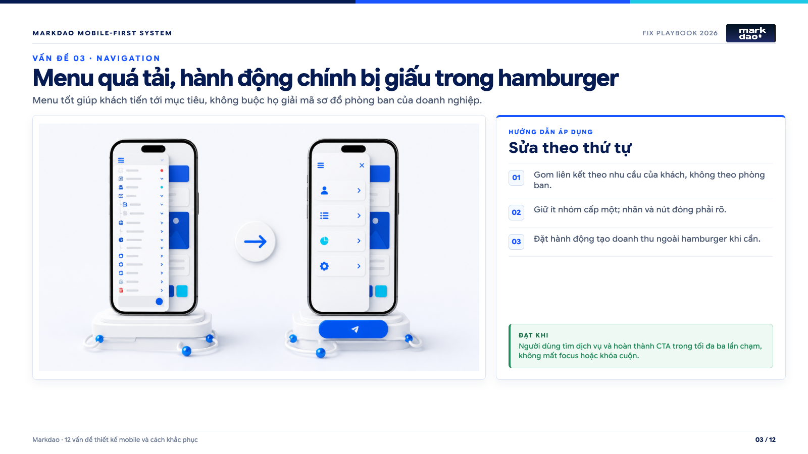
Implementation guide: 1) Group links based on customer needs, not internal departments. 2) Keep the number of top-level categories low; labels and close buttons must be clear. 3) Place revenue-generating actions outside the hamburger menu when necessary.
Success criteria: Users can find a service and complete a CTA within three taps, without losing focus or experiencing scroll locking.
Signs of failure: The mobile menu contains dozens of top-level links, vague labels, or multiple layers of submenus. Users must open the menu just to find a phone number, booking link, login, or cart. When returning to the page, the menu fails to maintain its state, or the close button is placed outside of an easily reachable area.
Impact: Navigation becomes a chore rather than a tool to help users reach their goals quickly. High-intent leads are likely to abandon the site simply because they cannot find the service, location, or CTA they saw in their search results.
Practical testing: Use one hand to perform three tasks: find a service, return to the homepage, and complete a CTA. Record the number of taps, the number of times you have to backtrack, and where you hesitate. Try this again with increased system font sizes.
How to fix: Group links based on customer needs rather than internal company structure. Keep only primary categories at the top level, ensure each group can be expanded clearly, and always provide a close button. For revenue-generating actions like booking or the cart, consider placing them outside the hamburger menu or in a sticky action bar, provided they do not obscure content.
Acceptance criteria: Critical tasks are completed within three taps from any main page. The menu does not overflow, lose focus, or lock scrolling after closing, and it functions reliably in both portrait and landscape modes.
4. Buttons, icons, and links are too small or placed too close together
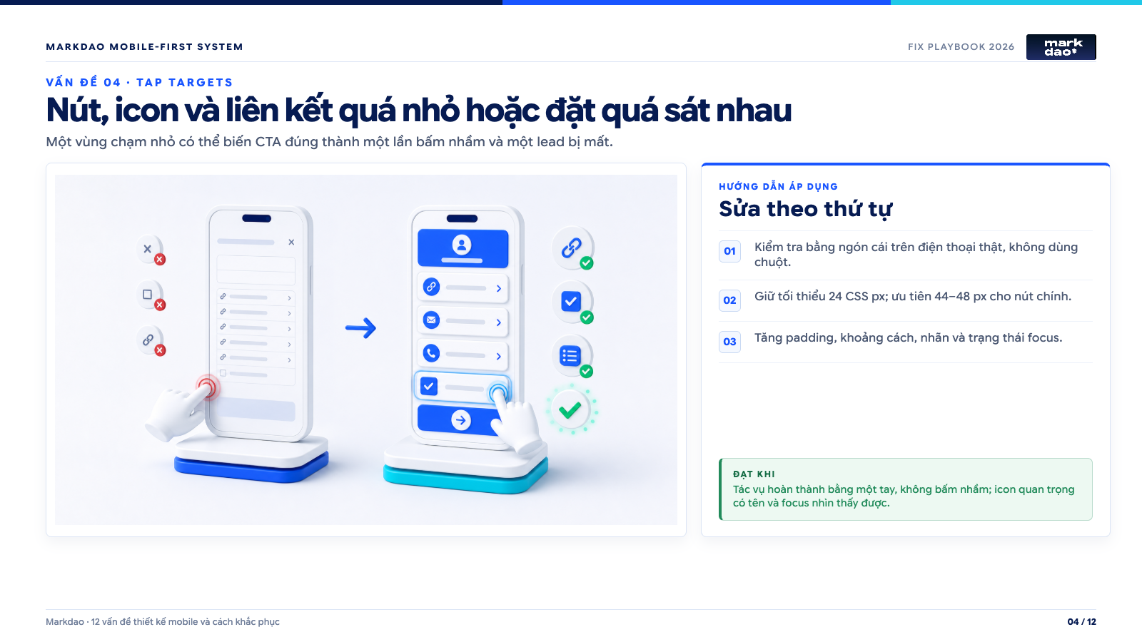
Implementation guide: 1) Test using your thumb on a real phone, not a mouse. 2) Maintain a minimum of 24 CSS px; aim for 44–48 px for primary buttons. 3) Increase padding, spacing, labels, and focus states.
Success criteria: Tasks are completed one-handed without mis-taps; important icons have labels and visible focus states.
Signs of failure: Icons lack labels, text links are small and crowded, checkboxes are difficult to tap, or popup close buttons consist only of a tiny "x". Users frequently tap the wrong element, especially when holding the device with one hand.
Impact: A single misclick can close a form, change a pricing plan, or redirect a user. This isn't just an aesthetic issue; it's a failure in accessibility and conversion.
Practical testing method: Test using your thumb on a real phone without zooming or using DevTools to click with a mouse. Check normal, focus, pressed, and disabled states. Pay special attention to close buttons, filters, pagination, checkboxes, and carousel controls.
How to fix: According to WCAG 2.2, touch targets at the AA level should be at least 24 x 24 CSS pixels or meet spacing exceptions. In practice, aim for 44 to 48 CSS pixels for CTAs, menus, and frequently used controls. You can increase the touch area using padding without making the icon itself too large; ensure enough spacing so that two targets aren't accidentally triggered.
Acceptance criteria: Testers can complete tasks one-handed without misclicks. All important icons have accessible names, focus states are clearly visible, and there are no small text links squeezed between different actions.
5. Sticky CTAs, chat, cookies, and browser bars obscuring content
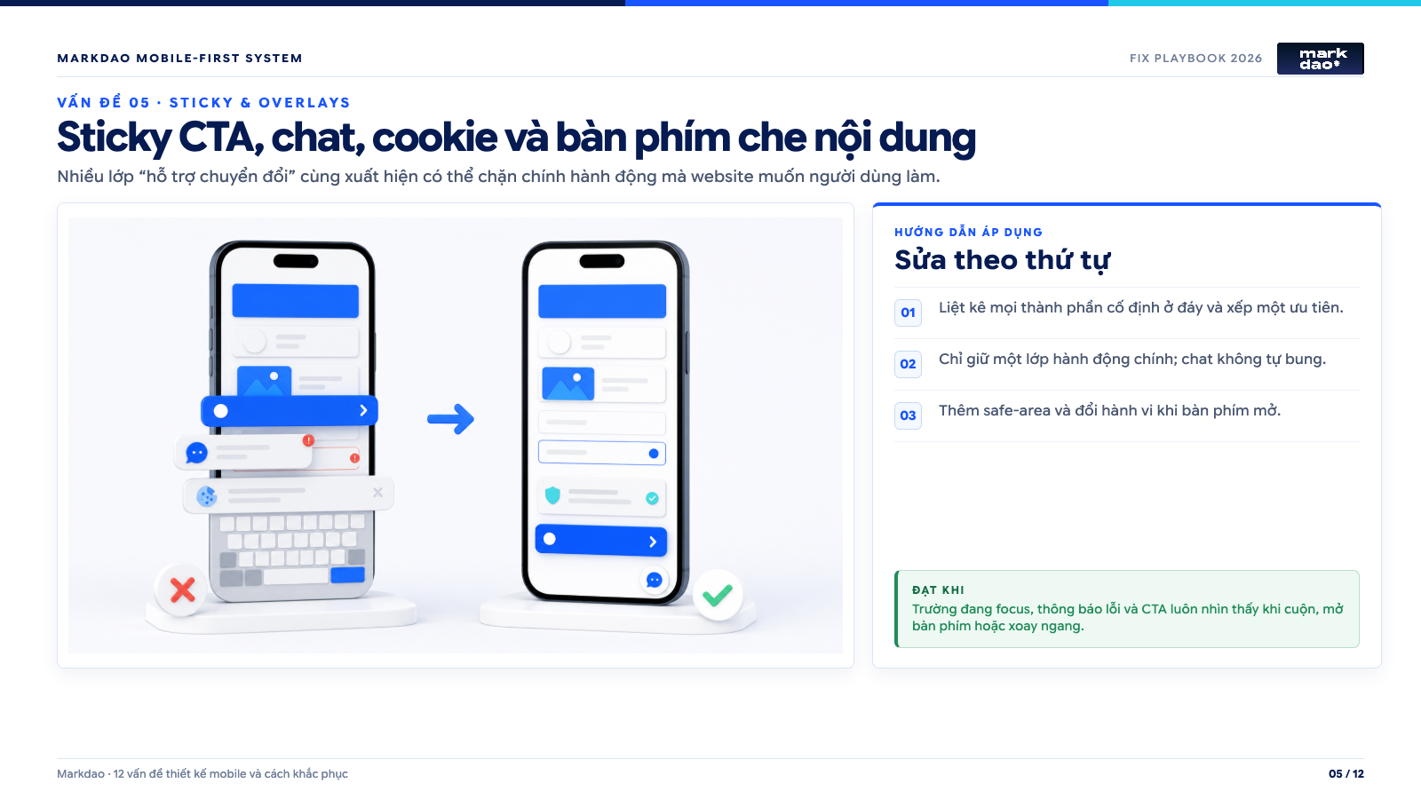
Implementation guide: 1) List all fixed elements at the bottom and prioritize them. 2) Keep only one layer of primary actions; chat should not auto-expand. 3) Add safe-area support and adjust behavior when the keyboard is open.
Success criteria: Focused fields, error messages, and CTAs remain visible while scrolling, when the keyboard is open, or in landscape mode.
Symptoms: Call buttons, Zalo, chat, cookie banners, and sticky CTAs all appear at the bottom of the screen simultaneously. When the keyboard opens or the address bar changes height, the submit button, error messages, or the last line of content are obscured.
Impact: Users see the CTA but cannot complete the action. Having the focused field obscured also makes the form feel broken, even if the underlying logic is working.
Practical testing method: Try scrolling to the bottom of the page, opening the chat, accepting or rejecting cookies, focusing on each form field in turn, and rotating the screen to landscape. Test on both Safari for iPhone and Chrome for Android, as they handle viewports and virtual keyboards differently.
How to fix: Keep only one layer of fixed actions with the highest priority. Add bottom padding corresponding to the height of the sticky bar and the safe area using env(safe-area-inset-bottom). When the keyboard is open, allow the action bar to collapse or hide if it obscures the input field. Chat should not auto-expand; cookie banners should be compact, closable, and not push important buttons out of view.
Acceptance criteria: All fields must be fully visible when focused; no CTAs, error messages, or close buttons should be obscured during scrolling, keyboard activation, or screen rotation. Fixed elements must not cause significant CLS.
6. Form creates too much friction or is covered by the keyboard
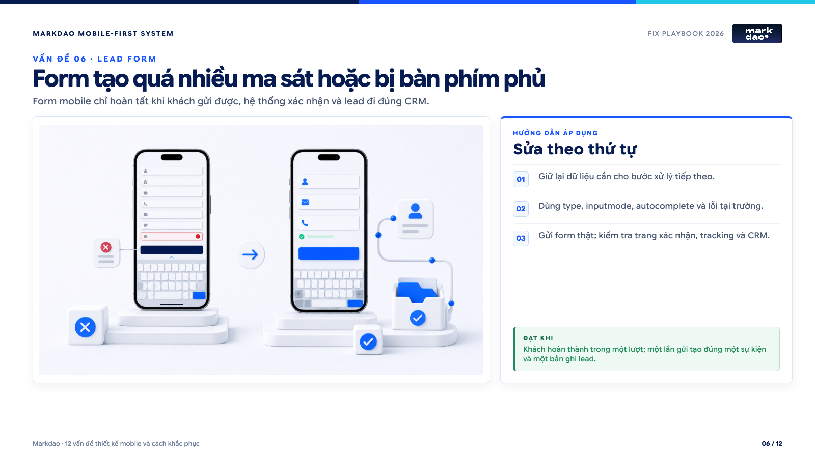
Implementation guidelines: 1) Retain data needed for the next processing step. 2) Use appropriate type, inputmode, autocomplete, and field-level validation. 3) Submit the actual form; verify the confirmation page, tracking, and CRM integration.
Pass when: The customer completes the form in one go; a single submission generates exactly one event and one lead record.
Signs: The form asks for too much information on the first contact, uses the same keyboard for phone numbers and emails, labels disappear after input, or error messages only appear at the top of the page. After clicking submit, the user is left unsure if the system is processing or has received the lead.
Impact: Customers abandon the form despite high intent. A more critical issue is when the interface indicates success, but the data fails to reach the CRM, email, or sales team.
Practical testing method: Use real data to submit the form on both iPhone and Android. Test leaving fields blank, entering incorrect data, using autofill, pasting phone numbers, opening the password manager, and clicking submit on a slow network. Simultaneously verify the interface, analytics events, and lead records in the destination system.
Remediation: Only ask for data necessary for the next step; move screening questions to a second step or a follow-up call. Use persistent labels, and appropriate type, inputmode, autocomplete, and enterkeyhint attributes to trigger the correct keyboard. Display errors next to the relevant field, retain user input, disable duplicate submissions during processing, and provide a success state with clear next steps.
Acceptance criteria: A qualified customer can complete the form in one go without re-entering data or being blocked by the keyboard. Leads must be recorded exactly once, reaching the correct CRM or inbox with clear source and timestamp data.
Real-world example: A booking page for local services usually only needs a name, phone number, service request, and time slot. Asking for company name, job title, budget, full address, and long messages at the initial stage often increases abandonment without necessarily improving lead quality.
7. Pricing tables, comparison charts, and filters are squeezed
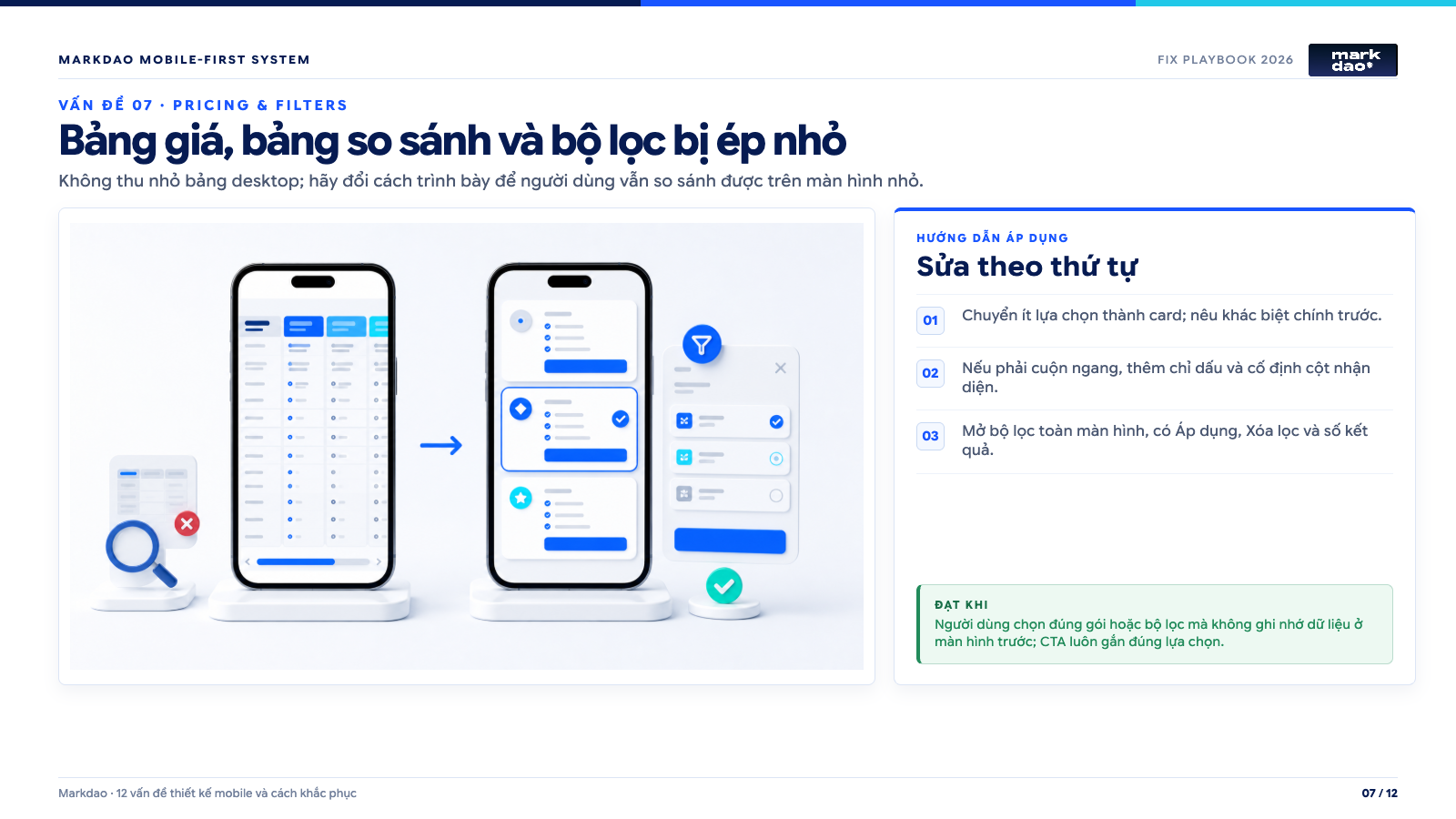
Implementation guidelines: 1) Convert fewer options into cards; highlight key differences first. 2) If horizontal scrolling is necessary, add indicators and pin the identifier column. 3) Open filters in full-screen mode, including Apply, Clear filters, and result counts.
Success criteria: Users can select the correct plan or filter without needing to memorize data from previous screens; the CTA is always correctly associated with the selection.
Symptoms: Desktop tables are shrunk to fit the screen, making text and plan selection buttons unreadable. Some columns disappear without warning; users must scroll horizontally without knowing there is more content to the right.
Impact: Customers cannot compare options, leading to misunderstandings about pricing or missing out on the right plan. For SaaS and e-commerce, this is a direct failure in the revenue journey.
Practical testing: Select a plan or filter a product from start to finish on a 320 CSS px screen. Check if the plan name, price, unit, key differences, and CTA remain within the same context.
How to fix: For fewer attributes, convert each plan into a card and place key differences first. For multi-column data, allow horizontal scrolling with clear indicators, pin the identifier column, and do not shrink text below a readable size. Filters should open as a full-screen panel, displaying the expected number of results with clear "Apply" and "Clear filters" buttons; filter states must be preserved when returning to the list.
Acceptance criteria: Users can compare options without having to memorize information from previous screens. No critical columns disappear silently; the CTA is always correctly attached to the plan, and the plan selection event records the correct value.
Real-world example: For three SaaS plans, do not force a ten-row table onto one screen. Instead, display each plan as a card, highlight three key differences, allow users to expand the feature list, and provide a full comparison table with horizontal scrolling further down.
8. Heavy images and videos, incorrect cropping, or layout shifts
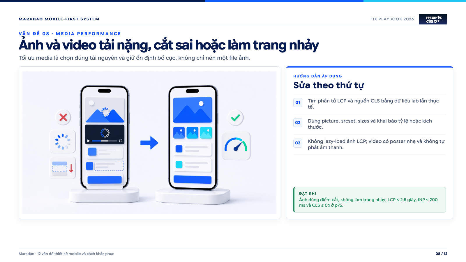
Implementation guidelines: 1) Identify LCP elements and CLS sources using both lab and field data. 2) Use picture, srcset, sizes, and declare aspect ratios or dimensions. 3) Do not lazy-load LCP images; ensure videos have lightweight posters and do not autoplay with sound.
Success criteria: Images are cropped correctly without causing layout shifts; LCP ≤ 2.5s, INP ≤ 200ms, and CLS ≤ 0.1 at the 75th percentile.
Signs: Mobile devices loading the same 2500px hero image as desktops, key images having products or text cropped out, videos auto-playing, and content shifting when images and fonts load. Poor LCP or CLS scores, but the team only compresses files instead of fixing the delivery method.
Impact: The above-the-fold area loads slowly, users click the wrong elements due to layout shifts, and mobile data is wasted unnecessarily. A page that looks "beautiful" on office Wi-Fi can be extremely slow on mid-range Android devices with weak 4G.
How to verify: Use PageSpeed Insights to identify the LCP element and the cause of CLS, then verify on a real phone using data saver mode or a slow network. Check each image aspect ratio at 320, 375, 390, and 430 CSS pixels.
How to fix: Use picture, srcset, and sizes so the browser selects the correct resource; create mobile-specific crops when necessary. Declare width, height, or aspect-ratio to reserve space before images load. Do not lazy-load LCP images above the fold; prioritize selective preloading. Videos should have a lightweight poster, a clear play button, and should not auto-play with sound.
Acceptance criteria: At the 75th percentile for mobile users, the target is an LCP of no more than 2.5 seconds, an INP of no more than 200 milliseconds, and a CLS of no more than 0.1. Images must convey the correct content, not be overly blurry, and not cause layout shifts during loading.
9. Popups appear too early and block all content
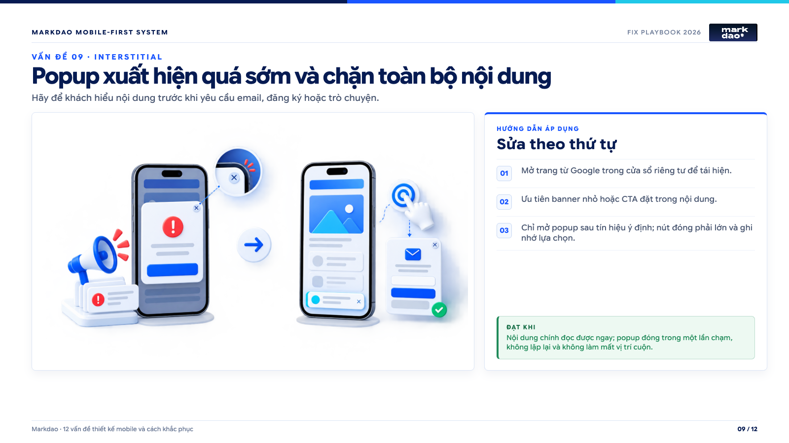
Implementation guide: 1) Open the page from Google in an incognito window to reproduce. 2) Prioritize small banners or CTAs placed within the content. 3) Only trigger popups based on user intent; the close button must be large and the choice should be remembered.
Success criteria: Main content is immediately readable; the popup closes with a single tap, does not repeat, and does not cause the user to lose their scroll position.
Signs: Promotional, newsletter signup, or chat popups appear the moment a user lands on the page. The close button is hard to find, the popup repeats on every page, or it takes up most of the screen on mobile devices.
Impact: Visitors are asked to take action before they have even understood the content. Full-screen popups can also reduce the accessibility of content from search results if implemented as intrusive interstitials.
Practical testing method: Open the page in an incognito window as a new visitor, arrive via Google, and try to close the popup with one hand. Then, navigate to another page, return, and check if your choice to close it was remembered.
How to fix: Prioritize small banners or in-content CTAs. If a popup is necessary, trigger it based on intent signals—such as reading a portion of the content, clicking to view a document, or preparing to leave the page—rather than relying solely on a fixed timer. The close button must be clear, the touch target large enough, and the popup should not obscure essential functionality. Legal notices must still appear as required but should occupy as little space as possible.
Acceptance criteria: Users arriving from search results can read the main content immediately. The popup can be closed with a single tap, does not reappear repeatedly, and does not cause the user to lose their scroll position.
10. Small text, long paragraphs, and poor reading rhythm for screens
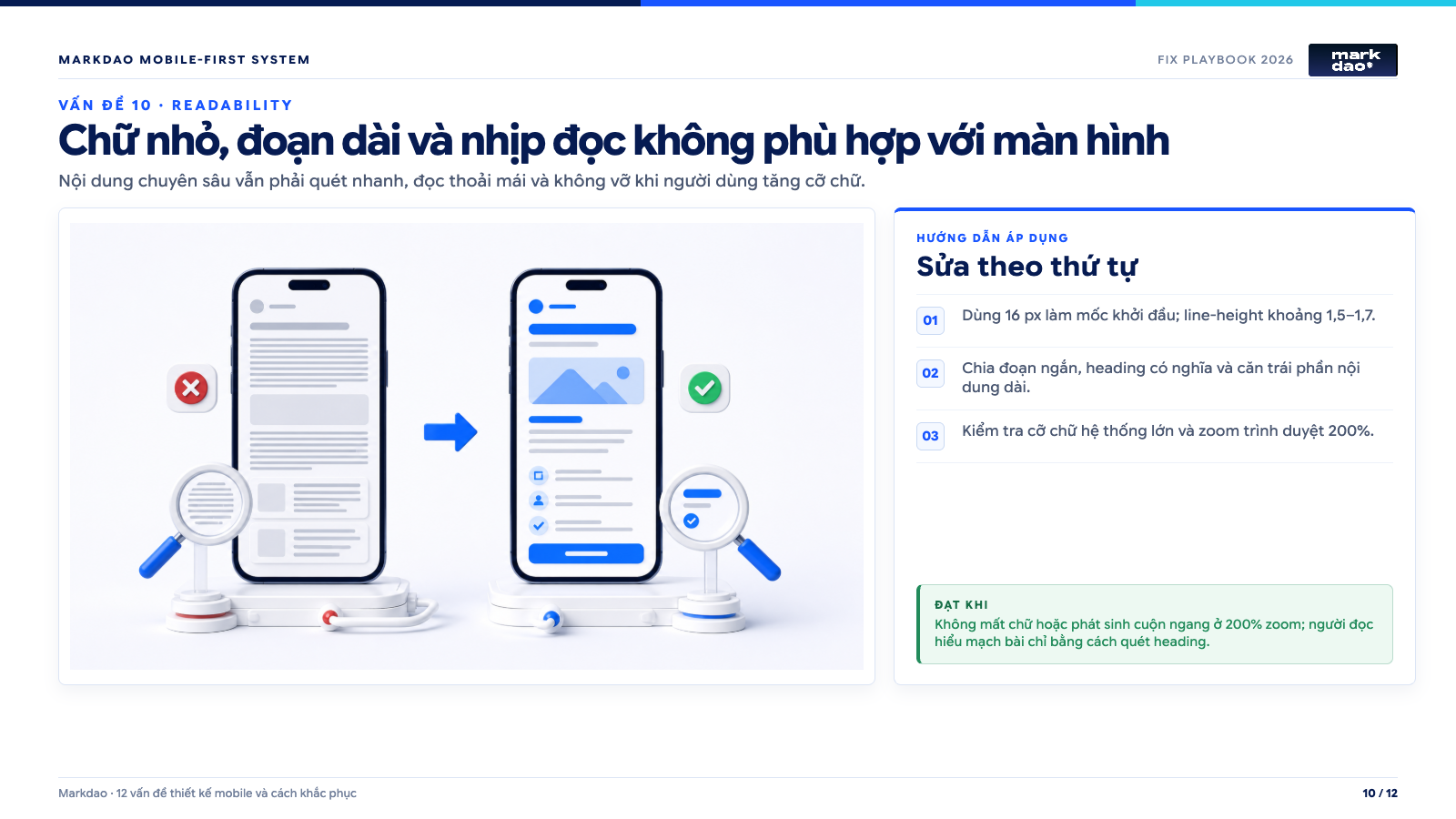
Implementation guide: 1) Use 16px as a starting point with a line-height of approximately 1.5–1.7. 2) Break text into short paragraphs, use meaningful headings, and left-align long-form content. 3) Test with large system font settings and 200% browser zoom.
Success criteria: No text is lost or horizontal scrolling is introduced at 200% zoom; readers can grasp the flow of the article just by scanning the headings.
Signs: Body text is too small, lines are too long, paragraph spacing is insufficient, or headings break in awkward places. Content relies heavily on center alignment, all-caps, or text placed directly over images with low contrast.
Impact: Readers are forced to zoom in or skip sections that help them make decisions. In-depth content becomes "difficult" not because of the subject matter, but because the presentation forces the eyes to work too hard.
Practical testing method: Read three consecutive paragraphs on a phone in low light, then increase the system font size and zoom the browser to 200%. Look for overlapping text, clipped content, horizontal scrolling, or CTAs with missing labels.
How to fix: Use 16px as a practical baseline for body text, then adjust based on the specific font and target audience. Maintain a line-height of 1.5 to 1.7, keep paragraphs short, use descriptive headings, and use lists for multiple conditions. Only place text over images if there is a background layer to ensure contrast; avoid center-aligning long paragraphs.
Acceptance criteria: Content remains readable at 200% zoom without text loss or horizontal scrolling, except for elements specifically designed to scroll. Readers can scan headings to understand the article's flow before reading the details.
11. Carousels, effects, and swipe gestures lack alternatives
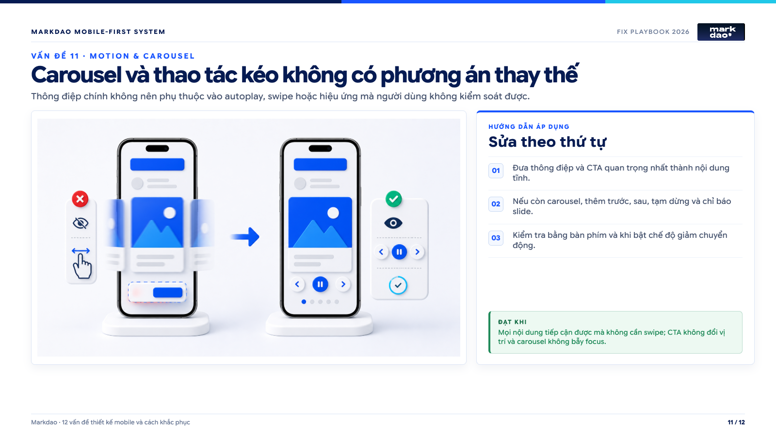
Implementation guide: 1) Make the most important message and CTA static content. 2) If a carousel is still necessary, add previous, next, pause, and slide indicator controls. 3) Test with a keyboard and with reduced motion mode enabled.
Success criteria: All content is accessible without swiping; CTAs do not change position, and carousels do not trap focus.
Warning signs: Important content is hidden in the second or third slide, the carousel auto-plays too fast, navigation requires swiping, or animations cause buttons to shift position. Users are unaware of additional content and cannot pause the movement.
Impact: Information is missed, one-handed operation becomes difficult, and users sensitive to motion may experience discomfort. Hero carousels also cause multiple messages to compete for attention in the most critical part of the page.
Practical testing: Try completing tasks without using swipe gestures, then enable your operating system's reduced motion mode. Check keyboard focus and ensure CTAs remain stationary while slides change.
Remediation: Convert the most important messages into static content. If a carousel is essential, include labeled previous/next buttons, slide indicators, and a pause function; do not force users to rely on swiping. Respect prefers-reduced-motion and avoid animations that shift the layout.
Acceptance criteria: All content and actions are accessible without swiping. Carousels do not cause CTAs to disappear, do not trap focus, and do not obstruct users when reduced motion is enabled.
12. Tracking, chat, and third-party widgets slow down or lose leads
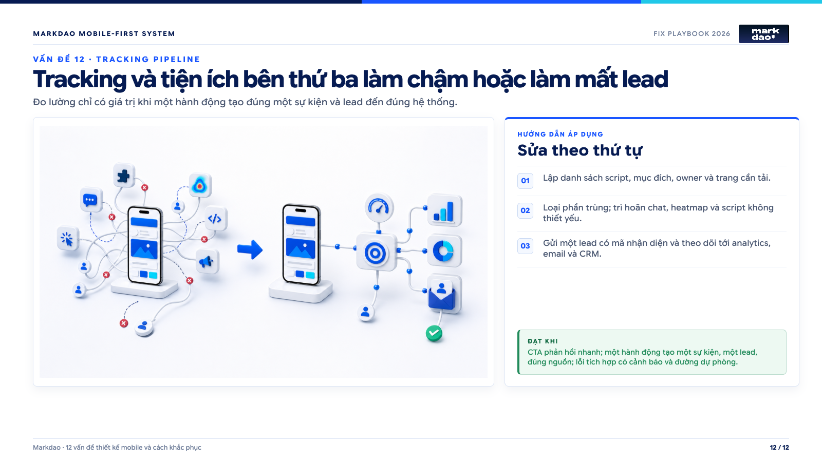
Implementation guide: 1) Create a list of scripts, their purpose, owner, and the pages where they load. 2) Remove duplicates; defer chat, heatmaps, and non-essential scripts. 3) Send leads with unique identifiers to analytics, email, and CRM systems.
Success criteria: Responsive CTA; one action creates one event and one lead from the correct source; integration errors trigger alerts and have fallback paths.
Signs: The page loads numerous advertising, heatmap, chat, scheduling, and A/B testing scripts immediately. CTA response is slow, forms submit twice, or conversion data differs between GA4, ad platforms, and the CRM.
Impact: The website is both slow and unreliable for measurement. The marketing team may optimize based on incorrect events, while actual leads are lost between the form, webhook, and CRM.
Practical testing: Create a list of all third-party scripts, their owners, and their purposes. Compare response times before and after blocking each script group in a test environment. Submit a lead with a unique ID and track it from the CTA click through to the CRM record.
Remediation: Remove duplicate or unused scripts; defer non-essential widgets until after interaction or proper consent. Load chat and heatmaps only on necessary pages rather than site-wide. Use a unified conversion definition, prevent duplicate submissions, and log errors at form, webhook, email, and CRM connection points.
Acceptance criteria: CTAs and forms remain responsive when scripts are enabled. One action creates only one event and one lead record; source, campaign, and landing page data are preserved throughout. When an integration fails, the system provides an alert and a fallback method for lead capture.
Mobile error handling playbook for a single sprint
An error list is only valuable if the team knows what to fix first and what "done" looks like. The following process is suitable for a short sprint, applicable to service, SaaS, e-commerce, or local business websites.
Step 1: Document errors so others can reproduce them
Each ticket must include the URL and page template; device, OS, browser, and network type; steps to reproduce the error; actual vs. expected results; screenshots or videos; impact on SEO, tasks, or leads; P0, P1, or P2 priority; assignee; acceptance criteria; and tracking events to verify. Do not write "mobile looks bad" because developers won't know what to reproduce or fix.
Step 2: Prioritize by business bottlenecks
P0 errors prevent Google from reading content, users from completing tasks, or businesses from receiving transactions and leads. P1 errors allow completion but cause slowness, misclicks, or abandonment. P2 errors are inconsistencies in presentation that do not block the user journey. Fix P0 before driving more traffic; do not prioritize color tweaks over critical conversion errors.
Step 3: Fix the root cause at the component or template level
If the same error appears on ten product pages, do not fix them manually ten times. Identify the component, CMS template, design token, or script causing the error and fix it at the source. Designers must provide full states for normal, focus, error, loading, success, and long-text scenarios; developers must clearly define breakpoints and behavior when content exceeds expectations.
Step 4: Acceptance testing on real devices and real user journeys
At a minimum, test on Safari for iPhone, Chrome on mid-range Android devices, small and large screens, portrait and landscape orientations, large font settings, and slow network conditions. Don't just stop at "looking right." Click CTAs, submit forms, book appointments, select plans, or make payments; then, verify that the data has reached the system correctly.
Step 5: Measure after release
Capture benchmarks before making changes, including mobile conversion rates, form start and completion rates, CTA clicks, Core Web Vitals, JavaScript errors, and the number of qualified leads. After release, check for errors within the first 24 hours and monitor trends long enough based on traffic volume. If the interface is better but leads drop, check your tracking, traffic quality, and content changes before drawing conclusions.
Quick acceptance checklist before closing a ticket
Considered complete when the error no longer reproduces on target devices; the main task is completed from start to finish; no new errors arise in related templates; focus, zoom, and keyboards do not obscure content; analytics events fire only once; leads or transactions reach the correct system; and screenshots or videos of the fix are attached to the ticket. Only when these conditions are met is the issue considered resolved.
After making changes, how do you know if the website is actually better?
Record metrics before making changes to have a baseline for comparison. Depending on traffic volume, you should monitor for at least two to four weeks after deployment.
Key metrics to track include:
- Mobile conversion rate.
- Number of users who start and complete forms.
- Number of clicks to call, message via Zalo, or book appointments.
- Bounce rate on landing pages.
- Core Web Vitals from real-world data.
- Number of qualified leads from mobile.
- Conversion gap between mobile and desktop.
- JavaScript or form errors arising after updates.
Do not judge success by traffic alone. The ultimate goal is to help the right people find your content, understand your offer, and complete the desired action with fewer obstacles.
FAQ

Responsive is a technique that helps an interface adapt to various screen sizes. Mobile-First is an approach that prioritizes content, performance, and user tasks starting from the smallest screen. A website can be responsive but still difficult to use if the content is in the wrong order, buttons are hard to tap, or forms cannot be completed.
Combine four sources: URL Inspection to see how Google reads your page, PageSpeed Insights to check performance, Chrome DevTools to detect layout errors, and a real phone to complete the user journey. Do not rely on a single tool.
No. Google discontinued the Mobile-Friendly Test and the Mobile Usability report in December 2023. You should now use Search Console URL Inspection, Core Web Vitals, PageSpeed Insights, Lighthouse, and manual testing on real devices.
You should perform a quick check after any major changes to the interface, plugins, tracking, or forms. For a stable website, you can perform a light check monthly and a deep audit quarterly. Pages that generate significant traffic or revenue should be monitored more frequently.
You can simplify the layout or move secondary content into accordions, but you should not remove important information that users and Google need. Main content, headings, links, metadata, and structured data should remain consistent with the desktop version.